


According to a survey, the answer is Premier Inn and Travelodge, the best-known budget hotel brands.
Premier Inn narrowly nudged out its budget rival, with The Hilton a distant third.
So what are these hotels doing right online? Or are the results merely a reflection of the popularity of these two brands?
I’ve been looking at the survey results, as well as how the top ten hotel brands deal with the search and booking process.
The stats
According to the results of Postcode Anywhere’s poll, the 10 easiest hotels to book online with are:
- Premier Inn: 29.81%
- Travelodge: 28.80%
- The Hilton: 9.79%
- Ibis: 7.20%
- Marriott: 7.09%
- Best Western: 6.97%
- Novotel: 4.39%
- Mercure: 2.47%
- Macdonald: 1.80%
- Guoman Hotels: 1.69%
What helps people book (and what deters them)?
- Hidden prices. An old problem online, when will they learn? 55% of consumers voted hidden prices as one of their top turn offs on hotel websites.
- Complicated and lengthy forms. 29% were deterred by poor form design.
-
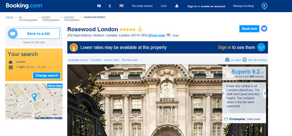
No reviews. Just 4% nominated this, perhaps because reviews haven’t been so widely used by the hotel industry, though Booking.com is a great example of how to use them.
- Customers rated photos (31%), customer reviews (30%), and clear pricing (29%) as the top features they’d want to see on hotel websites.
- 38% of customers use tablets and smartphones for researching hotels but this figure drops to 26% when it comes to actually booking.
- Three to five minutes is the longest a customer would spend on a hotel website before giving up and going elsewhere.
Homepages
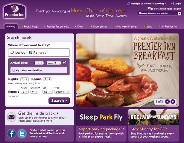
Premier Inn’s homepage is clear, with a simple booking form. Just get those visitors searching…
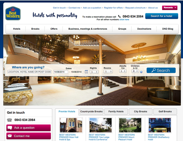
By contrast, Best Western’s page has less focus.
The most important element (the search box) is sllghtly lost in front of the hero image, while the search call to action could be clearer.
Flexibility
I think this is something more travel sites should build in. Yes, many people will have a specific date range and destination in mind, but others may be more flexible.
For example, I may want to go to Italy sometime in October (which would be nice) but may be easy about the specific city or weekend.
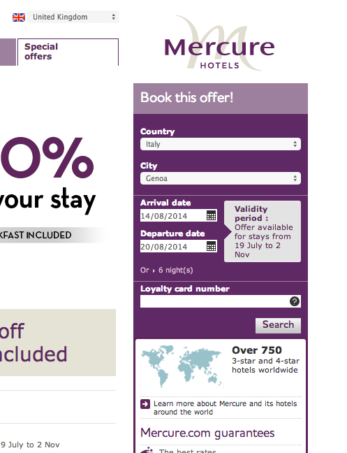
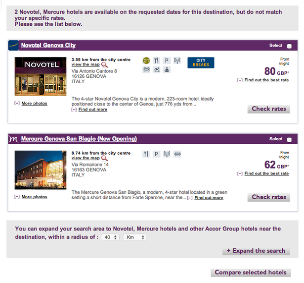
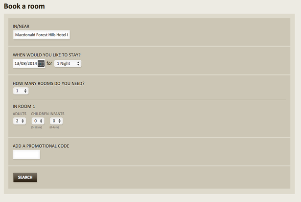
On Mercure, I have to specify city and dates, which means I’ll need to search again and again if I want to see what’s available in different cities.
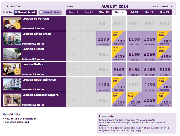
By contrast, Premier Inn has a ‘dates flexible’ tick box which allows me to see hotels near St Pancras over a week, with the option to switch weeks and see other available prices in calendar view.
Search results pages
A key part of the process. Results should be clear, easy to digest, and relevant.
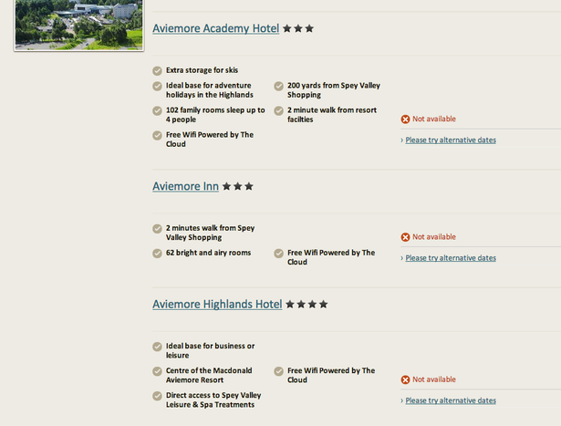
Macdonald fails on the last point. The first five results it shows me are unavailable and I have to scroll a way down the page to find one I can book. Many won’t bother doing that.
Mercure fairs better here. No results that completely match my search, but does at least show alternatives, with the option of expanding the search radius.
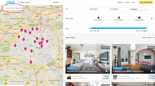
This is something hotel sites can learn from Airbnb’s excellent user experience.
Here, we have a ‘search when I move the map’ option, which makes it nice and easy to broaden or narrow the search radius without having to start over again.
Travelodge does offer a useful map view, though the ability to see prices for the selected dates would make it much more useful.
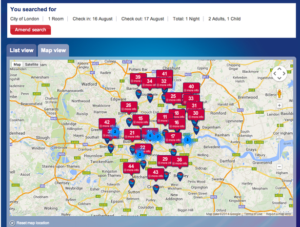
Ibis presents results well, with good options to narrow the search, though I found that Premier Inn was well ahead of the competition in this respect, with flexible results and clearer pricing.
Reviews
I could only find reviews on Best Western, which uses TripAdvisor ratings. It does have the sense to add review scores to results pages, though it could go further and use these as a refinement option.
The others are missing a trick. Many users will just find reviews elsewhere anyway.
Photos
Photos were important for 31% of survey respondents, and people will at least expect to see views of the room they’ll stay in as well as the hotel facilities.
It’s also an opportunity to sell the hotel through great imagery.
However, Guoman expects users to start booking this hotel with only this tiny exterior image to help them.
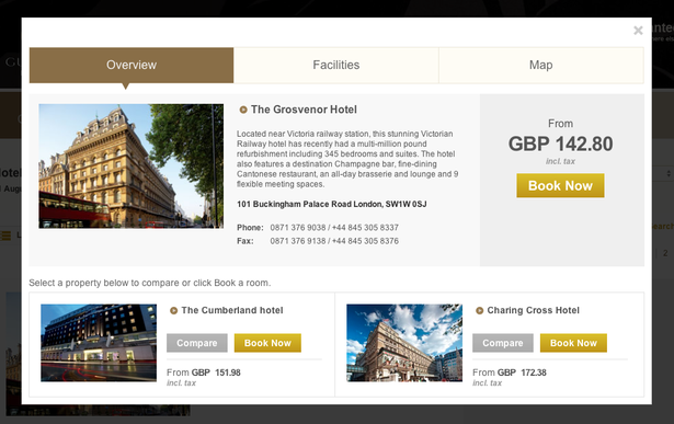
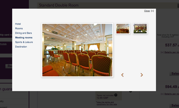
Indeed, small images were a problem in general, as well as cumbersome pop-ups and lightboxes. This one from Mercure didn’t really help to sell the hotel.
Another fault was that hotels often didn’t show photos for the precise room, or even room type.
When people are looking for luxury hotels at expensive rates, this is a major omission, as well as a lost opportunity to sell the luxury through excellent high-quality imagery.
It was actually hard to find any particularly good examples of hotels on the list using imagery well.
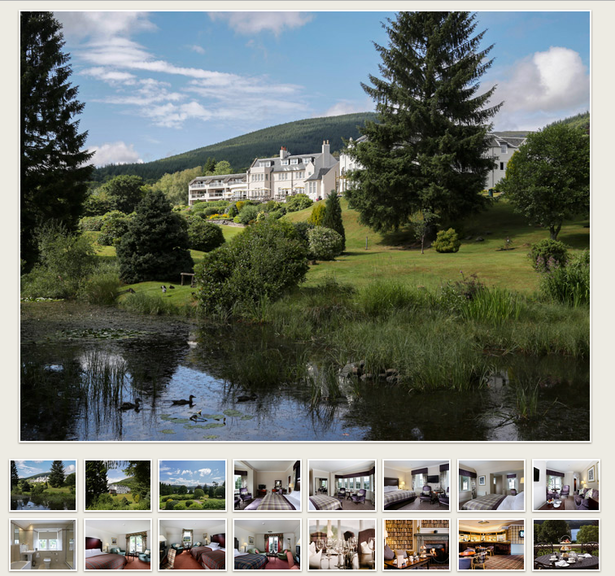
Macdonald had a nice gallery here, but this had to be found via a link on the hotel page. It’s in a beautiful setting, why not make images like this more prominent?
Forms
There were some frustrating processes here. For example, having found a room on the Macdonald site for a specific date in November, pressing the book button took me back to this form. That’s instant abandonment for many web users.
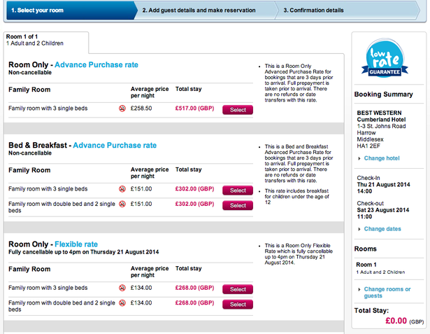
The number of room options on Best Western must confuse some visitors, with flexible rates, advanced rates, and so on. Seven different choices on this booking page.
The Travelodge booking form and checkout was well designed and simple to complete. Short enough to avoid too much user frustration.
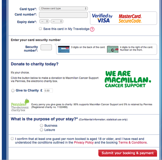
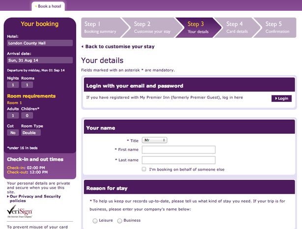
The Premier Inn checkout is also well designed, with the steps clearly signposted and form fields kept to a minimum. The persistent reminder of booking details on the left is also helpful.
In summary
Of course, the sheer popularity and low prices offered by Premier Inn and Travelodge help to produce the results shown in the PCA survey, but they do offer a generally better user experience than the other sites in the top ten list.
The two budget hotel brands get the basics of the hotel search and booking process right, and these are perhaps the most important details. A good search process helps them find the right hotel, and a smooth checkout makes it easy to pay.
There’s a lot the other sites could learn from hotel and travel sites like Airbnb and Booking.com, which provide excellent user experiences.
These two sites make excellent use of imagery and consumer reviews, something which is lacking on the hotel sites mentioned here.


No Comments