


While it is true that some people maintain a website just to share to other individuals their passion and talents, it can’t be denied that websites are primarily meant for business. This is the reason why it is important for you to come up with an impressive web page design that is not just appealing to the eyes but provides ease of navigation to those who visit it.
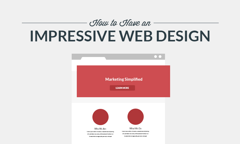
Learn how to have an impressive web design
For many people who visit your client’s page, the website is the physical store. Because of this, wouldn’t it be proper for you to make it more enticing and customer-friendly, in the same way, that you would do if you were an architect of a physical store? Hence, it makes a lot of sense why you should plan your client’s web page design carefully.
However, don’t be tricked into thinking that you just need to focus on your landing page. An impressive web page design is more than that. You also need to factor in the general workflow of your page so that it will not only be visually appealing but functional and easy to navigate as well. Here are some of the most important tips that you can follow to have an impressive web page design:
1.Visualize, Plan, and Jot Down Your Thoughts
This may seem obvious, but many designers immediately sit in front of their computers and work on the design of their web page with the help of Photoshop. Yes, in this era when things can be easily done digitally, it is still best to start your web page design with the use of pen and paper. Nothing can be a better start than this. Visualize what you want to happen with your website. Before allowing your thoughts to tinker with the layout idea, consider first the content. Next, visualize how you would like the layout to look like. This will involve a lot of hits and misses, so it’s best to work on this aspect with the use of pencil and paper. After which, ask yourself how you would merge the layout with functionality. Again, this will engender a lot of trial-and-error until you can finally get what you want.
2. Consider the Top Level Framework First
When making your initial sketches, one of the most important things that you need to consider is the highest level of the framework that will solve or even avert the design problems that you may encounter along the way. This means that you need to pay attention first on the UI (user interface) before considering the UX (user experience). You have to remember that the UI design process will involve the following stages:
- Capturing user experience. This will involve the studying of use cases, aims of users, and common problems.
- Coming up with a UI pattern that is in conjunction with the UX but is not necessarily limited to its UX.
- A visual appeal that prioritizes the parts correctly.
- Usability tests.
3. Include a Grid to Your PSD
Yes, it sounds basic. Prior to beginning your design with the use of Photoshop, you need to have a grid that will serve as your guide. You may opt not to use a grid, although there is no sensible reason why you shouldn’t, but rest assured that the result of the design without the help of the grid will not be as impressive as it should be if you use one. This is because the grid will guide you mount your would-be layout on different areas. Additionally, it will direct you to the recommended screen size as it assists you to come up with templates that are not only responsive but are also in conjunction with spacing and other issues associated with design.
4. Determine the Typography that you will Use
Although it is generally true that you shouldn’t use more than two types of typefaces for your web page design, you always have the choice to go for more or even less. However, regardless of your choice, always remember to go for a font that is easily readable, especially when used in lengthy texts. Be brave with your experimentation. If you think bold fonts are necessary, go for it.
5. Identify Your Color Theme
Apart from paying attention to the type of font that you will use, you should also be keen on the types of color that you will use. As much as possible, don’t go beyond 4 colors. Generally, you should only choose 2 main colors that are clear and bold, and the 2 other colors should complement the 2 major colors. In the event that you’re tempted to go for more colors, just make sure that you don’t go for more that are under the same hues. It would also help if you provide an ample white background so that the eyes of those who will visit your website will be relaxed.
The following are some of the most important tips that can help you choose the right color combination for your website design:
- Refer to the branding of your company. Referring to your client’s company color scheme is one of the safest ways for you to pick the right color for your website. If not, you can use it as your reference to look for other colors that will complement and match the color(s) of your company.
- Base it on your content. Another thing that can guide you to pick the right color for your website theme is to base it on the subject of your infographic. For instance, if your infographic is about apples, you can play with the shades of red. This will make the information of your infographic more attuned with your theme.
- Get a hint from nature. You can also pick your color choice based on nature. You may pick the colors based on the seasons. Whatever your choices will be, as much as possible, they should not exceed more than four.
6. Divide the Layout
Always remember that the simpler the structure of your website is, the easier it is for those who visit it to navigate. You should make sure to establish a link between the reason behind the layout and its impact on those who will use it. Likewise, make sure that the kind of layout that your website will have can help in highlighting its most important aspects. The trick here is to come up with the simplest form of layout for the simplest purpose. As you go on, you can add more components that are, likewise, important.
The following are some of the most commonly used web page design layouts that have never gone out of style over the years:
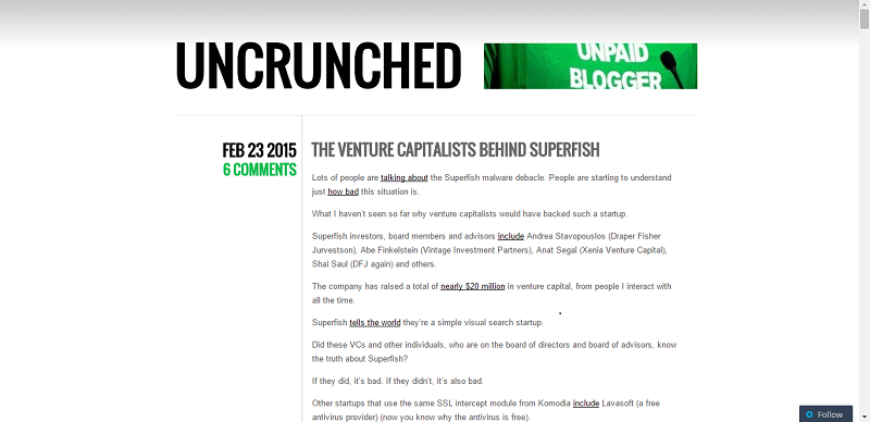
A blog using the Two Column, Wide Header layout
Two Column, Wide Header. Without question, this is the most common layout that you will find on the Internet. This is already a classic and impressive web design. This layout consists of a wide header that is usually 960px long and has two columns: one is wide, and the other is narrow. The narrow side primarily functions as the navigation panel. More often than not, in blog sites, the navigation column is placed on the right side. Uncrunched makes use of this layout.
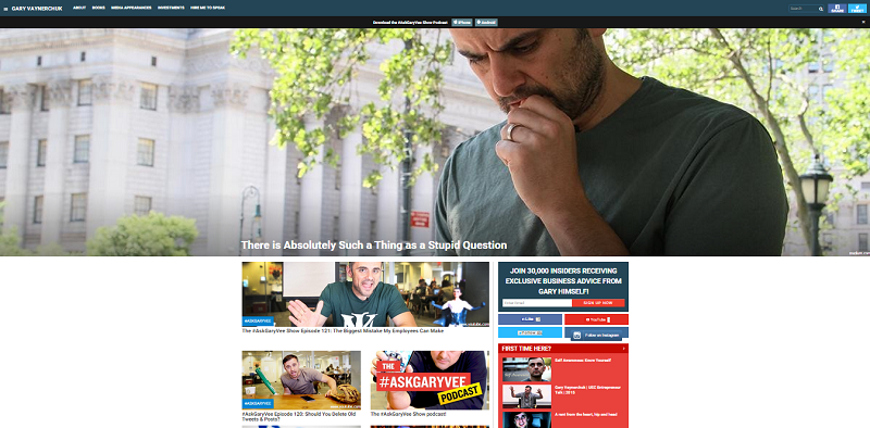
Gary Vaynerchuk adapts the Three Column, Wide Header layout
Three Column, Wide Header. For you to imagine this easily, this is the layout used by WordPress and Blogger. If you are not sold to the idea of going for the above-mentioned layout, this is your next best option. As its name suggests, this layout is made of 3 columns. The two narrow columns are often used for navigation purposes while the wide column is where the content is placed. A wide header is found on top of the columns. See Gary Vaynerchuk’s website to know how this layout looks like.
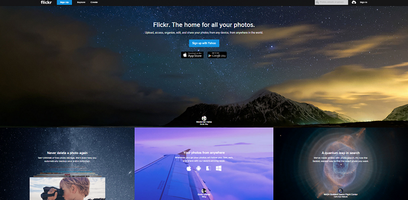
Flickr is impressive with the Four Boxes layout
Four Boxes. This layout is most common to products and news blog sites. It comes with a wide header that runs from end to end, another wide box that also serves as a header, and three columns that evenly occupy the screen. The large box is usually used to showcase the products of a website or where the articles are placed. The 3 columns can be used for product information, or secondary articles. This layout is used by Flickr.
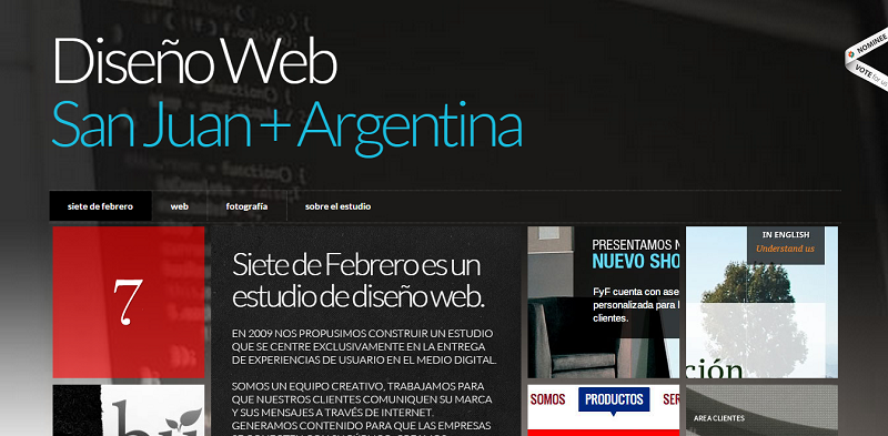
Siete de Febrero is a good example of an Undefined Grid Layout
Undefined Grid. This layout is heavily inspired by the common grid layout. It has a site-wide header that contains the navigational elements that are spread across the width of the site. Siete de Febrero is one website that has embraced this layout.
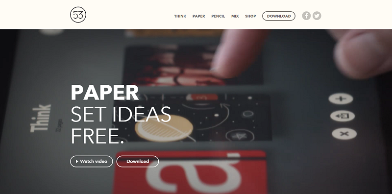
The Paper app landing page is a good example of the Large Screenshot layout
Large Screenshot. This layout includes a large screenshot that is placed immediately below the header. More often than not, there are between 2-4 grid-based boxes after the screenshot. It is in these boxes where more information about a product are placed. Ex. Paperapps uses this layout.
Single Column. This is a favorite layout of many microblogs that embrace the principles of minimalistic design. The single and center column is narrow and has a footer where navigational elements are placed. Tumbler uses this layout.
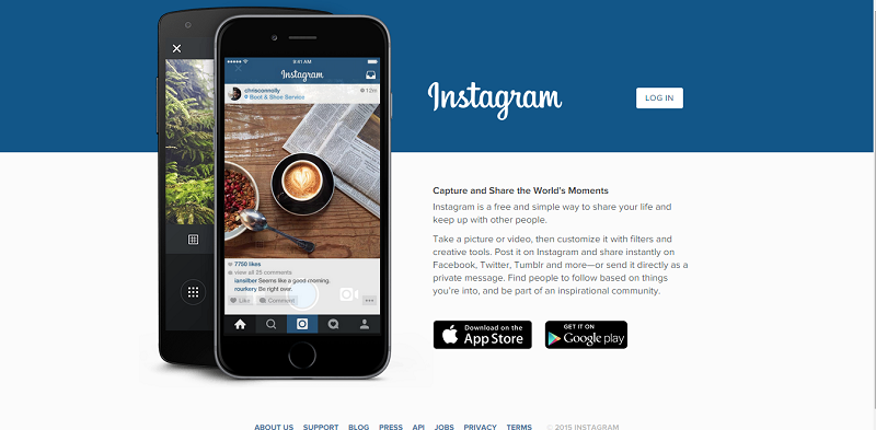
Instagram is one of the popular apps using the Featured Image layout
Featured Image. This is most popular to smartphone app developers. This layout involves the use of a large image in either side of the page and a single column where the content is placed. Instagram is one example of a design that uses this layout.
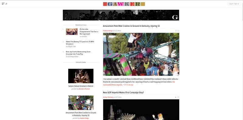
Gawker presents information using the Fixed Sidebar layout
Fixed Sidebar. As its name suggests, this particular layout makes use of fixed sidebar where all the navigation elements are found. On the other hand, its primary column contains all the content. Gawker is the best example of this layout.
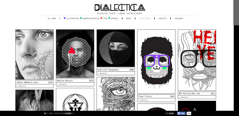
Dialectica Studio tells their story in a Grid Based Gallery
Grid Based Gallery. Many designers and photographers go for this layout as it also serves as their portfolio site. This involves the use of a header, heading, and a photo gallery that is grid based. Check Dialectica Studio to have a concrete idea on how this particular layout looks like.
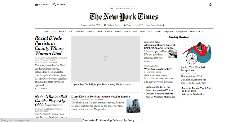
Nothing represents the Magazine Style layout than the New York Times
Magazine Style Layout. This layout is the most ideal if you want your website to be visually rich. Generally, the content of this layout is arranged according to their freshness. The freshest stories/ articles are placed in the largest box just below the header, while the older articles are placed in the second box. Other contents of the page are placed in the smaller post box. New York Times uses this layout.
7. Innovate and Challenge the Established
One of the major things that you need to bear in mind is that, as a designer, it is your responsibility to define the ease of navigation of your website. At times, this may call you to challenge the norm. For instance, would you still need to include a search option in your design? In the past, it may have been necessary. However, these days, in many cases, the answer is a resounding “no”. Think of other things that are existent in many websites. Do you really need those as a component of your web design? It is of vital importance that you assess the current designs and challenge their importance. Your answer can help you come up with a design that is apt for the need of the current times.
8. Outdo Yourself
Never rest on your laurels. Yes, this adage still applies to web design up to this very date. Just because the last web page design that you have had was a bang up, this doesn’t mean that you can do the same approach again. Apart from challenging the conventional designs, it’s also best for you to challenge yourself. Always push yourself to the limits to come up with an impressive web design that is not only visually appealing, but is functional and relevant to the present times. Explore the possibilities.
9. Be Attentive to the Details
This does not only apply to web designing but in all jobs. However, as a web page designer, it is of high importance that you pay attention to every bit and detail of your design. Does every component look good? Are they placed in the most ideal places? Do the color of the images jibe? Won’t a particular component affect the loading of the page? These are just some of the questions that you need to ask yourself as you progress with your design.
10. Give Each Component Equal Importance
You have to consider all the components of your design with equal importance because, when you come to think of it, they’re not there if they are not needed, right? What sets one component apart from the other is the degree of importance, but on the whole, they all play an important role. Hence, make sure that you design each in a way as if it were the only one that you are working on. It’s like paying attention to all the ingredients that you will use in a dish. You know that you should only pick the freshest and the best, because if one is of poor quality, it may affect the overall outcome of your culinary creation.
11. Enhance your Design
More than the aesthetic aspect of your design, there are certain things that you need to closely pay attention to and enhance. For instance, if you want your website to be devoid of blurry pixels, you need to ensure the contrast between the strokes and background colors. Of course, there are many other things that you need to pay attention to, apart from this. The bottom line is that you need to reassess all the inclusive components that you have come up with. All.
12. Keep your PSDs in Place
Regardless of the size of the website that you are working on, you need to make sure that your PSDs are well arranged. You may not realize the importance of this in terms of speeding up the process of designing and sharing files with others who are also working on the design of the website.
13. Consider All the Medium
One of the most important things that you need to pay attention to is the varying mediums where your website will be used. You might design a website that can easily load on desktops or laptops, but have you considered its loading capacity in mobile phones and tablets? Hence, don’t only focus on the conceptual aspect; always take into consideration the technical aspects, too. Build it under the best case scenario as you take into consideration the worst case scenario as well.
14. Go on Loving your Design until You Hate It
Many designers actually do this. They keep on gazing on their design, feeling proud of themselves until they get to a point wherein they can notice even the slightest flaw that they have made. Admiring their work eventually leads them to wanting for more, even to the extent of being their work’s own staunchest critic. Is this bad? Of course, not! This is one way of bringing yourself to pay attention to the slightest details of your design. This also leads you to challenging yourself to do better. This is not only true to web page designing. How things are done may be different with other jobs, but the practice should be observed in all fields.
15. Coordinate with your Client Every Now and Then
Many designers make a mistake of spending too much time in designing a webpage based on their personal taste and without taking into consideration what the client really wants. As a result, because the design that they come up with is not in line with what the client wants, all the time and effort that they have spent in coming up with the design end in smoke. It’s a given that clients instruct their designers what they want. The problem arises when there is lack of communication between the designer and the client as the latter bases his design on his interpretation of what the client wants. Hence, every now and then, make it a point to coordinate with your client to make sure that you are on the right track.
16. Coordinate with Your Developer
Just like many web page designers, web developers are also some of the most hardworking individuals on the planet. Nonetheless, they are some of the most secluded people in the process of website designing. Sure, it is not their job to work on the design of the website that you are developing. However, do you know that they are some of the most creative people that you neglect? In fact, the knowledge that they possess can help you come up with a design that really rocks. Therefore, before you begin your website design, make sure to encourage the web developers to pitch in their ideas. This will not only enable you to come up with a design that can be fully actualized; it can improve your camaraderie, too.
17. Simplify Your Explanation
When presenting to your client, make sure that your explanation is in black and white. If possible, speak a language that will make it easy for him to understand. You have to bear in mind that your knowledge and terminology in terms of web design are not necessarily on the same level with that of your client. You may be better than him in this regard. However, you should not take the chance to rub it on his face that you are better. Ensure that everything is understood so that the design that you will come up with is in accordance to what he really wants. Additionally, if there is something that he doesn’t approve of, it can be easily tweaked. You can save some time and effort in revising your work.
18. Be Open to Suggestions and Criticisms
You may think that the design that you have come up with has everything covered, and it is the best that you have ever made by far. However, you need to remember that each person has his own taste and preference. If the product of your hard work and creative juices does not fall in the good graces of other people, don’t take it personally. Bear in mind that they may see things differently from how you do. Listen to their suggestions and criticisms. After all, they may have a point that you failed to see because of your ego.
19. Keep Track of Your Design Once It is Up for Development
In order for you to make sure that what you have worked on and what the client has approved is really carried over by the web developers, make sure that you keep track of the process. Again, this boils down to coordination in order to achieve what should be done. After all, your job as web designer does not end once the PSD and styles-sheet are released. If the design that you have come up with does not sit well with the developers, for whatever technical reason they have, don’t allow them to tweak it. Ask them to give you time to revise what needs to be revised.
20. Share Your Approved Work to Others
Once your client has given the nod on your design, share it to other people who understand the nature of your work and are knowledgeable in the field. This will not only enable you to get feedbacks that you can use on your next project; it can also enable you to get comments that you can use to revise and further enhance your work upon the approval of the client.


No Comments