


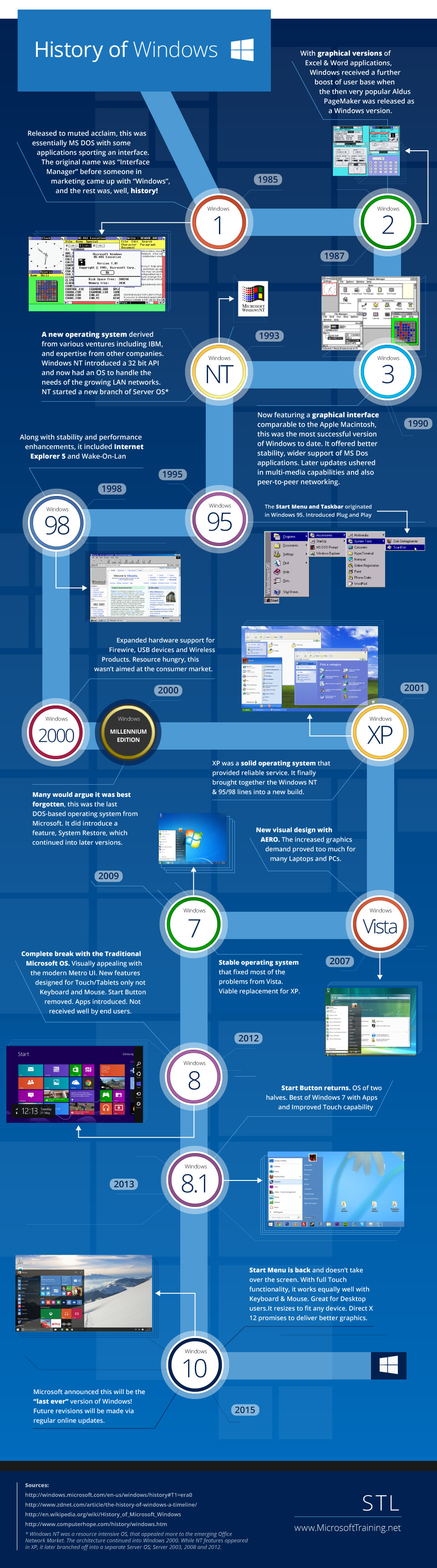
It seems like every creative field has a slew of new conferences popping up every year. These are becoming more popular as both patrons and organizers are gaining valuable experience and meeting new people. Naturally the best way to organize a gathering is over the Internet so conference websites are rising in popularity.
But how exactly should you design a new conference website? This post will cover a few tips and common design trends for events & conferences. Although each conference may cover a different subject, they all have common needs that should be expressed on a website. Follow along with this guide and you’ll walk away holding some valuable design techniques.
Grab your Visitor’s Attention
Think about a conference’s website like a broadened landing page. You want to capture attention and ultimately drive up ticket sales – but this can only happen by first capturing interest. You need to grab attention by showcasing everything that the event has to offer.
ConvergeSE is a popular conference and the 2015 website looks incredible. It uses large oversized page elements to bring focus onto certain bits of content. Visitors are drawn to the vibrant colors and heavy contrast found all over the site.
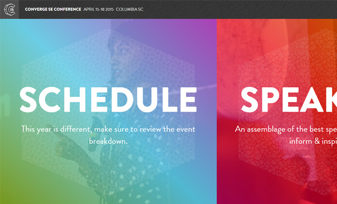
At the very top of the page you’ll find two boxes labeled “schedule” and “speakers”. Both of these links are important to returning visitors and first-timers because everyone wants to know what’s planned for the event.
Other links lead to further details & the signup form, but these top boxes are clearly the most important.
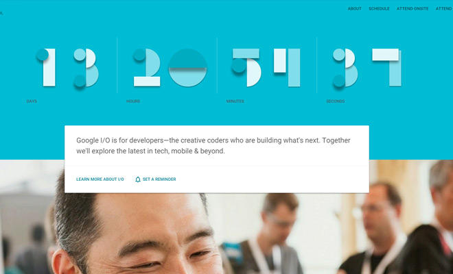
Opposite the oversized design technique is Google’s I/O 2015 event page. Their layout is also rather vibrant yet also seems more professional. Links are tucked away and content is more orderly. Overall the layout seems more generalized by giving equal attention to all pages and conference details.
It doesn’t matter how you structure information as long as you give visitors what they want. Design a header that really captures attention and follow your intuition from there.
Emphasize Special Guests
Conference workshops, talks, and keynotes are all delivered by honorary guests. Professionals in a certain field are usually invited to speak or give small workshops on a particular skillset.
These guests are a big reason why people choose to attend. Be sure to give plenty of information about these guests and explain their reason for appearing. Why should visitors pay to see these people talk or give demonstrations? What’s their experience and what type of information can they offer?
The homepage for DEVit Conf actually has a dedicated section for their speakers. After scrolling beyond the header you’ll find a list of speakers each festooned with a unique bio. Underneath this section is a list of events with times and further details.
Everything that visitors want to know about DEVit can be found right on the homepage.
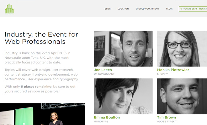
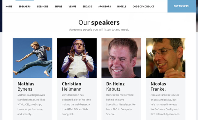
Industry Conf is a UK conference about web design/development and usability. The speakers are of utmost importance which is why they’re given prominent space on the homepage. Each speaker’s portrait photo links to the talk page which covers all of the talks and their content.
Decide how to portray the events and functions at a conference in a meaningful way. Get visitors excited to purchase their ticket by giving them stuff to be excited about.
Structured Typography
The important information listed on an event website is contextual. There’s no getting around the principle that typography defines how content is consumed.
When designing an event website pay careful attention to the size, placement, and style of your text. Particularly the relationship between headers and paragraphs. Visitors should be able to skim and still understand the content hierarchy dividing sections of content.
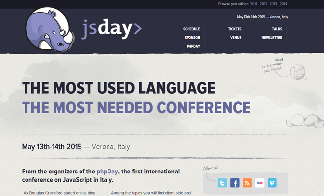
jsDay has a rather simple design which places more emphasis on typography. From the navigation to the footer it’s clear how content is organized. Text colors are crisp and easily recognizable against their backgrounds. If everything is easy to read then you’re doing your job.
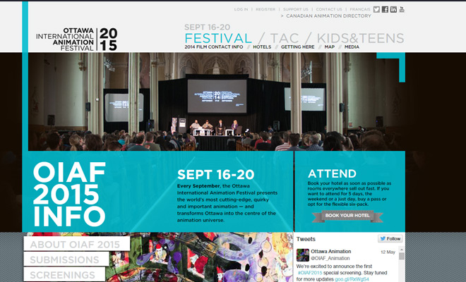
A more convoluted example of typography can be found on the Ottawa International Animation Festival webpage. Their layout focuses heavily on typography but uses contrast & size to differentiate between individual elements. The content isn’t “linear” but the hierarchy is still easy to comprehend.
Craft a Recognizable Logo
Cosmetic design tips often appear superficial, but the logo is a big piece to any composition. A good logo represents the conference branding. It may find useage far beyond the website like print work, flyers, or banners for the event.
![]()
![]()
Droidcon has a rather simple yet recognizable logo on their homepage. The colors work off Google’s Android logo and they tie together into the darker design. The Droidcon logo works because it uses color and text to convey the message.
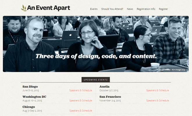
A different technique would be to incorporate a well-recognized logo into the design. For example An Event Apart uses a similar logo as A List Apart which is the magazine sponsoring the event. Notice how the Droidcon logo also worked with Google Android’s color scheme, a well-recognized logo by itself.
Tie your logo concept into something recognizable. Even if the design is simple it should still stand out to a majority of visitors. This builds brand recognition which is vital if the event becomes annual.
Make Signup Easy & Fun
The purpose of driving visitors onto a conference website is mostly to encourage registration. Encouragement can be given with schedules and fascinating keynotes, but the final goal is to sell out.
Make the signup process as simple and straightforward as possible. Visitors should know exactly where to go to reach the signup page. The form itself should be quick and only require essential information. Don’t scare people away with long-winded signup forms or requests for excessive personal information.
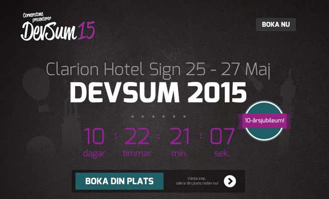
In the header of DevSum15’s homepage you’ll find a dark signup button with a large arrow icon. It seems to blend into the background and may be confusing for people who don’t speak Swedish.
But this design is so clean that I could recognize the signup button without understanding a lick of Swede talk. When building any landing page strive to design a CTA button that can be recognized without understanding the language. This is a good design technique for hitting people emotionally rather than analytically.

UX Burlington is another conference website with a clear signup design. Their layout focuses on minimalism with very few graphics and a limited color palette. Distraction-free pages tend to force visitors to gravitate towards whatever stands out. But you certainly don’t need minimalism to achieve this effect.
Consider every surrounding element on your page and design the signup button so that it stands out. Of course this button should still blend into the overall layout, but it should also be conspicuous and clearly emphasize the registration process.
Put it all Together
Whether you’re designing a professional conference site or just designing for fun, these tips will help you see the design process more clearly and efficiently. Underneath the text and flashy styles you’ll find repeatable patterns that can fit any conference layout. Utilize these tips going forward and see if you can find any other terrific examples of modern conference web design.
Read More at Tips for Building Conference & Event Websites


No Comments