


Websites for desktop programs and mobile apps serve one primary function: to increase downloads. These websites can also include information regarding program support and updates, but primarily developers want to increase retention rate among users.
The sole purpose of a landing page is to drive visitors toward one particular interaction. When studying landing page design you tend to notice a lot of similarities between different products. This post will cover trends found in landing pages made for desktop software and mobile applications. Each of these trends can help designers organize strategies for their own future landing page design projects.
Program Feature Lists
There’s nothing more frustrating than a vague landing page. This goes double for some program that I’m expected to download without having any clue what it is or how it works.
Every application has a purpose which can be broken down into smaller features. For example, Photoshop has a seemingly endless collection of features that might entice new users. But even something as simple as CPUID has a lot of interesting features.
Since most visitors have a dangerously short attention span you need to be terse and succinct.
![]()
![]()
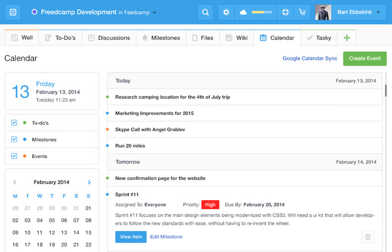
Feature lists are used to explain concepts with some sort of graphic/icon coupled with a brief description. The landing page for Archeeve shows how to be quick and direct with your style.
Each feature only includes a thin icon, title, and short 5-10 word description. The information doesn’t need to be structured into perfect sentences as long as it can still be understood.
![]()
![]()
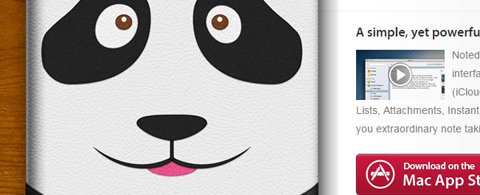
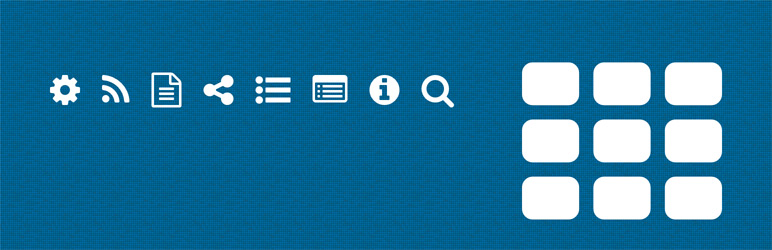
The OS X app Noted has a very similar structure. Each individual feature gets its own icon with a small block of text. The features are listed next to each other in 2 columns streaming down the page.
Keep in mind that many visitors won’t even read the descriptions but will skim the headers. Each feature should have a relatable icon and some heading text which sums up the direct value of this feature to the user.
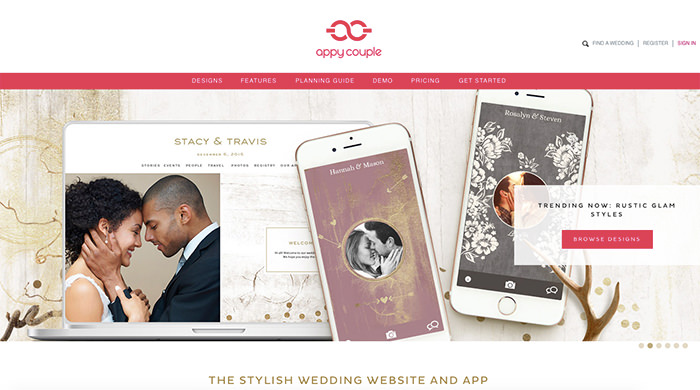
Relatable Color Scheme
Color and texture is the best way to capture attention and give life to a webpage. Visitors will be more inclined to stick around if you can offer some aesthetically pleasing color choices. Aim towards a specific theme that relates to the program and use icons/graphics in conjunction with this theme.
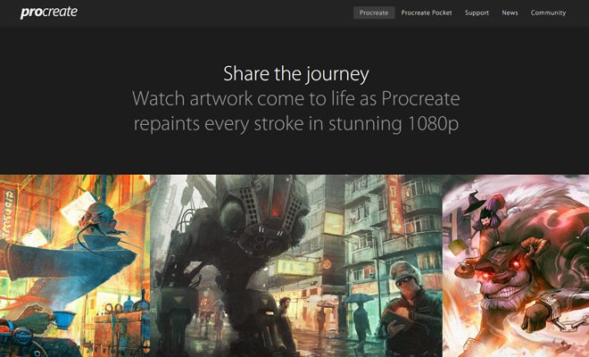
Procreate is a mobile app for iOS made for digital painting. Most of the landing page is black or dark gray which contrasts against photos and screenshots. The page doesn’t seem to have a significant style other than dark & artsy. In this scenario I feel that it works perfectly.

The OS X productivity app Alfred is well-known among Mac users. The Alfred landing page has always been exquisite and for good reason. Individual sections of the page are broken up through the use of alternating colors and patterns while placing focus on the content.
Remember that colors should be made to contrast where appropriate. Sometimes you need buttons or links to stand out from other elements on the page. The same can be said for whole content sections like the Alfred App footer.
While you should utilize color tastefully, be sure to avoid going too flashy with your style. Texture is always good and multiple colors will help to break up the page. Just be sure that you’re designing a style that fits best for the application and not just something you enjoy.
Application Screenshots
Landing pages featuring digital products need to place sole emphasis on the product. This can be done with features and graphics, but most notably with screenshots.
High-quality screens offer a direct view of the program in action. Great photos that showcase a variety of functions can be the tipping point for potential customers sitting on the fence.

Take a look at the homepage of Monodraw for OS X. It’s an ASCII editor made for Mac and the header features a big screenshot right underneath the download/buy buttons.
While scrolling down you’ll notice that different sections use sliding animations to display other screenshots. Each section covers a different feature while also demonstrating how it can work. Even someone who has no need for this application should still be able to appreciate the beauty of this landing page.

In the world of Windows let’s take a peek at the homepage for ShareX. This is a program for grabbing screenshots and clips of your desktop with special features, annotations, and post-production addons. The page itself is rather simple with some CTA buttons and a lone screenshot.
But at the top you’ll notice a navbar which includes a screenshots link. This opens a modal window featuring screenshots hosted on Imgur. There are dozens of screens in this one album covering all the major features and how they look in the program.
Use screenshots to add pragmatism into your layout. Give visitors a reason to trust the application and see how it can actually work in a real-world situation.
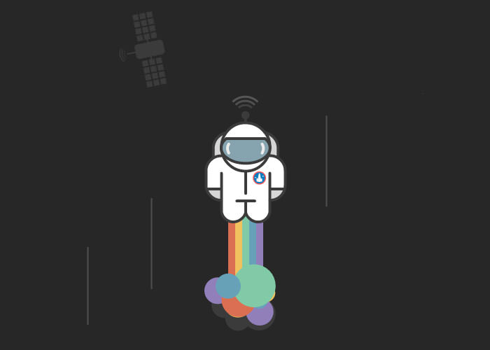
Eye-Catching Graphics
While graphics may not fit the theme of every landing page, they will certainly add the impression of quality & attention to detail. Graphics typically revolve around the app icon and related thematic items. The best graphics will tie into the overall design theme.
![]()
![]()
Sooshi for iOS has a remarkably stunning set of graphics for their landing page. Each graphic is designed to perfection with a stylized sense of realism. Each icon ties into further details about the app to explain features, functions, and general concepts.
If you’re not an amazingly talented graphic designer then don’t force anything into your project work. Top-tier graphics aren’t achieved overnight so keep practicing and try to match your favorite designers. Over time you might surprise yourself with a big leap in skill level.
Natural Call-to-Action
Without a doubt the call-to-action is the biggest piece of any landing page. For software and mobile apps the goal is to get visitors to download & install the program. Freeware has an easier time increasing downloads compared with paid applications, but the CTA design strategy remains identical.
Visitors should be offered the action immediately when landing on the page. This means you want to add the button/link somewhere in the page header within clear view. Stick with a color that stands out against the background to create high contrast and visibility.
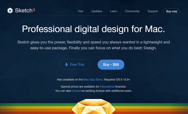
For example, Sketch uses two different button styles where the “buy” button is slightly more visible than the free trial button.
However visibility isn’t the only requirement because the process also needs to feel natural. Downloading and installing the program should be as easy as possible. Most visitors will enter the site with a suspicious attitude and it’s your job to disarm them and bring some trust into the situation.

When hovering over the Transmit download link you’ll be greeted with a small tooltip bubble. This popup contains information about the application’s size, release date, and latest version. You obviously don’t need to adopt this technique but extra information is a method of easing worries and concerns. As the Planeteers taught us: knowledge is power.
Call-to-action buttons have been featured in other articles with great detail. Your goal as a designer should be increasing visibility while exuding a sense of trust and incentive for action.
Start Designing
Feel free to explore creative landing page ideas and see what you can make. Imagination is powerful but you can find nifty ideas by working from references. These trends offer a peek into popular ideas that can be used to improve your landing page design workflow. Take what you like, discard the rest and be sure to add a touch of yourself into every project.
Read More at Landing Page Design Trends for Apps & Desktop Programs


No Comments