


This article is supposed to be your ultimate PSD to HTML learning resource. We have more than 5 unique text and video coding tutorials in this article as well as additional 30 3rd-party PSD to HTML conversion tutorials. You will learn how to create HTML websites and convert your Photoshop designs in no time!
At the end of article, we also included more tutorial sites you can use to deepen your coding knowledge.
We have lots of different coding tutorials here, but let me start with the most complete video tutorial series, that will teach you how to design a website in Photoshop. Then you will learn how to convert this Photoshop design into HTML.
And finally after we are done with HTML coding part, we’ll teach you how to convert into working Twitter Bootstrap website! As you can see everything you need is here.
Table of Contents:
- How To Convert PSD To HTML To Twitter Bootstrap
- How To Make a WordPress Website in 10 Minutes
- Create Agency Landing Page In Adobe Photoshop
- Learn How To Convert PSD Agency Landing Page to HTML
- 30+ Best PSD to HTML/CSS Conversion Tutorials
- Want to Learn Programming?
- Useful Additional Resources To Teach You How To Code
Note: If you don’t want to spend all the time learning how to do PSD to HTML conversion, check out a service PSD2HTML, which does it for you! Great if you are in rush, or if you are designer and don’t really enjoy working with HTML/CSS.
How To Convert PSD To HTML To Twitter Bootstrap Video Tutorial Series
Hello everyone, welcome to Basic Web Design Video Course, where you will learn how to code a website. In this course I will walk you through the very basic steps on what to do and what to learn before, and during, building a website.
You’ll learn all the steps including:
- planning
- wireframing
- using basic tools and panels in Photoshop
- basic HTML and CSS coding
- and after learning these we will apply our knowledge and code our very first website from scratch in Twitter Bootstrap.
Resources in this tutorial:
Wireframe: Download!
Finished PSD: Download!
- Part 1: Basic Web Design Video Course – Wireframing, Photoshop Tools & Panels, and Designing
- Part 2: Basic Web Design Video Course – Basic HTML Tags, Structure & CSS Properties
- Part 3: Basic Web Design Video Course – Complete HTML Markup & CSS Styles
For our valuable readers we will be pushing the basics here. So it’s your chance to learn and become a web designer for free. Are you excited? I hope that beginners can follow through and learn how to code a website, if anything is unclear just reach out to me in the comments section.
I will do my best to walk you through everything in these HTML tutorials slowly and clearly. So let’s get started!
Part 1: PSD to HTML Tutorial – Wireframing, Photoshop Tools & Panels, and Designing
Planning and Wireframing
What is a wireframe?
A wireframe is a visual presentation of how a website’s layout will look when it’s finished. It’s about structuring the overall layout without any graphics, placing the various elements where you believe they will look and work best. Wireframing is a great step to start before jumping on to Photoshop because it allows you to focus on the important components of the website without all the visual clutter of a finished design. Wireframing also saves you time when designing a website because wireframing acts as a sketch, and instead of having to do things more than once in Photoshop, you can just adjust your ‘sketch’ until you’re happy.
Your wireframe should include boxes that represents images, header, footer, sidebars, text blocks, navigation and other content aspects of your website.
You don’t have to worry about drawing them yourself, since there are many wireframing tools available on web.
Wireframing Tools:
Tools Used: Go Mocking Bird
Photoshop Basic Tools and Panels
Some beginners know the functions of specific tools, take the Ruler Tool(I) as an example. The problem is they don’t know how to look for the distance when they measure and how to turn the guides on and off. Especially those who are using earlier versions of Photoshop. Like this question in Quora What is the shortcut to display the distance between two guides in Photoshop? So in this part I will walk you through the basic Tools and Panels in Photoshop, talk about how important they are and how each tool will help you create your website design in Photoshop.
Designing In Photoshop
Now that we have the general idea for our website’s layout, it’s time to tone this up and make it more presentable in Photoshop. Let’s make this design as simple as possible.
In the next part we will be talking about the basics of HTML and CSS and with this knowledge we will convert our simple design into a working website.
So, that’s it for this part. I hope you learned something and found the videos helpful. If you have any suggestion regarding the videos or how I presented it please leave a comment below. I’m really excited to hear your thoughts in the comment section, see you guys down there.
Peace!
Part 2: PSD To HTML Tutorial – Basic HTML Tags, Structure & CSS
Howdy, this is the second part of our “How To Convert PSD To HTML Course”. This time we will talk about the tools needed before starting out with HTML and CSS, then we will learn the most commonly used HTML tags.
For this tutorial, we will only cover the tags that are very useful to beginners, we will cover more tags at a later time. Then, we will style the tags using basic CSS properties. No worries guys, in the next videos we will go more in-depth and learn together.
Download: PSD Template
Final Product of this HTML Tutorial

Preparation
Which Text Editor To Use For Coding?
Windows
Mac
HTML Basic Tags and Structure
We will talk about the most commonly used tags that you’ll see on a website. We will cover headings, paragraphs, links, images, list items and divisions. Also we will familiarize ourselves with the basic structure of HTML markup and how to open and close a tag.
Let’s code a website!
Basic CSS Properties
In this coding website tutorial video we will learn to style a certain element or tag using CSS properties by changing width, height, colors, floats, etc. Using these basic properties we can turn our HTML markup into a well presented website.
Now that we have finished positioning our layout structure we can now proceed to the next part, which is marking up the HTML of our very basic design template and completely style it using CSS.
So, that’s it for this part. I hope you learned something and found the videos helpful. If you have any suggestions regarding the videos, or how I presented them, please leave a comment below. I’m really excited to hear your thoughts in the comment section, see you guys down there.
Part 3: PSD To HTML Tutorial: How To Code a Website From Scratch
Hey guys, we’re really excited to release this resource for you. If you’re following my previous tutorials, I started with the basic one, which is boring for some of you and might be helpful for the beginners who just started learning.
In this web design video course, I will show you the processes involved on creating a landing page – from planning, searching for inspiration in the top design community, choosing fonts, colour scheme, wire framing and finally transferring the wire frame into Photoshop and rocking it out there. Once we have our PSD design ready, we will convert it into a working website using Twitter Bootstrap. We will be also covering how Bootstrap, scaffolding, base CSS, and JavaScripts work!
Get ready and let’s get started!
The Final Product
Resources you will need to complete this tutorial:
- Background Image
- Museo Font
- Pixel Pattern
- Time and Patience
The Designing Part
Finding Inspiration & Wire Framing
Let’s assume that we already know what is the goal of the website we’re going to make. The first step is to gather some inspiration that suits your taste for your website and start doing some rough sketches using your pen and paper.
The next thing you will need after finding inspiration is to create a wire frame based on your ideas.
Wireframe to Photoshop Tutorial
Basing on our wire frame, we will start transferring it into Photoshop to have a much clearer vision of what exactly the website layout will look like. What’s good about doing this is we can focus only in placing the elements like buttons, text headings, and paragraphs in the right position and the right size.
Applying Styles To Website
Here is the exciting part, and that is, applying styles to all of the elements, buttons, fonts and background. In here, we can play around with a lot of stuff, for example, applying filters to images, playing with curves, putting contrast, creating our own shadows to make the elements pop out more.
So that’s it, guys, for the designing part. It’s a matter of trying and playing to come up with a great outcome. Just remember to search for inspiration because designers of the 3 design communities I’ve mention are following the latest trends of web design. It’s not copying but learning from their works.
I think there is nothing wrong with that as long as we don’t copy their overall design. So if you’re planning to create yours, please take time to think and plan what’s best for you, gather some inspiration, create a wireframe, choose the right fonts and colour scheme for your brand and, lastly, rock the Photoshop until you have come up with great results.
Learn How To Go From PSD to HTML to CMS Using Twitter Bootstrap
In the first part of this coding tutorial, we are working mostly on the graphical part. We’ve also talked about where to find inspiration, colour schemes, grid and much more.
In this 2nd section of the Elegant Landing Page Design in Photoshop tutorial, we will be working on the coding part. In here, we will talk about how to use Twitter Bootstrap for transforming our PSD design into a working website.
I will divide this into 3 videos:
- first one will be about marking up the HTML;
- the second will be about applying CSS styles
- and the last one will be taking care of the responsive part. This will take much of your time but if you’re a beginner and willing to learn to transform your own Photoshop design into a working HTML website, I know you will find time to learn this. Let’s get started!
Resources you will need to complete this HTML tutorial:
HTML Markup
Here, I will walk you through on how easy it is to use Twitter Bootstrap by just linking the appropriate file path to make it work. Then I will guide you step-by-step on how to mark-up properly the HTML base on our design, starting from the header down to the footer.
Applying CSS Styles
Now that we’re done marking up our HTML, it is time to overwrite the styling that Twitter Bootstrap has provided. What’s good with this is we will not be worrying anymore on the layout structure because Bootstrap already has done it for us by just adding the right classes for each division that we’ve markup in HTML. All we need to do now is to style the elements to match to our PSD design.
Responsive Part
Alright, you’ve done a lot. Have a break; get some cup of coffee. Done? Finally, we reach the last part of this tutorial, which is to make every section responsive. And also, we will make the banner and testimonial section working as a carousel.
Conclusion
That’s it guys! Imagine how easy and powerful Bootstrap is by the pre-made classes provided for us to use. All we need to do is to properly adjust some padding and margins to make everything look good and balanced.
You’ve done a great job, guys! You just completed the tutorial. I hope you can apply this in your future projects. I wish you learn something from this. Make sure to share it with your friends. If you have comments or suggestions, feel free to drop them below. I’m excited to hear from you. See you guys on the comment section. Cheers!
How To Make a WordPress Website in 10 Minutes
This is another quick video showing how to quickly make your website live in less than 10 minutes. We’ll show how easy it is..and we are using the easiest starting option, hosting from Bluehost. Use this link to get 50% discount to your hosting plan.
Code a Responsive Website Using HTML5 and CSS3
Now if you were looking for video HTML tutorial and are ready to build responsive web design with HTML5 and CSS3 – you are in the right place. Just download source files, view demo and click play on the video – let’s make a responsive HTML website!
Looking for quick coding tutorial? – How to Make Website Responsive In About 15 Minutes
Build Flat Responsive WordPress Website From Scratch (High Quality Course)
If you are looking to take your web design career to whole new level in 2015 – we created The Ultimate 2015 Web Design Learning Course, where in 9 hours we will teach you how to Build Your Own WordPress Site – 100% Responsive & Flat –
You will learn how to build website from scratch in Photoshop, then convert PSD to HTML and CSS. Finally using Bootstrap magic, we will convert website to fully responsive and functional WordPress website.
Yes, you will learn how to make website responsive, but this time you will be building high quality website design you can be really proud of!
We throw in some business lessons, interviews and many bonuses to amplify your learning and help you get some clients as well! Watch the video to see exactly what’s inside.
What you are waiting for? Take your skills to the next level right now.
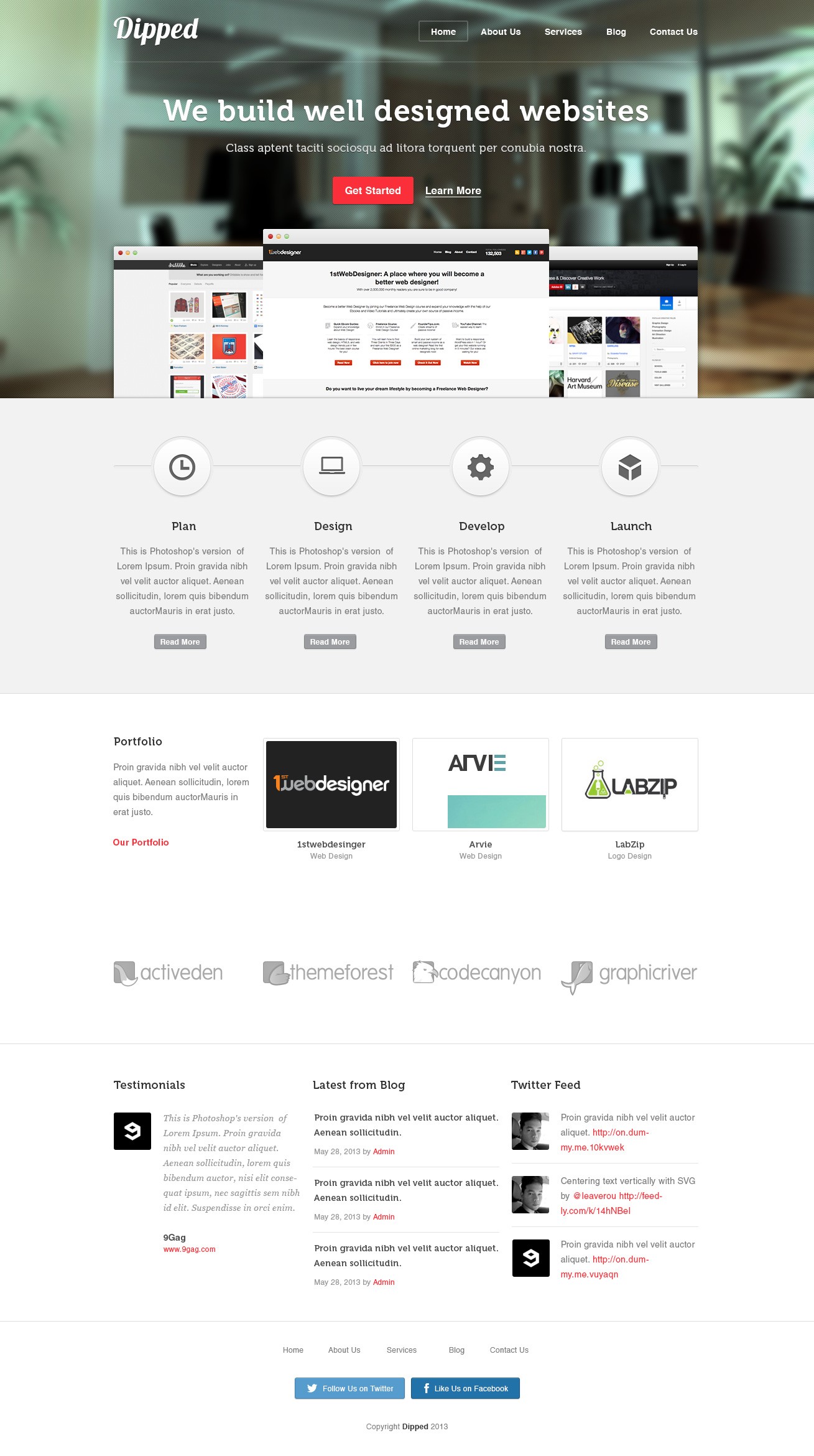
Bonus Tutorial: Create Agency Landing Page In Adobe Photoshop
Hey Guys! Were you ever asked to design a Design Agency website and you’d run out of ideas? Well, this tutorial is just for you. I will show you how to create a stylish looking landing page using Adobe Photoshop. Don’t worry, this design will not take too long and don’t be afraid of doing this if you are a beginner I promise to guide you all the way through. So what are we waiting for? Let’s get started!
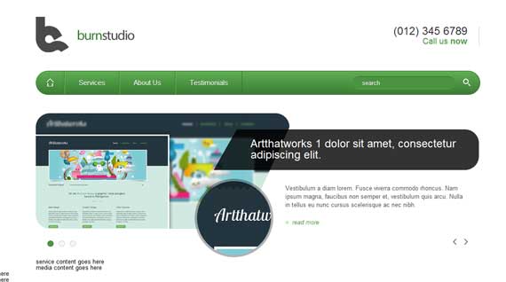
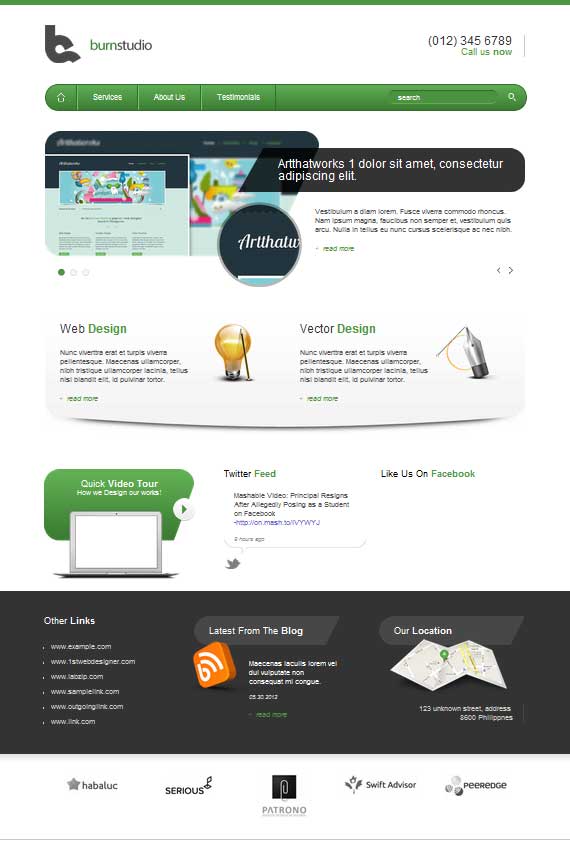
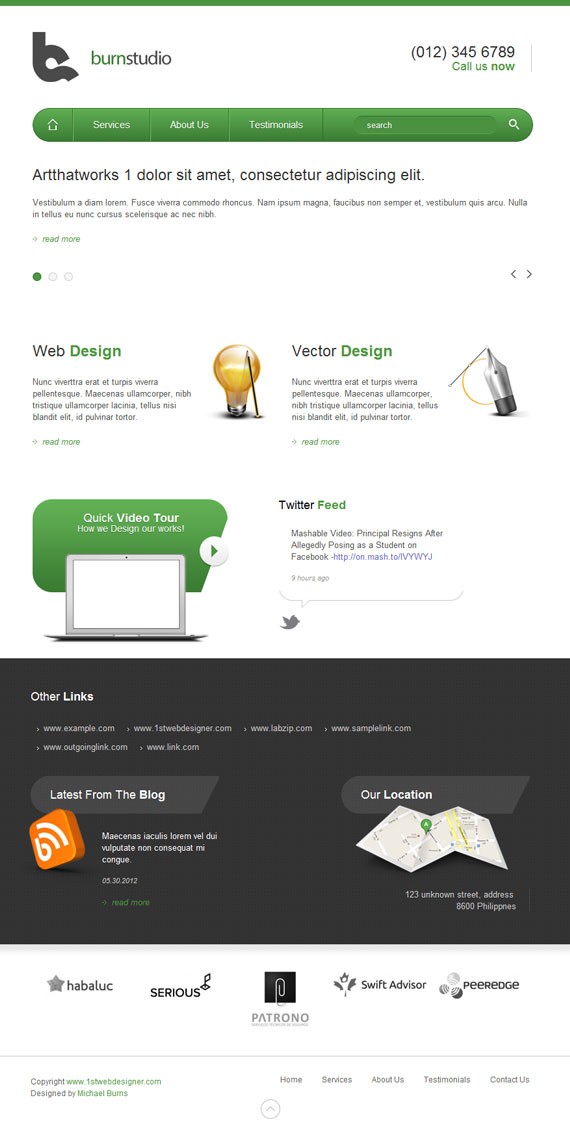
Here is what we will be making, click on the image for full preview:

PSD Download
Are you ready to learn how to code a website? Let’s get started then!
Resources for this tutorial
- Home
- Search
- Map
- RSS
- Macbook Air
- Web Design
- Vector Design
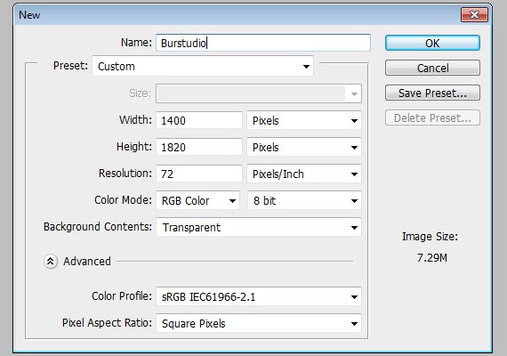
Step 1: Setting up the Document
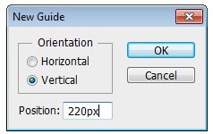
Start by creating a 1400px x 1820px document in Photoshop.
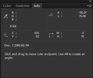
Ruler Tool is very useful for this tutorial make sure that rulers and guides is turned on.
- Rulers: Ctrl + R
- Guides: Ctrl + ;
Also one thing important in using Ruler Tool is the Info(Information) Panel. The use of this is when you are measuring using the ruler, the information will be shown in the information panel. Make sure that this is shown in your panels to the right. If it is not shown you can access this by going to Windows – Info.
The total width of this site will be 960px. So, let’s create our first guide by going to View – New Guide, set the value to 220px. Create another guide but now change the value to 1180px, this will make a total of 960px in the center of our canvas.
Step 2: Working on Header
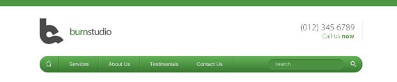
Our header will contain a logo, call to action, navigation, search.
Step 2.1
Using Rectangle Tool(U) with a fill color of #4d9543, create a 100px by 10px shape and place it on the very top of the canvas.
Step 2.2
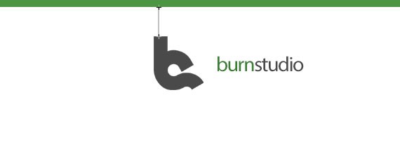
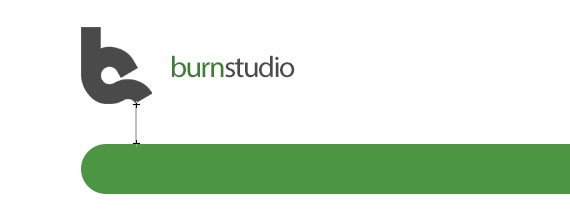
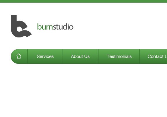
This is a personal logo that I’ll be using in this tutorial. For the Burnstudio text I used Myriad Pro 30pt, color #4d9543 and #4a4a4a. Feel free to create your own brand name using these font settings. Once you have finished it, place the logo 40px below the green shape.
Step 2.3
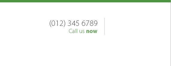
On the other side let’s add the call to action. The font I used for this is Kozuka Gothic Pro, 24pt. If you don’t have this font try to use Helvetica Thin/Light. Color will be #333333 and #4d9543. Now, add your number and Call us now text using Text Tool(T). I also added a 1px #c8c8c8 solid line 20px from the right side of the text. You want to align it with the logo.
Step 2.4
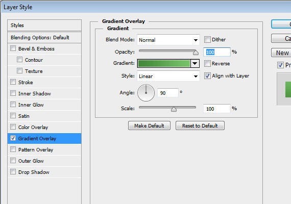
Next we’ll create the navigation. Select Rounded Rectangle Tool(U) and set the Radius to 30px. Now, create a 960px by 50px shape with a fill color of #4d9543. Place it 40px below the logo.
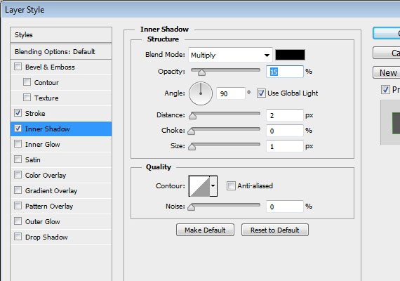
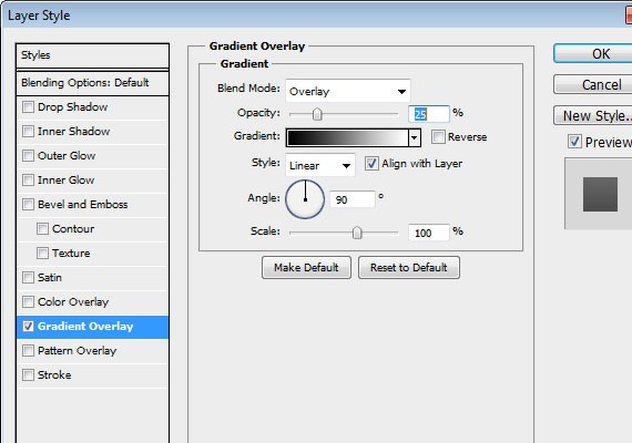
Step 2.5
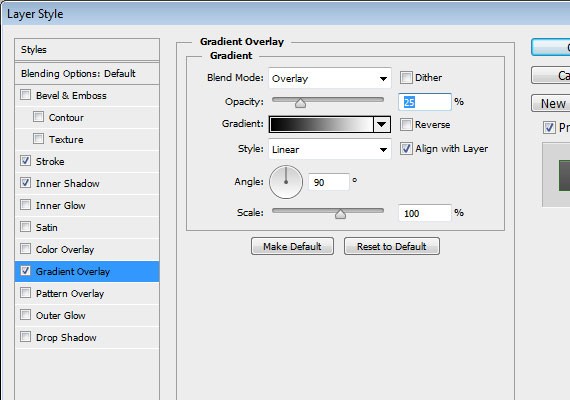
Apply these Blending Options
- Stroke
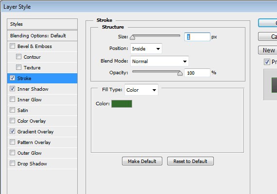
- Inner Shadow
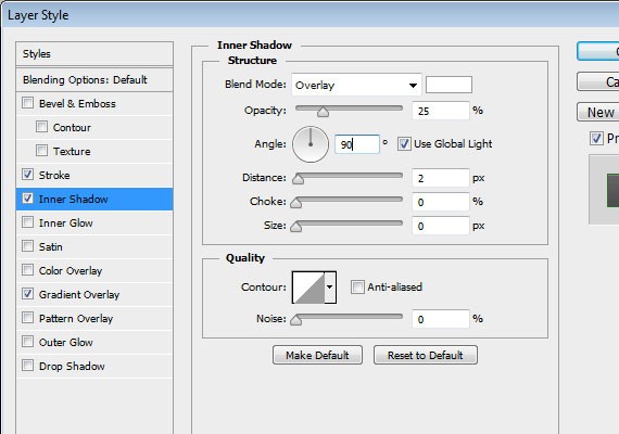
- Gradient Overlay
Step 2.6
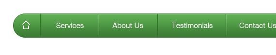
First you will need to add the home icon, followed by the links. The font I used is Helvetica Light, 15pt. Using Text Tool(T) add the following links. Note that each link has a 30px distance from the divider, so measure it using Ruler Tool(I).
Step 2.7
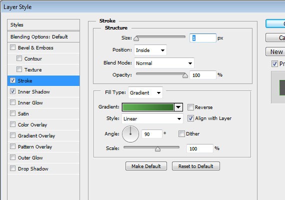
Duplicate the divider and move it 1px from the right and apply this Blending Option.
- Stroke
Result
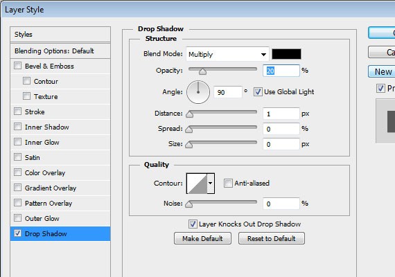
Step 2.8
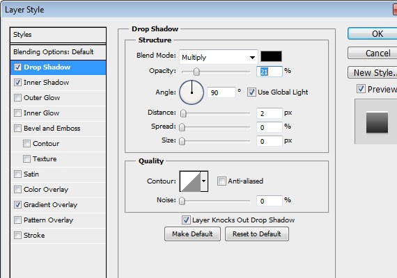
To create the search bar, create a 225px by 30px shape using Rounded Rectangle Tool(U) with a fill color of #4b9241, place it 55px to the left. Add the (search) text using Text Tool(T), font is Helvetica 14pt. Then, place the Search Icon 20px to the left.

Step 2.9
Apply this Blending Option to the search bar
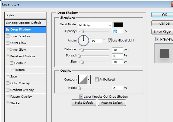
- Stroke
- Drop Shadow
Last step in this part is to add Drop Shadow on the icons and text to make it more crisp.
Step 3: Working on Slider
Step 3.1
The slider part will be 300px high and 40px below the navigation, so go ahead and measure it with Ruler Tool(I).
Step 3.2
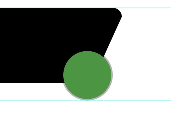
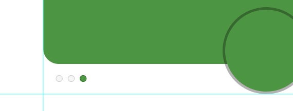
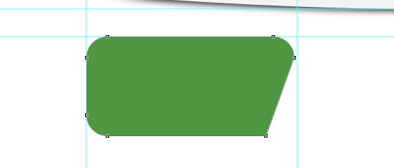
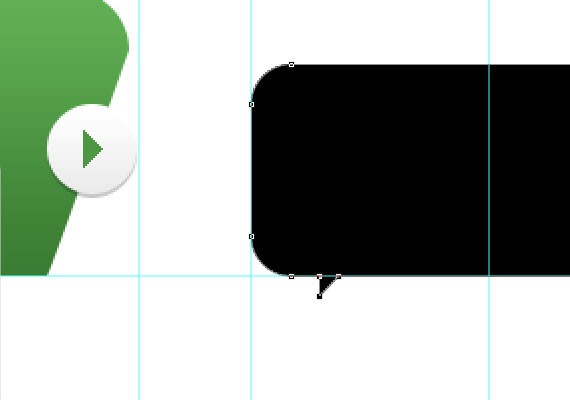
Once you’ve done it. Select Rounded Rectangle Tool(U) and create the same shape as shown in the screenshot below. All you need to do is first create a 550px by 250px shape and customize the bottom right corner the same in the screenshot below using Direction Tool(A).
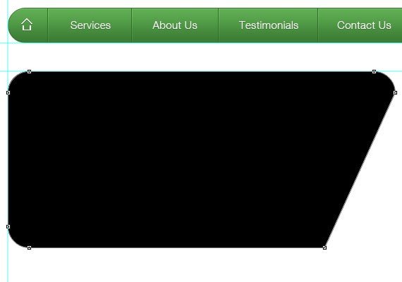
Step 3.3
Next using Ellipse Tool(U) create a 160px by 160px shape. Fill color for this one doesn’t matter because we’ll be masking an image above it later. Place this shape at the center of the bottom right corner.
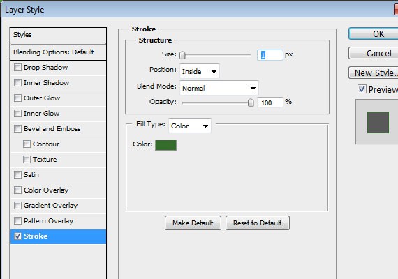
Apply these Blending Options
- Stroke
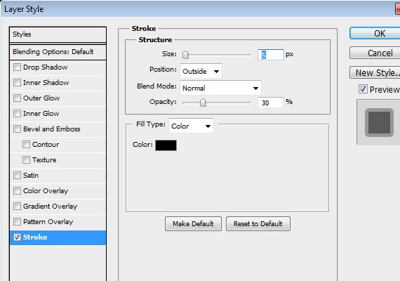
Result
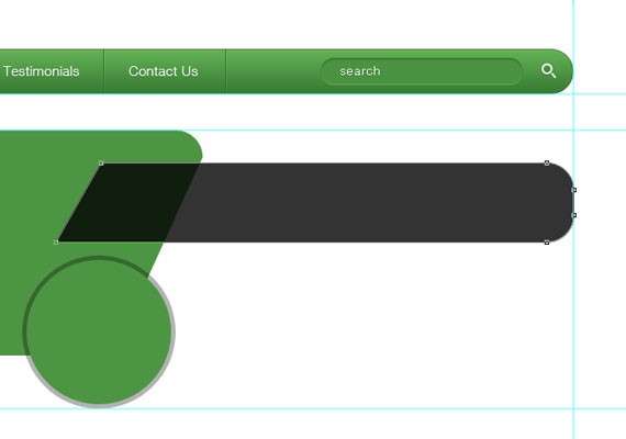
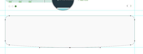
Step 3.4
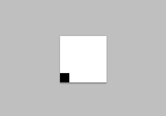
Create another shape using the same tool. Make sure the fill color is #000000 and change the opacity to 80%. For the purpose of the presentation I made it a green so that you can see how the shape will look. The shape size is 575px by 88px.
Step 3.5
Next we will be adding the slider controls. Using Ellipse Tool(U) create a 3 13px by 13px shape. the normal state color will be #f5f5f5 and for the active is #4e9643. Place it as shown in the screen shot below.
Apply this Blending Option
- Stroke (Normal)
- Stroke (Active)
Result
Step 3.6
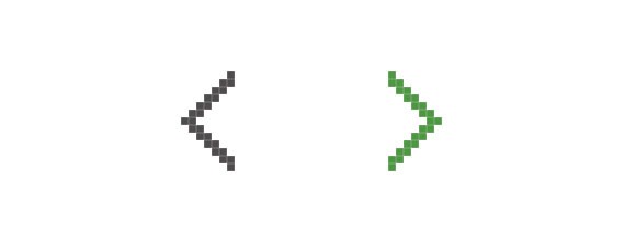
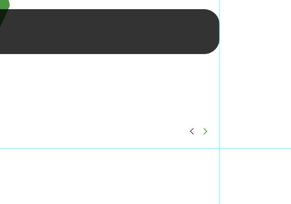
Next is the previous and next button. I created this using Pencil Tool(B). Normal state color will be #4f4c4d and for the Active the same green color. Place this as shown in the screenshot below.
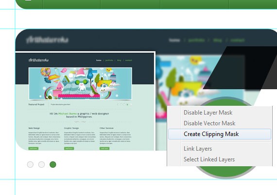
Step 3.7
Now that we have all the shapes together let’s fill it with text and add an image. All you need to do is create a new layer above the shape and place your image there, then Right Click and click Create Clipping Mask. Do the same on the ellipse shape. I will leave it up to you what image you use.
Step 3.8
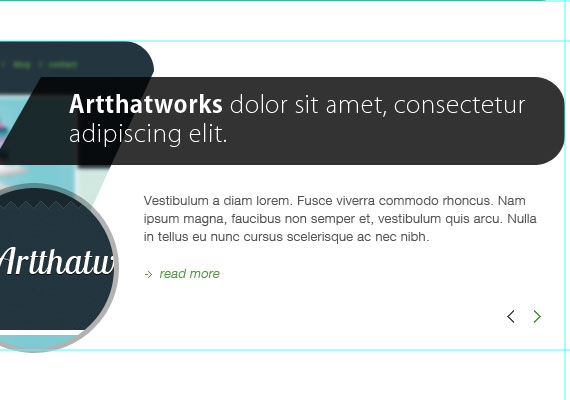
Next let’s add the text. For the heading title I used the same font as the call to action part, then for the paragraph I use Helvetica 13pt, #555555 and for the read more I made it Italic and used the same color green and added an arrow using Pencil Tool(B) beside it. And that’s it for this slider part.
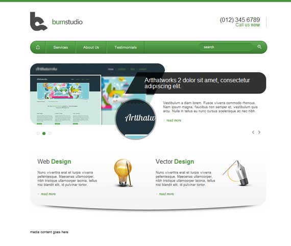
Step 4: Working on Services Area
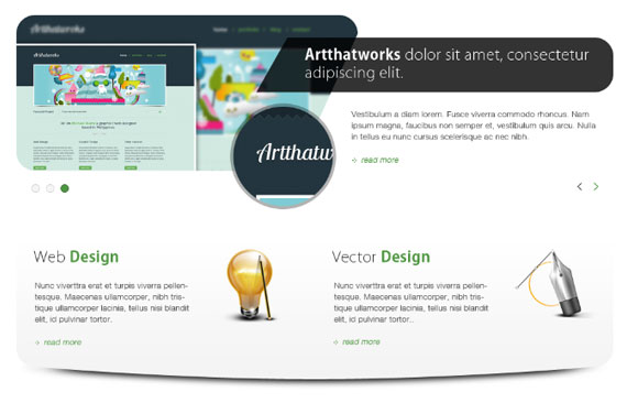
Step 4.1
The service area will be 240px high and 40px below the slider, so go ahead and measure it with Ruler Tool(I).
Step 4.2
Using Rounded Rectangle Tool(U) with a fill color of #f9f9f9 create a shape as shown in the screen shot below.
Apply the following Blending Option
- Gradient Overlay

Step 4.3
We will be dividing the shape into two so that we can align our service blocks properly. 960/2 is 480px, so go ahead and measure it with the Ruler Tool(I). Add the following text and Icons as shown in the screen shot below. Note that text sizes and color are all the same so feel free to copy some elements as we did previously. Also the distance from the shape left and above is 30px.
- Web Design
- Vector Design
Step 4.4
Adding the shadow to the bottom part is very simple. All you need to do is duplicate the base shape and make the fill color #000000, place it below the original shape layer. Next, Go to Filter – Blur – Gaussian Blur to 7.0, create a mask on the layer and brush over the part that we don’t nee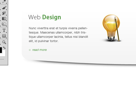
Step 5: Working on Media Section
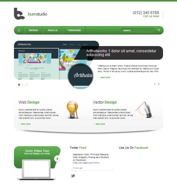
This part will be divided into 3 sections Video, Twitter & Facebook.
Step 5.1
We will work first on the Video section. The video will take up 305px by 220px and the same distance from above. Go ahead and measure it with Ruler Tool(I).
Step 5.2
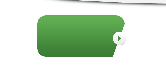
Using Rounded Rectangle Tool(U) create a 300px by 145px shape as shown in the screen shot below with the same green color.
Apply this Blending Option
- Gradient Overlay
Step 5.3
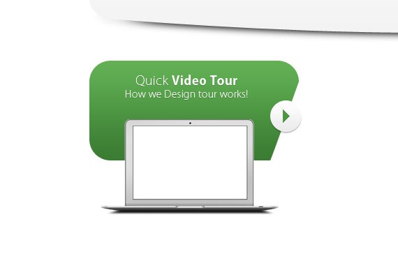
Next let’s create a play button. Using Ellipse Tool(U) create a 45px by 45px shape with a fill color of #f5f5f5.
Apply the following Blending Options
- Drop Shadow
- Inner Shadow
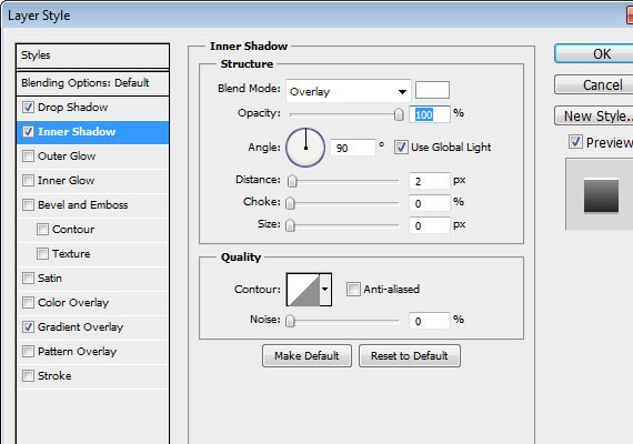
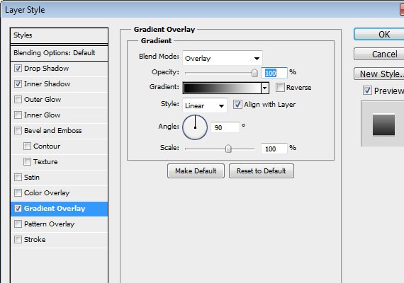
- Gradient Overlay
I also added a play icon I created using the Pencil Tool(B) with the same green color.
Step 5.4
Add some text with the same font, the size will be 18pt and 14pt. Lastly add the macbook air icon and place it as shown in the screen shot below.
Step 5.5
Now let’s design the Twitter feed. Select Rounded Rectangle Tool(U) change the Radius now to 20px. Create a 105px shape of width, the height will not matter. Now customize the shape by using Pen Tool(P) and Direct Selection Tool(A) and make a shape as shown in the screen shot below.
Step 5.6
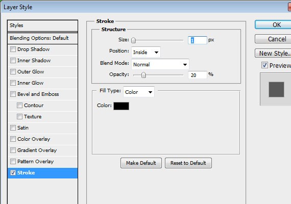
On the layers panel make the shape fill color to 0% and apply an inside stroke 1px solid #c8c8c8.
Step 5.7
Now let’s add text and the Twitter icon. Place it as shown in the screenshot below. Heading font size is 18pt, paragraph 13pt and for the link color and the hours color is #6767c9, #999999.
Step 5.8
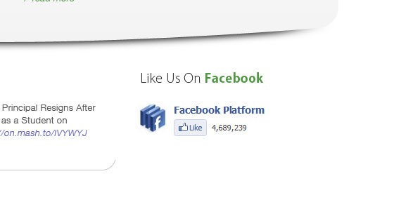
For the Facebook widget there’s nothing special I just took a screen shot in the widget page.
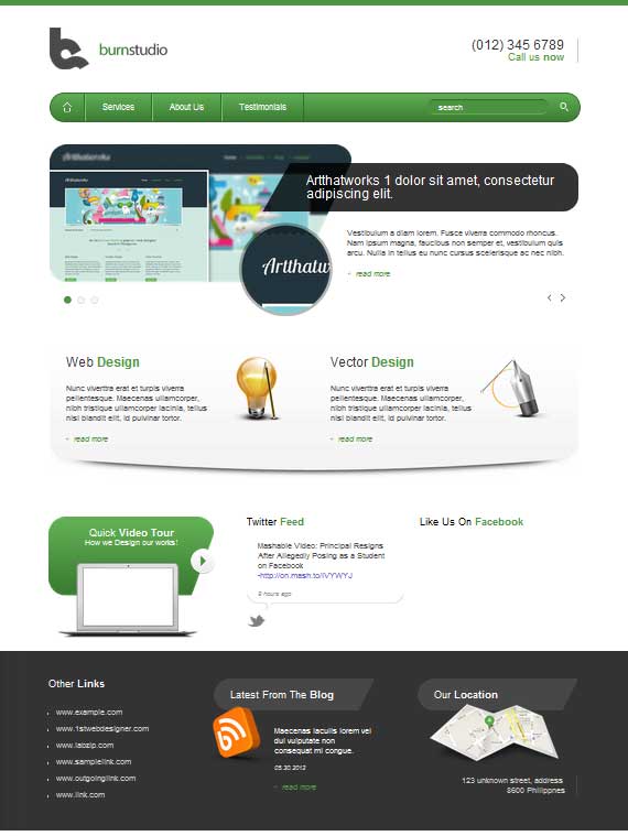
Step 6: Working on Links, Blog, Location Section
Step 6.1
The footer will be 100px by 320px and 50px distance from top, so go ahead and measure it with Ruler Tool(I). Then, Fill the whole space using Rectangle Tool(U) with a fill color of #333333.
Apply this Blending Option
- Drop Shadow
Step 6.2
Let’s create a dotted pattern to apply in the shape. Create a new 5px by 5px transparent document and create a dot on the bottom left part of the canvas as shown in the screen shot below. Go to Edit – Define Pattern and apply this to the shape with a 30% Opacity.
Result
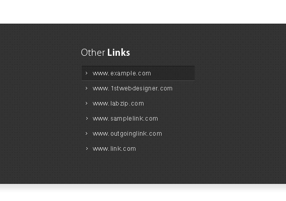
Step 6.3
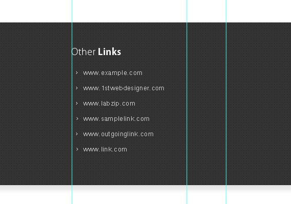
Now let’s work on the links section, the total width for this will be 225px. I used the same font style and size, the links have a distance of 25px from each other. The distance of the heading from the top is 50px and 30px below. Also, I create an arrow shape using Pencil Tool(U) and add it beside the links.
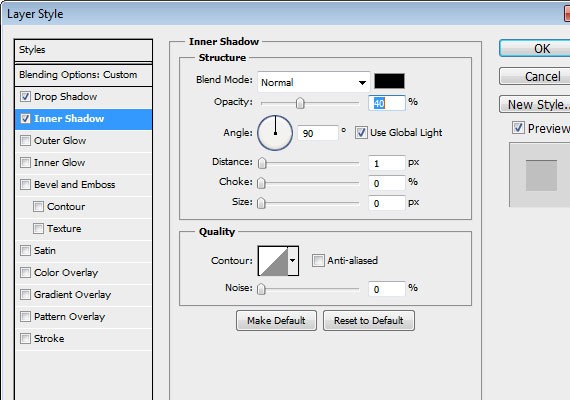
Step 6.4
Create a 225px by 29px shape with a fill color of #000000, lower down the fill color to 20%. Place it as shown in the screen shot below.
Apply this Blending Option
- Drop Shadow
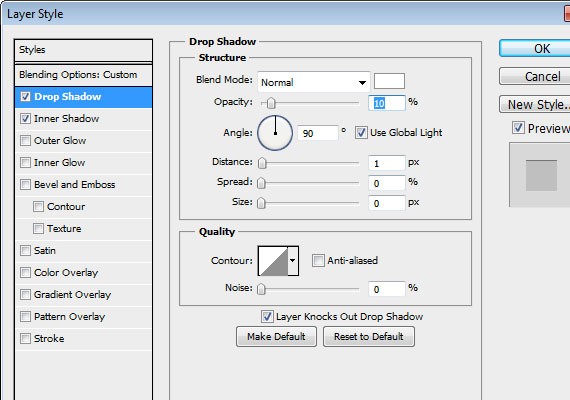
- Inner Shadow
Step 6.5
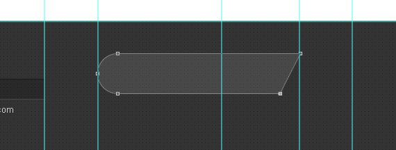
Now let’s proceed to blog section. Using Rounded Rectangle Tool(U) create a 292px by 58px shape as shown in the screenshot below. Fill color will be #ffffff and lower down the opacity to 10%. Distance from the links section is 77px.
Step 6.6
Add the icon and fill it with text using Text Tool(T). For the date color #cccccc and for the link is #ffffff.
Step 6.7
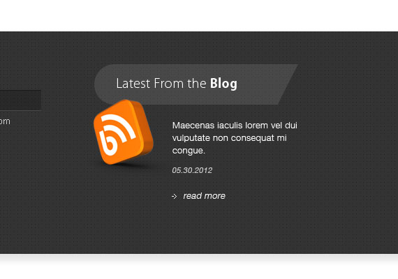
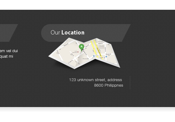
For the location just duplicate the heading and change the text to (Our Location). Add the map Icon. I already customized the map to show where is my exact location so feel free to customize yours. For the text color will be #cccccc and for the line #484848.
Step 7: Working on Footer
Well, this part is very simple just take some sample Icons and desaturate it by going to Image – Adjustment – Desaturate or by pressing Ctrl + Shift + U. This section will take up 145px of height so, place the icons accordingly and make sure it is centered. Last thing is to add a 1px #c8c8c8 below and we’re done.
Step 7.1
Text size 12pt, paragraph color #666666, distance from top 30px, distance from text 15px.
Step 7.2
Text size 12pt, link color #666666, 2px #c8c8c8 bottom line border.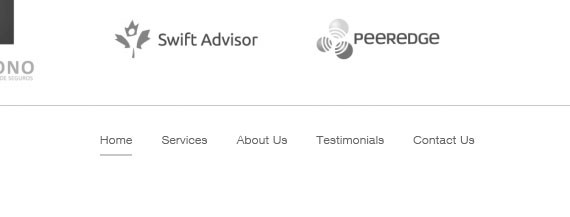
Step 7.3
For the back to top button. I create it using Ellipse Tool(U), 30px by 30px shape. I apply 1px #bdbdbd inside stroke and crate an arrow facing top using Pencil Tool(B).
We’re done with Photoshop part, now onto creating this PSD into working HTML website!
Learn How To Convert PSD Agency Landing Page to HTML Website
Howdy, folks! In this PSD to HTML tutorial you will learn how to code the agency landing into HTML website . I’m not really into coding, more of a design person and this is my first coding tutorial. I will try my best to guide you through the whole thing. We will be coding this from scratch and by the end you will have an awesome and fully functional agency layout.
Are you ready? Let’s get started!

Resources You Will Need To Code This Website:
- PSD Download
- SlidesJS
- CSS Tools: Reset CSS
- Time and Patience 🙂
Step 1: Preparation for the PSD to HTML Tutorial
We all know that in converting PSD to HTML/CSS we will need to go back and forth in Photoshop (or other image editing tool) to measure the sizes, distance, and colours. So make sure you open up the PSD file in Adobe Photoshop.
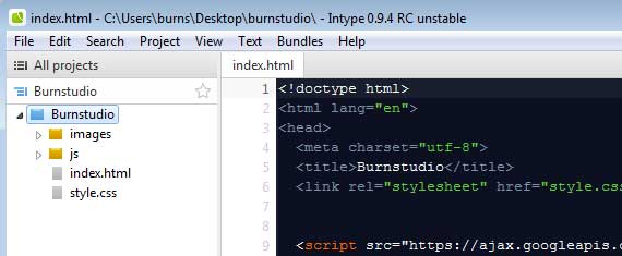
Of course you’ll need your favorite code editor and debugging tools. I used Intype as my text editor and for debugging tools I recommend Web Developer Toolbar and Firebug.
It is important to test our code using different browsers every step of the way so that we can keep on track of our code. I used CSS3 styles in this tutorial, which should work in Chrome and Firefox. For IE6 trust me, it still looks fine.
Step 2: Getting Files Ready
You will need to create a directory folder and inside of it you should have /images directory for images and /js directory for JavaScript. I placed the CSS file in the root folder including the HTML file.
Also we need to export the images to be used in the PSD file. For example the The Logo, you will need to select the layer from the layers panel, copy and paste it in a different document and CTRL + ALT + SHIFT + S in order to save for web and devices, the appropriate file type for the logo should be .png. But if you’re tired of doing this you can just download the files and use the images I already exported.
Step 3: Simple Starter Layout
To build our HTML layout we should first analyze our design by looking at the Photoshop layout and identify the sections that are unique.
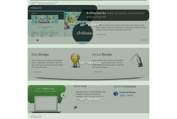
- Background: you notice that the background is white.
- Header: Notice that in this section the header has a green line on the top which covers the whole screen, so in order to do this we need to wrap the header with another container. The header contains logo, call to action, navigation and search.
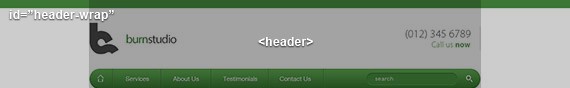
Pay attention to the naming of id or class in every screenshot I made, these will be the names we will use when we markup the HTML.
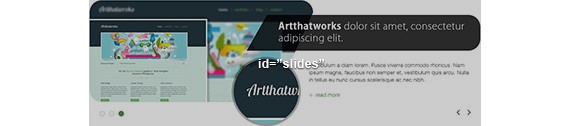
- Slides: for the slider we will be using SlideJS.
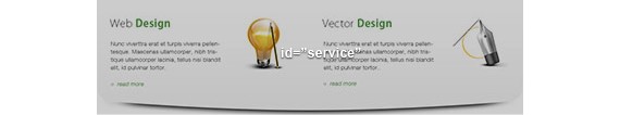
- Service: this section contains 2 columns for web design and vector design.
- Media: this section is divided into 3 columns for video, Twitter, and Facebook.

- Notice the above section slides, services, and media are positioned in the center, so we will wrap them with a div and name it container.
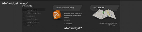
- Widget: this section is divided into 3 columns for links, blog, and location. Also you will notice it is covered with a gray dotted pattern that covers the whole screen.
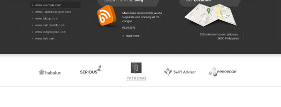
- Client: In this section you will notice there is a solid gray border on the bottom that covers the entire screen and a list of clients logo.

- Footer: Finally, the footer which contain 2 columns for copyright, footer links, and back to top arrow.
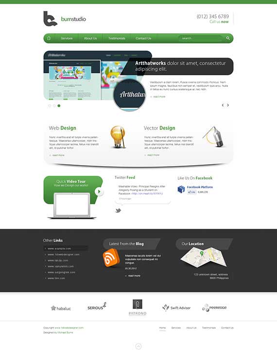
Here is the image of the overall markup that we have done.
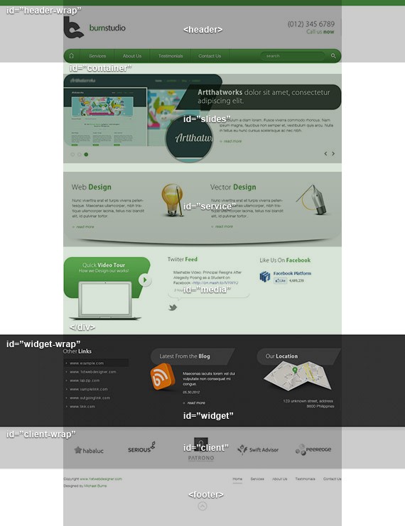
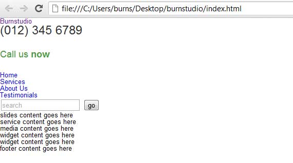
Now, Based on these notes we create the following HTML layout.
<!doctype HTML>
	<html lang="en">
	<head>
	  <meta charset="utf-8">
	  <title>Burnstudio</title>
	  <link rel="stylesheet" href="style.css">
	</head>
<body>
<div id="header-wrap">
<header>
header content goes here
</header>
</div>
<!-- end header wrap -->
<div id="container">
<div id="slides">
slides content goes here
</div>
<!-- end slides -->
<div id="service">
service content goes here
</div>
<!-- end service-->
<div id="media">
media content goes here
</div>
<!-- end media -->
</div>
<!--! end container -->
<div id="widget-wrap">
<div id="widget">
widget content goes here
</div>
<!-- end widget -->
</div>
<!--! end widget-wrap -->
<div id="client-wrap">
<div id="client">
widget content goes here
</div>
<!-- end client -->
</div>
<!--! end client-wrap -->
<footer>
footer content goes here
</footer>
</body>
</html>
Notice that the naming of the divs in every section is based on the naming we did earlier when we analyzed the PSD layout. Note that this layout is a fixed width of 960px. I know it would be better if we used a CSS framework for this project. But like I have said, we will do it from scratch.
Step 4: Working on Header Section
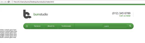
Now lets focus more on the header section we will mark up the HTML elements that can be found in this section.
<h1><a href="index.html" title="burnstudio">Burnstudio</a></h1>
<div id="call">
<h3>(012) 345 6789</h3>
<h4 class="green">Call us <strong>now</strong></h4>
</div>
<!-- end call -->
<nav class="group">
<ul>
<li class="home"><a href="#" title="">Home</a></li>
<li><a href="#" title="">Services</a></li>
<li><a href="#" title="">About Us</a></li>
<li><a href="#" title="">Testimonials</a></li>
<li class="last">
<div>
<input type="text" name="search" placeholder="search" />
<input type="submit" name="search" value="go" class="search"/>
</div>
</li>
</ul>
</nav>
In the above HTML I just followed what I saw in Photoshop. First is the Logo, since the logo is clickable I added <a> tag inside the h2. Followed by the the call number which is wrapped in a div with an id of call. Lastly I created a <ul> list which contain links and the search.
Now let’s add the CSS as follows:
All CSS should be added in the style.css file. Also, make sure you just copy the CSS reset which I provided in the resources and place it in style.css file.
body{
	background: #fff;
	font-family: Helvetica, Arial, sans-serif;
	font-size: 13px;
}
/* FONT STYLES*/
h3{
	font-size: 24px;
	font-family: Helvetica, Arial, sans-serif;
	color: #333333;
	margin-bottom: 25px;
}
h4{
	margin-bottom: 25px;
	font-size: 18px;
	font-family: Helvetica, Arial, sans-serif;
}
h5{
	font-size: 14px;
	font-family: Helvetica, Arial, sans-serif;
}
p{
	font-size: 13px;
	color: #555555;
	line-height: 18px;
}
a, a:link, a:visited{
	text-decoration: none;
	outline: none;
}
.green{
	color: #509743;
}
.white{
	color: #fff;
}
strong{
	font-weight: bold;
}
/* END FONTS STYLES */
In the above CSS, since we have reset styles we need to style our text formats. I know that we used a different font for our headings and I don’t think Google fonts support Kozuka Gothic. But for now we will replace it with Helvetica. Notice also I added the classes green and white, this will be used when we style green or white text that can be seen in the design.
When you test it you will have something that looks like the screenshot below.
/* HEADER */
#header-wrap{
	border-top: 10px solid #4d9543;
	padding-top: 40px;
}
header{
	width: 960px;
	margin: 0 auto;
	padding: 0;
}
header h2 a{
	display: block;
	text-indent: -999999px;
	background: url(images/logo.png) no-repeat;
	width: 214px;
	height: 77px;
	float: left;
	margin-bottom: 40px;
}
#call{
	float: right;
	border-right: 1px solid #c8c8c8;
	padding-right: 25px;
	margin-top: 20px;
}
#call h3{
	margin: 0;
}
#call h4{
	text-align: right;
	margin: 0;
}
nav{
	clear: both;
	width: 960px;
	height: 50px;
	-moz-border-radius: 30px;
	-webkit-border-radius: 30px;
	background-color: #3b7c33; /* Fallback */
	border-radius: 30px;
	/* Safari 4+, Chrome 1-9 */
	background-image: -webkit-gradient(linear, 0% 0%, 0% 100%, from(#5fae53), to(#3b7c33));
	/* Safari 5.1+, Mobile Safari, Chrome 10+ */
	background-image: -webkit-linear-gradient(top, #5fae53, #3b7c33);
	/* Firefox 3.6+ */
	background-image: -moz-linear-gradient(top, #5fae53, #3b7c33);
	/* IE 10+ */
	background-image: -ms-linear-gradient(top, #5fae53, #3b7c33);
	/* Opera 11.10+ */
	background-image: -o-linear-gradient(top, #5fae53, #3b7c33);
	border: 1px solid #336c2b;
}
nav ul li{
	float: left;
	border-right: 1px solid #336c2b;
	border-left: 1px solid #78c368;
}
nav ul li.home{
	border-left: none;
	text-indent: -9999px;
	background: url(images/home.png) no-repeat 50% 50%;
}
nav ul li.last{
	border-left: none;
	border-right: none;
	float: right;
	margin-right: 20px;
}
nav ul li a{
	display: block;
	padding: 0 30px;
	height: 50px;
	line-height: 50px;
	font-size: 15px;
	color: #fff;
	text-shadow: 0 1px 0 #387031;
}
nav ul li a:hover{
	background: #5fae53;
}
nav ul li.home a:hover{
	-webkit-border-top-left-radius: 30px;
	-webkit-border-bottom-left-radius: 30px;
	border-top-left-radius: 30px;
	border-bottom-left-radius: 30px;
	background: #5fae53 url(images/home.png) no-repeat 50% 50%;
}
nav ul li div input[type=text]{
	-webkit-border-radius: 20px;
	-moz-border-radius: 20px;
	background: #4b9241;
	border-left: none;
	border-right: none;
	border-bottom: 1px solid #5ead52;
	border-top: 1px solid #346d2c;
	color: #fff;
	text-shadow: 0 1px 0 #387031;
	padding: 5px 0 5px 20px;
	width: 200px;
}
nav ul li div input[type=text]:focus{
	outline: none;
}
/* TO STYLE PLACE HOLDER */
::-webkit-input-placeholder {
   color: #fff;
}
:-moz-placeholder {
   color: #fff;
}
nav ul li div input[type=submit]{
	background: url(images/search.png) no-repeat 50% 50%;
	border: none;
	text-indent: -999999px;
	margin-left: 15px;
	height: 50px;
	width: 16px;
}
/* END HEADER */
In the above CSS I styled header-wrap with a 10px green border, since a div by default is styled in a block display this will fill the whole width of the screen. Then I centered the header with margin: 0 auto. Next, I styled the Logo with a fixed width and height. I also floated it the left. For the Call I floated it right and apply a 1px gray border also a 25px padding from right. Note that to get this value you need to go back to Photoshop and use the Ruler Tool(I) to measure the distance. Since I styled the h3 and h4 with a 25px bottom margin in our base text format we need to reset it and change it to 0. This will make the h4 and h3 in the call section back to normal.
Next, I styled the navigation with a fixed width, height and a gradient, I applied a clear both to clear the above floating elements logo & call. All li are floated left except for the last li element, also it has a left and right border except for the the home there is no left border and for the last there is no right border. All a is styled 30px padding from left and right 0 for top and bottom, a height of 50, a text shadow, a line-height of 50 to make it center vertically. For the class home I pushed out the text and replace it with the home icon. Since the corner is rounded we need to specify another style hover for the home button that’s what I did below the a:hover.
Lastly, I styled the search input with a rounded radius, a green background, dark border on top and light border on bottom. Also to target placeholder attribute refer to the CSS which I comment to style place holder this is a part of css3 property.
Before previewing this to IE lower versions make sure to copy and paste the code below in the header section of our HTML file. This will enable HTML5 elements to work in older IE browsers.
<!--[if IE]>
	<script type="text/javascript">
	(function(){
	var html5elmeents = "address|article|aside|audio|canvas|command|datalist|details|dialog|figure|figcaption|footer|header|hgroup|keygen|mark|meter|menu|nav|progress|ruby|section|time|video".split('|');
	for(var i = 0; i < html5elmeents.length; i++){
	document.createElement(html5elmeents[i]);
	}
	}
	)();
	</script>
	<![endif]-->
Now our layout should look like this.
Step 5: Working on Slider Section
Now let’s add the content inside the slides element, here’s the HTML.
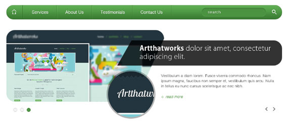
<div class="slides_container">
<div>
<img src="http://1stwdcdn-31d9.kxcdn.com/wp-content/uploads/2012/09/slide1.png" alt="slide1" />
<div class="slide-right">
<h1 class="slide-heading">Artthatworks 1 dolor sit amet, consectetur adipiscing elit.</h1>
Vestibulum a diam lorem. Fusce viverra commodo rhoncus. Nam ipsum magna, faucibus non semper et, vestibulum quis arcu. Nulla in tellus eu nunc cursus scelerisque ac nec nibh.
<a href="#" class="readmore">read more</a>
</div>
</div>
<div>
<img src="http://1stwdcdn-31d9.kxcdn.com/wp-content/uploads/2012/09/slide1.png" alt="slide1" />
<div class="slide-right">
<h1 class="slide-heading">Artthatworks 2 dolor sit amet, consectetur adipiscing elit.</h1>
Vestibulum a diam lorem. Fusce viverra commodo rhoncus. Nam ipsum magna, faucibus non semper et, vestibulum quis arcu. Nulla in tellus eu nunc cursus scelerisque ac nec nibh.
<a href="#" class="readmore">read more</a>
</div>
</div>
<div>
<img src="http://1stwdcdn-31d9.kxcdn.com/wp-content/uploads/2012/09/slide1.png" alt="slide1" />
<div class="slide-right">
<h1 class="slide-heading">Artthatworks 3 dolor sit amet, consectetur adipiscing elit.</h1>
Vestibulum a diam lorem. Fusce viverra commodo rhoncus. Nam ipsum magna, faucibus non semper et, vestibulum quis arcu. Nulla in tellus eu nunc cursus scelerisque ac nec nibh.
<a href="#" class="readmore">read more</a>
</div>
</div>
</div>
<!-- end slies container -->
In the above HTML markup I added a class slides_container this will hold our slides elements which is wrapped by a div that contains an image, a div class of slides-right that holds the slide title, info, and read more link. Also I added a class for the heading slide-heading, paragraph info and for the read more readmore. This will be helpful since we will repeat the HTML code 3 times and they will have the same styles if we add the CSS later.
Now let’s style all the element, here’s the CSS.
#container{
	width: 960px;
	margin: 0 auto;
}
/* SLIDES */
#slides{
	position: relative;
	margin-top: 40px;
}
.slides_container{
	height: 315px;
}
.slide-right{
	position: absolute;
	top: 0;
	left: 385px;
}
.slide-heading{
	background: url(images/slide-heading.png) no-repeat;
	width: 494px;
	height: 68px;
	color: #fff;
	font-size: 24px;
	padding-top: 20px;
	padding-left: 80px;
	margin-top: 35px;
	margin-bottom: 30px;
}
.slide-right .info{
	width: 395px;
	margin-bottom: 20px;
	margin-left: 155px;
}
.slide-right .readmore{
	margin-left: 155px;
}
.readmore{
	font-style: italic;
	text-decoration: none;
	color: #509743;
	padding-left: 15px;
	background: url(images/more.png) no-repeat 0 50%;
}
.readmore:hover{
	color: #c8c8c8;
}
.pagination{
	position: absolute;
	bottom: 25px;
	left: 25px;
	z-index: 99;
}
ul.pagination li{
	float: left;
	margin-right: 10px;
	background: url(images/pagination.png) no-repeat;
	background-position: top;
	width: 14px;
	height: 15px;
}
ul.pagination li.current{
	background-position: bottom;
}
ul.pagination li a{
	display: block;
	text-indent: -999999px;
}
a.next{
	position: absolute;
	right: 25px;
	bottom: 30px;
	display: block;
	width: 7px;
	height: 13px;
	background: transparent url(images/prev-next.png) no-repeat;
	background-position: top right;
	text-indent: -9999px;
}
a.prev{
	position: absolute;
	right: 50px;
	bottom: 30px;
	display: block;
	width: 7px;
	height: 13px;
	background: transparent url(images/prev-next.png) no-repeat;
	background-position: top left;
	text-indent: -9999px;
}
a.next:hover{
	background-position: bottom right;
}
a.prev:hover{
	background-position: bottom left;
}
/* END SLIDES*/
In the above CSS since slides, service and media are wrapped with the container div, we will style this first to make them centered. Next, slide’s position is set to relative to make it the parent element. This is helpful so that we can position the inside elements prev, next, and pagination absolutely which are auto-generated by the JavaScript. For the slides_container I gave it a fixed height of 315px which is equal to the height of the slider image. For the slide-right which contains the heading, info and read more, all positioned absolutely, 0 out top, and pushed it 385px from left.
For the slide-heading I gave it a fixed width and height equal to the background image, and gave it a padding to make the text align properly, also a margin to give a space and align it correctly. For .info I gave it a fixed width with margin to align it. For .readmore first I gave it a separate margin style since only the slider readmore has this and all of the readmore links in the layout has no margins from left. Then followed by the readmore styling which has a green color with background arrow and a gray hover.
For the pagination, prev, and next buttons this is auto-generated by the JavaScript in order to style this first we need to identify what is the tag or the applied html class attribute. To do this you need to used the Firebug tool if you’re using Firefox, if you’re using Chrome just right click to the element and click Inspect Element a dialog will appear and you can see there what element is being used.
Now that you know the element, we will target it in the CSS. For the Pagination I positioned it absolutely, placed it 25px from the bottom and left, also I applied z-index 99px – this will make the pagination right on the very top over the other elements. If werre not going to apply this notice that it is not clickable because the image is on top of the pagination itself. Then I floated the pagination li elements to left, gave it a right margin of 10px, added a background image with a fixed width and height.
I positioned the background by default to top since the normal state image is on top, for the current or the active state we will going to reverse the positioning from top to bottom and lastly display it as a block level element and hide the text. For the .next and .prev pretty much the same we did in pagination but this time it is positioned to the right. Noticed the prev-next.png on the left side this contains the image of prev button and on the right side this contains the image of the next button. I positioned the .next image to top right, .prev positioned to top-left, and for the hover just change the top to bottom.
Now let’s add the required jQuery script in the header. Copy the slides.min.jquery.js file from the /source directory and paste it in our /js directory.
 <script src="https://ajax.googleapis.com/ajax/libs/jquery/1.5.1/jquery.min.js"></script>
 <script src="js/slides.min.jquery.js"></script>
Finally, we need to add the JavaScript code that will allow the slider to work on our layout. You should add this script just before the . Here’s the JavaScript.
<script>
$(function(){$('#slides').slides({preload: true,generateNextPrev: true,});});
</script>
Now our layout should look like this.
Step 6: Working on Service Section
Now let’s add the content inside the service element, here’s the HTML.
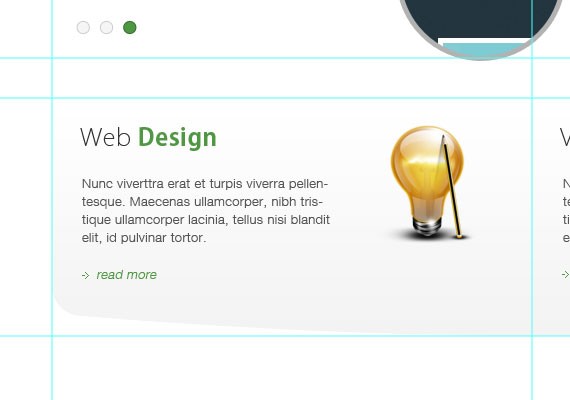
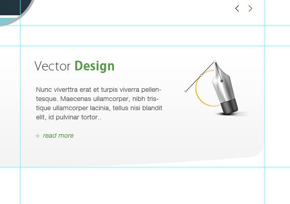
<div id="web">
<img src="images/web.png" />
<h3>Web <strong><span class="green">Design</span></strong></h3>
Nunc viverttra erat et turpis viverra pellentesque. Maecenas ullamcorper, nibh tristique ullamcorper lacinia, tellus nisi blandit elit, id pulvinar tortor.
<a href="#" class="readmore">read more</a>
</div>
<!-- end web -->
<div id="vector">
<img src="images/vector.png" />
<h3>Vector <strong><span class="green">Design</span></strong></h3>
Nunc viverttra erat et turpis viverra pellentesque. Maecenas ullamcorper, nibh tristique ullamcorper lacinia, tellus nisi blandit elit, id pulvinar tortor.
<a href="#" class="readmore">read more</a>
</div>
<!-- end vector -->
I created a unique div id web and vector which contains the same elements such as an image, headings, paragraphs and readmore link. In the heading you can see I added a span and applied a class of green since the heading is combined with different colour. For the read more link we apply the same class we did in the slider area.
Now let’s style all the element, here’s the CSS.
/* SERVICE */
#service{
	margin: 40px auto;
	height: 253px;
	padding-top: 30px;
	background: url(images/service-bg.jpg) no-repeat;
}
#web{
	float: left;
	width: 450px;
	padding-left: 30px;
}
#web p{
	width: 260px;
	margin-bottom: 20px;
}
#web img{
	float: right;
	margin-right: 50px;
}
#vector{
	float: right;
	padding-left: 30px;
	width: 450px;
}
#vector p{
	width: 260px;
	margin-bottom: 20px;
}
#vector img{
	float: right;
	margin-right: 50px;
}
/* END SERIVCE*/
I styled the service div 40px from above to bottom and added an auto left and right, I also added a height that is equal to the background image. For the web div I floated it to the left and gave it a 50% width of the parent div, the same with the vector div but floated to the right. For the paragraph I gave it a fixed width with a margin, for the image I floated it right and give it a right margin, pretty much the same on vector image and text.
Now our layout should look like this.
Step 7: Working on Media Section
Now let’s add the content inside the media element, here’s the HTML.
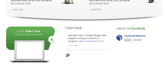
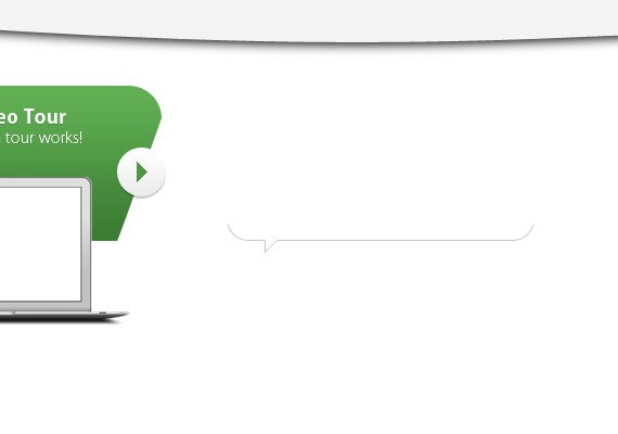
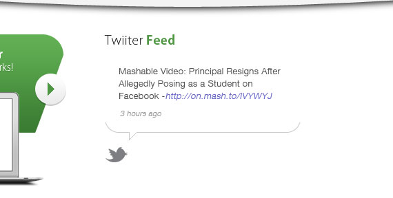
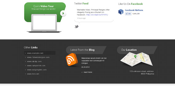
<div id="media" class="group">
<div id="video">
<h4>Quick<strong>Video Tour</strong></h4>
<h5>How we Design our works!</h5>
<a href="#" class="play"><img src="images/play.png" alt="play" /></a>
</div>
<div id="twitter">
<h4>Twitter <strong><span class="green">Feed</span></strong></h4>
Mashable Video: Principal Resigns After Allegedly Posing as a Student on Facebook -<a href="#" class="t-link">http://on.mash.to/IVYWYJ</a>
9 hours ago
</div>
<div id="facebook">
<h4>Like Us On <strong><span class="green">Facebook</span></strong></h4>
</div>
</div>
<!-- end media -->
I created 3 different sections: video div which contains text headings h4, h5 and a clickable image for play button, twitter div which contains a heading and a paragraph, lastly a facebook div which contains a heading and if you wish to add your widget you can add it by going to Facebook plugins. Also, I added a class group on the media div. I’ll show you what that does when we move on to the CSS.
Now let’s style all the elements, here’s the CSS.
/* MEDIA  */
#media{
	margin: 0 auto;
}
#video{
	width: 302px;
	padding-top: 20px;
	float: left;
	margin-right: 58px;
	background: transparent url(images/video-bg.png) no-repeat;
	height: 225px;
}
#video h4{
	margin: 0;
}
#video h4, #video h5{
	text-align: center;
	color: #fff;
	text-shadow: 0 1px 0 #387031;;
}
#video .play{
	float: right;
	margin-top: 5px;
}
#twitter{
	width: 285px;
	height: 180px;
	float: left;
	margin-right: 30px;
	background: transparent url(images/twitter-bg.png) no-repeat;
	background-position: bottom;
	padding: 0 0 20px 0;
}
#twitter p{
	padding: 0 20px;
}
#twitter .time{
	font-size: 11px;
	font-style: italic;
	color: #999999;
	margin-top: 15px;
}
a.t-link{ color: #6767c9; text-decoration: none; }
a.t-link:hover{ text-decoration: underline; }
#facebook{
width: 285px;
float: right;
}
/* END MEDIA*/
/* CLEAR FIX */
.group:after {
  content: "";
  display: table;
  clear: both;
}
/* END FIX */
I styled the video div with a fixed width and height of 302px x 225px, gave it padding, floated it to the left and lastly added a background image. I styled h4 and h5 centred and added a dropshadow, for the play button which has a class of .play I floated it to the right and added a margin to position it on the right. For twitter div I gave it a fixed width and height of 258px by 180px and added a background image positioned in bottom, also I gave the .time with a smaller font and lighter caller, also for the a.t-link which has a blue color. For facebook this is the same to twitter heading and floated to right.
The purpose of the group class is to force the element to self-clear its children a.k.a clearfix. What this means is the media is the parent element which holds child elements inside of it that are floating left this are video, twitter and facebook. The media element doesn’t determine it’s height when we apply that clearfix hack this will identify the automatically identify the maximum height of the child element.
Now our layout should look like this.
Step 8: Working on Widget Section
Now let’s add the content inside the widget element, here’s the HTML.
<div id="widget-wrap" class="group">
<div id="widget">
<div id="links">
<h4 class="white">Other <strong>Links</strong></h4>
<ul>
<li><a href="#">www.example.com</a></li>
<li><a href="#">www.1stwebdesigner.com</a></li>
<li><a href="#">www.labzip.com</a></li>
<li><a href="#">www.samplelink.com</a></li>
<li><a href="#">www.outgoinglink.com</a></li>
<li><a href="#">www.link.com</a></li>
</ul>
</div>
<div id="blog">
<h4 class="footer-header white">Latest From The <strong>Blog</strong></h4>
<img src="images/blog.png" alt="blog" />
Maecenas iaculis lorem vel dui vulputate non consequat mi congue.
05.30.2012
<a href="#" class="readmore">read more</a>
</div>
<!-- end blog -->
<div id="location">
<h4 class="footer-header white">Our <strong>Location</strong></h4>
<img src="images/map.png" alt="map" />
123 unknown street, address
</br> 8600 Philippnes
</div>
<!-- end location -->
</div>
<!-- end widget -->
</div>
<!--! end widget-wrap -->
I added a class group to widget-wrap, you already know what this class does. Next I created 3 div links which contains an unordered list, blog which contains a heading, image, title, date and read more link. Lastly, location which contain an image, and the address.
Now let’s style all the element, here’s the CSS.
/* WIDGET */
#widget-wrap{
	padding: 50px 0;
	background: #333333 url(images/widget-bg.jpg);
}
#widget{
	width: 960px;
	margin: 0 auto;
}
h4.footer-header{
	background: transparent url(images/footer-header.png) no-repeat;
	line-height: 58px;
	text-indent: 30px;
}
#links{
	width: 225px;
	float: left;
	margin-right: 75px;
}
#links ul{
	list-style-image: url(images/links.png);
	margin-left: 15px;
}
#links ul li a{
	color: #cccccc;
	font-size: 13px;
	padding: 8px 0;
	display: block;
}
#links ul li a:hover{
	color: #fff;
}
#blog{
	position: relative;
	width: 290px;
	float: left;
	margin-right: 75px;
}
#blog img{
	position: absolute;
	top: 50px;
	left: -18px;
}
#blog p.title{
	color: #fff;
	margin-left: 110px;
	margin-bottom: 15px;
}
#blog p.date{
	margin-left: 110px;
	color: #cccccc;
	font-style: italic;
	font-size: 11px;
	margin-bottom: 15px;
}
#blog a.readmore{
	margin-left: 110px;
}
#location{
	position: relative;
	width: 290px;
	float: right;
}
#location img{
	position: absolute;
	top: 45px;
	left: 22px;
}
#location p.address{
	margin-top: 115px;
	border-right: 1px solid #484848;
	padding-right: 20px;
	text-align: right;
	color: #cccccc;
}
/* END WIDGET */
I styled widget-wrap div with a padding of 50px top and bottom and added a gray dotted pattern background. For the widget div I appled 960px width and position it centered. For the links div I gave it a width of 225px, floated it to left and give it a right margin 75px, for the ul list. I added a background image, also I styled the a with a lighter gray and hover of white (I didn’t follow the hover effect in the PSD design).
For the blog div I gave it a width of 290px, floated it to left, apply a 75px margin and position it relatively. For the heading I added a backround, indented the text, and added 58px line height to make the text centered vertically. For the blog img since we just positioned blog div to relative we can now position this absolutely to position the image the same to psd design which is left 18px. For the .title, .date and .readmore they have the same margins from left. For the location the same also in blog where it is positioned relatively and position the inside image absolutely, and for the address I added margin and paddings and give it a 1px border to the right.
Now our layout should look like this.
Step 9: Working on Client Section
Now let’s add the content inside the client element, here’s the HTML.
<div id="client-wrap" class="group">
<div id="client">
<ul>
<li><img src="images/client-1.jpg" alt="" /></li>
<li><img src="images/client-2.jpg" alt="" /></li>
<li><img src="images/client-3.jpg" alt="" /></li>
<li><img src="images/client-4.jpg" alt="" /></li>
<li><img src="images/client-5.jpg" alt="" /></li>
</ul>
</div>
<!-- end client -->
</div>
<!-- end client-wrap -->
In above HTML I added again a group class on client-wrap div and added an unordered list element that contains an image.
Now let’s style all the element, here’s the CSS.
/* CLIENT */
#client-wrap{
	background: #fff url(images/client-bg.jpg) repeat-x;
	padding: 40px 0;
	border-bottom: 1px solid #c8c8c8;
}
#client{
	width: 960px;
	margin: 0 auto;
}
#client ul li{
	width: 20%;
	float: left;
	text-align: center;
}
/* END CLIENT */
In the above CSS I styled the client-wrap div by adding a little gray gradient background, padding top and bottom 40px and lastly added a solid gray bottom border. I positioned center the client div and lastly for the unordered list elements which contains the images I floated it left, since we have 5 images I divided it evenly by giving a 20% width of each element, lastly I applied text-align to make the images center.
Now our layout should look like this.
Step 10: Working on the Footer Section
Now let’s add the content inside the footer element, here’s the HTML.
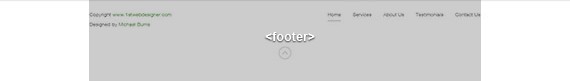
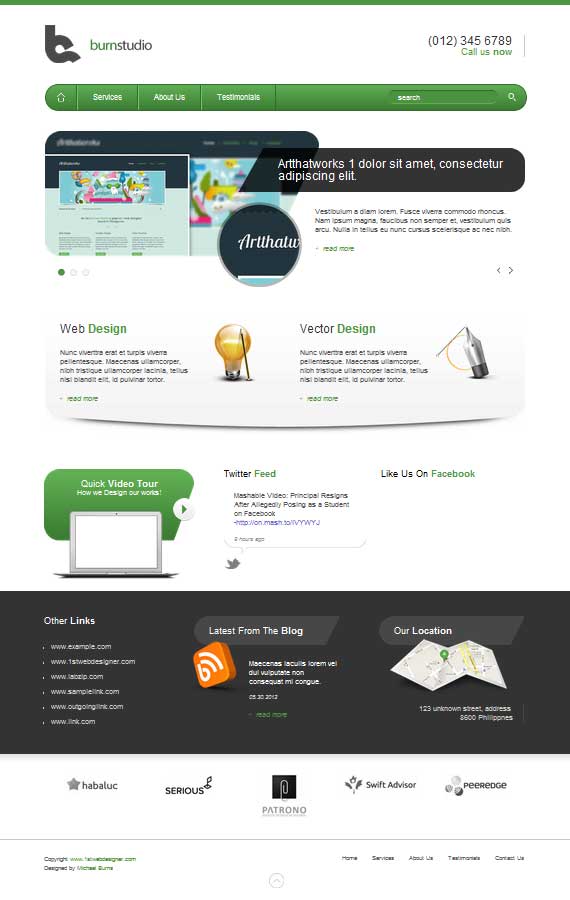
<footer class="group">
<div id="footer-left">
Copyright <a href="#" class="green">www.1stwebdesigner.com</a> </br>
Designed by <a href="#" class="green">Michael Burns</a>
</div>
<div id="footer-right">
<ul>
<li><a href="#">Home</a></li>
<li><a href="#">Services</a></li>
<li><a href="#">About Us</a></li>
<li><a href="#">Testimonials</a></li>
<li><a href="#">Contact Us</a></li>
</ul>
</div>
<a href="#header-wrap"><img src="images/back-top.png" alt="back-top" class="back-top" /></a>
</footer>
In above HTML I added a group class to footer, then created 2 section first is footer-left which contain the copyright text, next footer-right which contain an unordered list links. Lastly I added clickable back to top image.
Now let’s style all the element, here’s the CSS.
/* FOOTER */
footer{
	clear: both;
	width: 960px;
	margin: 0 auto;
	padding: 30px 0 60px 0;
	position: relative;
}
#footer-left{
	float: left;
	width: 50%;
}
#footer-left p{
	font-size: 12px;
	color: #666666;
}
#footer-left a:hover{
	color: #c8c8c8;
}
#footer-right{
	float: right;
	width: 50%;
}
#footer-right ul{
	float: right;
}
#footer-right ul li{
	float: left;
	margin-right: 30px;
}
#footer-right ul li:last-child{
	margin-right: 0;
}
#footer-right ul li a{
	color: #666666;
	display: block;
	padding-bottom: 10px;
	font-size: 12px;
}
#footer-right ul li a:hover{
	border-bottom: 2px solid #c8c8c8;
}
.back-top{
	position: absolute;
	bottom: 30px;
	right: 50%;

}
/* END FOOTER */
In above CSS I styled the footer by giving a width of 960px, centered it, applied a padding of 30px top and 60px bottom, lastly I positioned it relatively. For the footer-left and footer-right I gave it a width of 50%, floated it left and right. For the copyright text I made it smaller and changed the color to a lighter one. For the links I floated the ul to the right and floated li to left, gave a margin of 30px, for the last-child I removed the margin, for the links I styled it the same with the copyright text and added 2px border when its hovered. Lastly, since I positioned the footer relatively, I can position the back-top absolutely to the center which is right 50%.
Now our layout should look like this.
We’re done, Finally!
Wew! This took me so long to write. How was this PSD to HTML tutorial? I hope you learned something from this tutorial. If you have some techniques, comments, suggestions please share and drop it below. Also, for the next tutorial I’m going teach you how to make this layout responsive. Yeah! You heard it right, let’s make it responsive!
If you liked this tutorial kindly share it with your friends. Thanks! 🙂
Convert Burnstudio Agency PSD Into Responsive HTML Website: Media Queries Tutorial
If you’re following the series, we have converted Burnstudio Design Agency from PSD to working HTML/CSS version. We have discussed how we will markup the HTML and how we will style it using CSS.
Now, in this tutorial I will teach you how to make it Responsive by using Media Queries. Media Queries will change the look of the website depending on the screen resolution of the device: desktop to a mobile resolution by tweaking the CSS for a variety of viewports.
By the end of this media queries HTML tutorial you will learn how to convert any website into a responsive website.
Let’s get started!
Step 1: Preparation
Make sure that you followed the previous tutorial where we converted a PSD file into a working HTML/CSS website. Before anything else I want to point out that we need to design how it will look based on our existing design for a different viewport, in this case for a mobile device that has a max-width of 320px.
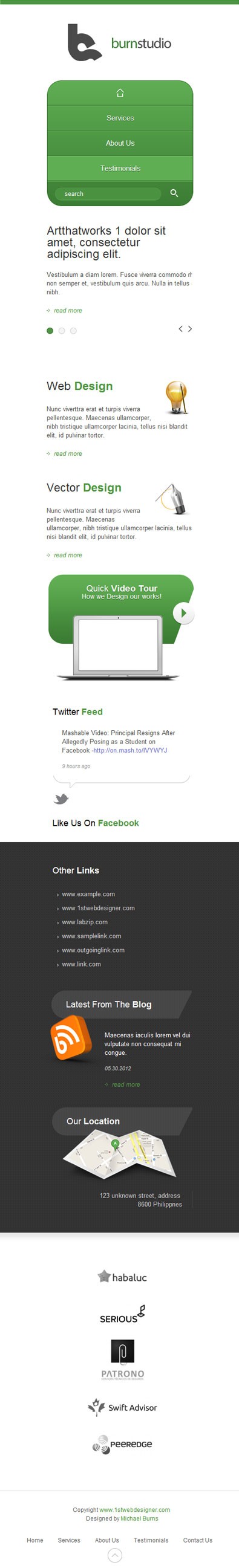
Click to see full preview.
In the image above you can see the elements are the same but I styled it in a way that will suit the 320px width of a mobile version. For this tutorial we will not tackle the design process, we will jump into coding directly. Don’t worry, in my upcoming HTML tutorial I will teach you how to design for the responsive web.
Lastly, of course you still need your favorite code editor, debugging tools and lastly the web browser where we can view our coded layout.
Step 2: Getting Files Ready
Make sure you open up the HTML file and the CSS file in your text editor and we’re ready to go.
Step 3: Adding Meta Tag
<meta name="viewport" content="width=device-width, initial-scale=1, maximum-scale=1">
This will take control of the layout on mobile browsers. Place this inside the tag and you’re ready to go.
Step 4: Working < 960 Viewport
This is how our website layout will look on screens with a width of 960px and below.
@media only screen and (max-width: 960px){styling goes here}
This is our first media query that will target screens less than 960px.
Now let’s add the CSS styling as follows:
/* VIEWPORT &lt; 960px */ @media only screen and (max-width: 960px){ header, nav, #slides, #service, #widget, #media, #client, footer, #container{ width: 768px; } .slide-right{ left: 0; } .slide-heading{ width: auto; height: auto; padding: 0; margin: 0 0 20px 0; background-image: none; color: #333; } .slides_container div img{ display: none; } .slide-right .info{ width: 768px; margin-bottom: 20px; margin-left: 0; } .slide-right .readmore{ margin-left: 0; } .slides_container{ height: 200px; } a.next{ right: 0px; } a.prev{ right: 25px; } .pagination{ left: 0; } #service{ background: none; height: auto; } #vector{ padding-left: 0; width: 369px; } #vector img{ margin-right: 0; } #web{ padding-left: 0; width: 369px; } #web img{ margin-right: 0; } #facebook{ display: none; } #twitter{ margin-left: 18px; } #blog{ clear: both; } #links{ width: auto; margin-bottom: 30px; } #links ul li{ float: left; margin-right: 30px; } }
Since our layout is now less than 960px, we will style all the main container elements by changing the width to 768px.
Next is the slider area, notice that we have a heading with a class of slide-heading, a div with a class of slide-right which contains the information and read more. We need to change the style of this by removing the background of the heading and changing the fixed width/height to auto, zero out the padding, add a 20px margin, and lastly change the color to a dark gray.
For the img that displays on our slider we will hide it by changing the display to none. For the slide-right .info .readmore we will zero out the left margin to push it back to the left, also for the .info let’s change the width to 768px and add a 20px bottom margin. For the slider controls let’s just move the next to right by change the right value to 0px, for the prev change the value to 25px. Lastly, for the pagination change the left value to 0px.
Moving on to the service section. When we’re coding the service section we forgot to add a group class to it’s parent container, we already know the function of the group class so no need to explain. For the CSS styling we will just remove the background and change the height value to auto.
<div id="service" class="group"/>
Inside of our service section we have vector and web that we styled by default by giving a padding of left 30px, let’s zero it out and change the width to 369px. Lastly, for the vector img and web img let’s change the margin right to zero.
In the media section since we don’t have enough space here let’s just hide facebook by changing the display to none. Maybe you’re wondering why hide it? Well, I know we should find a way to make everything responsive, but based on what I have read from other blogs ,sometimes we need to remove/hide some elements due to lack of space, just like some other responsive sites, they remove a couple of links in their main navigation.
In widget section the only thing we need to change is the links, let’s change the default width to auto, then by floating the li elements to left and adding a 30px margin to right.
Step 5: Working < 768 Viewport
@media only screen and (max-width: 768px){styling goes here}
The above CSS is our second media query that will target screens less than 768px (Tablet Portrait).
Now let’s add the CSS Styling as follows:
/* VIEWPORT &lt; 768px */ @media only screen and (max-width: 768px){ header, nav, #slides, #service, #widget, #media, #client, footer, #container{ width: 524px; } nav ul li.last{ display: none; } .slides_container{ height: 250px; } .slide-right .info{ width: 524px; } #web{ width: 100%; margin-bottom: 30px; } #web img{ padding-left: 20px; } #vector{ width: 100%; } #vector img{ padding-left: 20px; } #service{ height: auto; } #video{ margin: 0 auto 30px auto; float: none; } #twitter, #facebook{ float: none; margin: 0 auto; margin-bottom: 30px; } #facebook{ display: block; } #links{ width: 285px; float: none; margin: 0 auto; } #links ul li{ width: 285px } #blog{ float: none; margin: 30px auto; } #location{ float: none; margin: 0 auto; } #client ul li{ width: 100%; float: none; margin: 30px 0; } #footer-left{ width: 100%; margin-bottom: 30px; } #footer-left p{ text-align: center; } #footer-right{ float: none; width: 100%; margin-bottom: 30px; } #footer-right ul{ float: none; width: 75%; margin: 0 auto; } }
The first step is similar to what we did in the previous one. Let’s change the width of the main containers to 524px.
Now that we are on a smaller viewport, which is less than 768px, our search bar will fall down the navigation. So for a quick solution let’s just hide it for now.
In slider area let’s decrease the height of the container to 250px and change the width of .info to 524px.
In web and vector section let’s change the width to 100% to fill up the whole space and by giving the web a 30px bottom margin to give space.
In media section by default our video div is floated to left let’s change it to none, position in to center, and add we will add a 30px bottom margin. For twitter and Facebook still the same float to none, position to center, add a 30px bottom margin and lastly let’s reveal the Facebook again by changing the display to block.
In widget section we will position everything to the center, so we will give the links a fixed width of 285px, change the float to none and add a margin 0 auto to position it to the center, also for the li element change the width to 285px. Now that we have the links in position let’s position the blog and location by doing the same step.
In client section by default we give it 10% width to equally divide and position the images correctly, now let’s change it to 100% and add a 30px bottom margin.
In footer section let’s give a 100% width to footer-left and footer-right. In footer-left we will position the text to center by simply adding text-align to center. For the footer links we need to add a class of group again to it’s container which is footer-right.
<div id="footer-right" class="group"/>
Now that we added the class let’s change the float to none and add a 30px bottom margin. Lastly, we will change the website width to 75% and give it a margin 0 auto to position to center.
Step 6: Working < 524 Viewport
@media only screen and (max-width: 524px){styling goes here}
This is our third media query that will target screens less than 524px (Mobile).
Now let’s add the CSS Styling as follows:
/* VIEWPORT &lt; 524px */ @media only screen and (max-width: 524px){ header, nav, #slides, #service, #widget, #media, #client, footer, #container{ width: 300px; } header h2 a{ width: 100%; background-position: center top; } nav{ height: auto; } nav ul li{ float: none; border: none; border-bottom: 1px solid #336c2b; border-top: 1px solid #78c368; } nav ul li.home{ border-top: none; } nav ul li.last{ display: block; border-bottom: none; width: 100%; margin: 0; } nav ul li.last div{ margin-left: 15px; } nav ul li a{ text-align: center; } nav ul li.home a:hover{ -webkit-border-top-left-radius: 30px; -webkit-border-top-right-radius: 30px; -webkit-border-bottom-left-radius: 0; border-top-left-radius: 30px; border-top-right-radius: 30px; border-bottom-left-radius: 0; background: #5fae53 url(images/home.png) no-repeat 50% 50%; } #call{ display: none; } .slides_container{ height: 270px; } .slide-heading{ width: 300px; } .slide-right .info{ width: 300px; } #web img{ width: 64px; height: 72px; } #vector img{ width: 76px; height: 69px; } #service{ height: auto; } #footer-right ul{ float: none; width: 285px; margin: 0 auto; } #footer-right ul li{ float: none; margin: 0; } #footer-right ul li a{ padding: 8px 0; } }
Now we’re getting to a smaller viewport which is for mobile devices. First thing to change is the main containers: change the width to 300px.
Next we will hide the call div by adding a display to none. For our logo let’s position it to center by giving it a width of 100% and by adding a background-position center top.
In nav part let’s make the navigation styled vertically to perfectly suit a smaller viewport. First, let’s give the nav of height of auto, unfloat the li elements, border to none since we have a border-left and right by default, then overwrite the style by adding again a border-bottom and top. Now we will remove the border-top for .home and border-bottom for .last, also we will display the search bar again by applying a display block to .last also give it 100% width and 0 out the margin. To position the search bar correctly apply a 15px margin to the left on li.last div. Now let’s position the text to center by applying text-align center. Next, we will change the border-radius to top-left and top-right when we hover to .home.
In slider section let’s just change the width of the container to 270px and for the .slide-heading and .info change the width to 300px.
In service section let’s change the width and height of the image for web and vector, lastly give the service div a height of auto.
Lastly we will style the footer links by changing the float to none, give it a width of 285px and position it to center. For li elements change the float also to none and 0 out the margin, lastly give the a element a 8px top and bottom padding.
We’re done, Finally!
And there you go, we just turned an HTML layout into a responsive one. How was the tutorial? I hope you learned something from it. If you have some techniques, comments, and suggestions please share them below!
If you liked this tutorial kindly share it with your friends. Thanks! 🙂
30+ Best PSD to HTML/CSS Conversion Tutorials
If you’ve found some troubles on turning your PSD designs into HTML/CSS, or you would like to learn some new HTML and CSS tips, this roundup is for you. These tutorials would help you to improve your coding skills and techniques.
If you went through previous tutorials, you should already be pretty good with PSD to HTML conversion, but if you are real passionate web designer you will not stop until you are PSD to HTML expert! So this is for you, 32 more tutorials collected from all around the web. Enjoy!
1. PSD2HTML: Highest quality HTML5 / CSS3 Conversion Service
Maybe, just maybe sometimes it is better to just outsource the parts that you are not enjoying. If you love to design in Photoshop or Sketch, but hate coding, this resource will be for you.
For just $99 per inner page and $199 for the first page PSD2HTML will create the highest quality HTML5 / CSS3 working version compatible with all modern browsers and devices.
Check them out, in case you are in need for such service. 1WD totally recommends them, they know what they are doing. In fact they already have completed over 75,000 projects!
2. Coding Up a Web Design Concept into HTML & CSS
In this walkthrough you’ll go through the process of converting the design concept from PSD document right through to completed HTML and CSS mockup, complete with clean and valid code, a few touches of CSS3 and some quick fixes to help out old IE6.
3. Coding a Web Layout in XHTML and CSS
In this tutorial we’ll be learning how to code a web layout. Hopefully it’ll be good practice for anyone who doesn’t really know how to use XHTML and CSS. Moreover, this tutorial acts as a great introduction to CSS and XHTML.
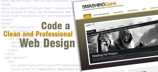
4. How to Design a Blue Marketing Company Layout in Photoshop
In this web development tutorial, you will learn how to code a web page template from a Photoshop mock-up from a previous tutorial called “Create a Clean and Professional Web Design in Photoshop” using HTML/CSS.
5. Coding: Corporate WordPress Style Layout
In this tutorial you will learn how to code the Corporate WordPress Style Layout into xhtml and css.
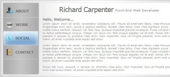
6. Digital Curriculum Vitae: PSD Conversion
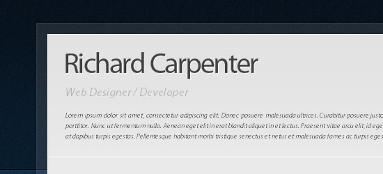
This tutorial you’ll be walking through the process of coding your “Digital Curriculum Vitae” into a working HTML/CSS Template.
7. Design & Code a Cool iPhone App Website in HTML5
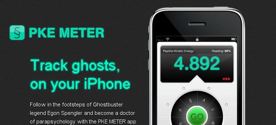
HTML5 is definitely the flavor of the month, with everyone in the design community getting excited about its release. In this tutorial you’ll get a taste of what’s to come by building a cool iPhone app website using a HTML5 structure, and visual styling with some CSS3 effects.
8. Design and Code Your First Website in Easy to Understand Steps
In this tutorial, we’re going to design and code our first website in simple, easy steps. This tutorial was written for the beginner with the hope that it will give you the tools to write your own standards-compliant websites!
9. Coding a Band Website Created in Photoshop to HTML Tutorial
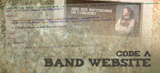
In Part 1 of this tutorial, you learned step-by-step how to design an awesome band website in Photoshop. Now in Part 2, you’ll learn how to take that PSD and turn it into clean, working XHTML/CSS code.
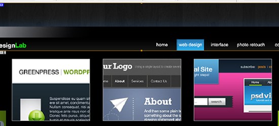
10. Coding: Design Lab TV Styled Layout
In this tutorial you will learn how to code the Design Lab TV Styled layout into xhtml and css.
11. Personal VCard Pt.2
In this tutorial you’ll be converting the vCard into a 4 page template.
12. How to Code up a Web Design from PSD to HTML
The tutorial covered the process of designing our site concept from sketch to finished PSD design.
13. How to Design and Code a Flexible Website
In this tutorial, you’re going to be designing and coding a simple blog-style web-page. You’ll pay special attention to making your design flexible and accessible by using clean and simple XHTML and CSS. This tutorial is aimed at beginners, and anyone looking to improve the accessibility of their web designs.
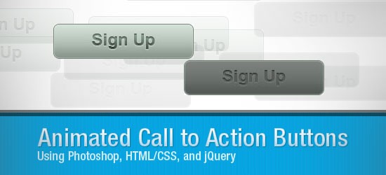
14. Create an Animated “Call to Action” Button
In this web design and development tutorial, you’ll get a walkthrough for creating a “Call to Action” button sprite in Photoshop as well as how to use jQuery to animate it. This tutorial is broken up into three sections: Photoshop, HTML/CSS, and JavaScript.
15. Code a Corporate Website from a Photoshop Design: PSD to HTML Tutorial
In this tutorial you will walk through the process of coding Corporate Website design in HTML and CSS.
16. Hosting Layout #2: Sitebuild
Learn how to code a Hosting Layout using a free PSD file.
17. How to Create a Lifestream of Your Online Activities
A lifestream is a simple website that compiles your online activity in real time and displays it in chronological order. These days all the cool kids have personal lifestream sites, so let’s take a look at creating our own website that pulls in a range of RSS feeds through SimplePie and displays them together in a cool design.
18. Design and Code a Slick Website PSD To HTML From Scratch
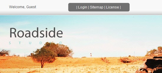
In this second part of the tutorial, you will code your design into a standards-compliant, cross-browser xHTML, CSS, and JavaScript/jQuery layout. Fire up Coda, or your editor of choice… it’s coding time!
19. Minimal and Modern Layout: PSD to XHTML/CSS Conversion
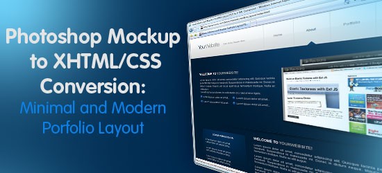
In this web design tutorial, you’ll see a process for converting a Photoshop mockup to working HTML/CSS template. This is Part 2 of a tutorial series that will show you how to create the design, and then convert it to an HTML/CSS template.
20. How to Code a Clean Portfolio Design
Coding a Clean Portfolio Design into HTML/CSS.
21. Web Design Layout #10: Sitebuild
Today you’ll be taking through the process of converting web design layout into a one page template.
22. How to Convert a Photoshop Mockup to XHTML/CSS
Follow this walkthrough of coding up a graphical website layout into valid, standards compliant XHTML and CSS. Starting with the initial process of exporting the individual images from the Photoshop document through to building the complete page.
23. How To Build Your Own Single Page Portfolio Website
Let’s take a look at producing a single page portfolio concept in Photoshop, constructing the page in XHTML/CSS and adding some fancy functionality with jQuery.
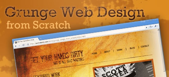
24. How to Code a Grunge Web Design PSD To HTML from Scratch
In this step-by-step web development tutorial, you will learn how to convert a beautiful and eye-grabbing grunge theme web layout–created from Photoshop in a previous tutorial–into a working HTML and CSS template.
25. Dark Layout #2: Sitebuild PSD To HTML Tutorial
In this coding tutorial you’ll be showed how to slice and dice the dark layout #2 PSD into a working template.
26. From Photoshop to HTML
You will learn how to code a business website from the Photoshop file that is included with this tutorial.

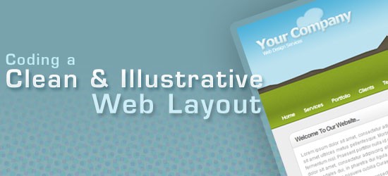
27. Coding a Clean & Illustrative Web Design from Scratch
In this comprehensive and step-by-step PSD to HTML tutorial, you will learn how to convert a Photoshop mockup of a professional web layout design that features an illustrative landscape header into a standards-compliant XHTML/CSS template.
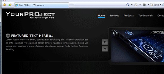
28. My Project Pt.2: PSD To HTML
Today you’ll be converting your PSD into a one page working CSS template through this tutorial.
29. Coding a Clean Web 2.0 Style Web Design from PSD To HTML
In this web development tutorial, you’ll learn how to build a web page template from a Photoshop mock-up from a previous tutorial called “How to Create a Clean Web 2.0 Style Web Design in Photoshop” using HTML/CSS and the jQuery library.
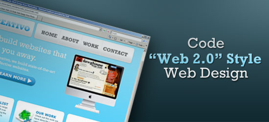
30. Web Design Layout #9 SiteBuild
In this HTML tutorial you’ll learn how to code the web design layout #9 PSD.
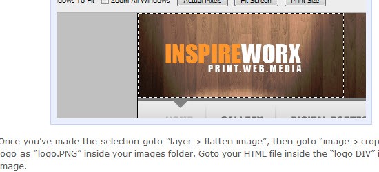
31. Portfolio Layout #10: Learn To Code It
Coding tutorial of the portfolio #10 layout. In this tutorial you’ll read the steps to take in slicing and coding the layout. Before attempting this PSD to HTML tutorial i highly suggest you create the layout before hand and have it ready
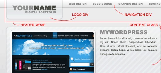
Want to Learn Programming?
Everyone wants to be a programmer and design their own web based startups. 1WD is your one stop resource for web design, programming, inspiration and everything else that’s related. So, we thought why not compile a one stop article for those who are beginning to learn coding. Without further ado, let us all learn how to program.
There is quite a bit of information in this article that you may find useful, I highly recommend bookmarking it for later reference.
Why Do people want to learn how to program?
This is an interesting development actually, similar to when blogging started becoming popular. There was a chunk of people who wanted to start a blog of their own because it looked like anyone could do it. Similarly, these days there seems to be a rush towards non-programmers wanting to learn how to program.

Which Is The First Programming Language To Learn?
There are so many different programming languages that sometimes it’s hard to figure out where to start. This is what I think:
- Start with C.
- Learn python.
- I am a Ruby expert and I can tell you that Ruby is probably the easiest to learn. Learn Ruby to learn programming.
- Go for Java. The world runs on Java!
These tips are for programmers who go into hardcore programming, if you are more of a designer and want to focus on creating converting websites to be able to charge more, read this article about must learn languages in 2015.

Best Way To Learn How To Code
Programming, like everything else, is easy once you know what you’re do. You just need to start programming to learn how your language of choice works. Once you’ve made some mistakes and had some success it will start to come easier to you.
- Programming is an art and there is no ‘right way’ to learn it – C, C#, C++, Java, Ruby and all other programming languages are tools that will teach you programming. They are just tools. So now, ask yourself how do artists become artists? Well, they just start painting or drawing whatever they are passionate about. At the end of the day the journey makes them the artists. So, start trying and stop thinking.
- Got it, Sir! But, I still need to start somewhere, right? WHERE? – There will be a list of resources at the end of this article that you can use to start learning programming.
- How long will it take me to become a ‘real’ programmer? – This isn’t a question I can answer. If you really want to be an expert then be rest assured that it’ll take at least a decade! If you think you’re going to be the next Mark Zuckerberg remember that Zuk started programming as a child. It even took him a decade to create something like Facebook.
- ENOUGH! Which programming language? Tell me, NOW! – Any, really. I mean it. Write each language you’re interested in on a piece of paper, put them in a hat and start with whatever language you pull out. Trust me when I say that the core of all programming languages is the same. The syntax changes and that can be grasped in a couple of weeks. The most important thing about learning a programming language is to CODE. Don’t just read books and watch video tutorials. CODE the stuff yourself. Don’t copy the program and execute it as explained in those HTML tutorials. Type the codes yourself and then execute them. Make changes in and do your own thing. Make sure that you have started to feel and understand those programs.
Now, how do I pick a project?
Actually, you should have an answer to this question. You have learned programming and now you want to create your own web application. Then why think? Just pick anything and DIY (Do It Yourself). Sound good? Go ahead, create a chess program in your programming language or a calculator. Just code something!

Useful Additional Resources To Teach You How To Code:
Enough talking. Let us all get rolling now. Here are some of the best resources that you can use to learn programming:
- Code School – This is another one stop website for those who want to learn programming. They are loaded with video based tutorials and on-the-fly coding tools that help you understand programming even when you know nothing about it.
- Codecademy – Another site that is loaded with amazing and helpful information. It has been appreciated by its users and I know that it is worth it. One of the rare, interactive ways to pickup JavaScript.
- RockingCode – 1stWebDesigner’s own video course teaching you how to build a website from scratch to fully responsive and flat WordPress website.
- W3Schools – This was my go-to website while I was in school. It has been an amazing experience learning programming from W3Schools. They start from the basics, stick to basics and even the complex explanations on the website are pretty easy to understand. In short, it’s a perfect place to start learning programming.
- Try Ruby – Got 15 minutes? Go, give Ruby a chance in those 15 minutes. The on-the-fly editor helps you learn Ruby in no time. At least it will introduce you to Ruby very quickly.
- Try Bloc – Another great member and teacher in the Ruby community.
- jQuery Air – This tool helps you learn jQuery in the browser itself. This tool will help you learn jQuery in the most practical way. Don’t miss it.
- Hackety – Well, they won’t actually teach you how to hack, but they will teach you how to program.
- TeamTreeHouse – Team Tree House has received praise from around the planet and the Internet community for the amazing work they have been doing. Try them if you are beginning to learn any new programming language.
- PHP Know How – You didn’t think I’d forget about PHP did you? PHP is the language that WordPress relies on to function.
- Lifehacker’s Learn to Code – Lifehacker has compiled an amazing article that teaches you the basics of coding. This article is a great starting point for anyone that wants to learn more about programming.
What Language Should I Start Learning?
Gosh! How many times will I have to tell you this. ANY! Just check out any of the resources listed in this article and start learning how to program. Let me know if you found the resources beneficial.


No Comments