


Way, way back in 2011 we published an article looking at how 26 commerce sites presented their mega menus.
This refers to the drop-down menus that are generally situated within the horizontal navigation at the top of a webpage.
Web trends and UX design have changed in the intervening years, in large part due to increasing consumer adoption of mobile and new technologies such as responsive design, so I thought it would be interesting to revisit those same sites to see how they’ve evolved.
Here they are…
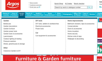
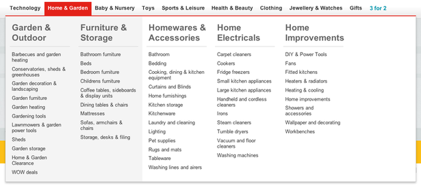
1. Argos
Argos’ top nav has changed dramatically since 2011, reflecting new product categories and consumer behaviour.
The mega menu design has also been altered accordingly and widened so it now takes up the full screen width.
The columns have been simplified, so they have larger headers and only refer to a single sub-category. The ordering within the lists has also changed – in 2011 the products were in alphabetical order, but that isn’t strictly adhered to in the current lists.
2011
2014
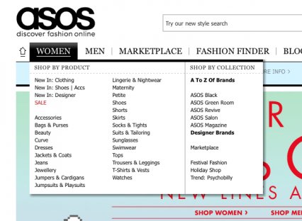
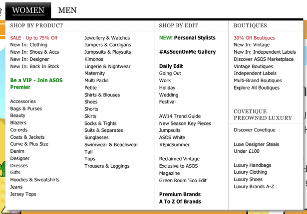
2. ASOS
ASOS has retained the same basic layout though it has been expanded to include new ranges such as ‘Boutique’ and ‘Preowned’.
As mentioned in the original post, ASOS doesn’t break up the subcategories as much as others do, which makes it slightly harder to scan.
2011
2014
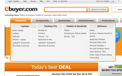
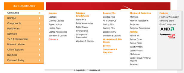
3. Ebuyer
Ebuyer has shifted its navigation from the top to the left of the screen, and has also done away with the bold column headings.
Instead the columns now include several different product categories, and there is also a ‘Featured’ section on the far right.
Weirdly, some of the categories contain no subcategories (e.g. ‘Servers’).
Overall the new design means the mega menu offers slightly less clarity, but can include a wider range of products.
2011
2014
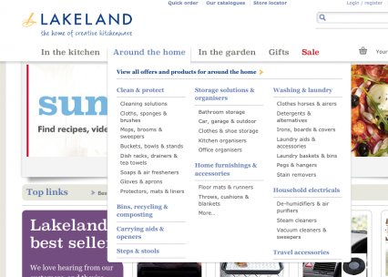
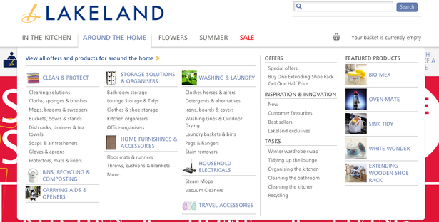
4. Lakeland
In 2011 we pointed out that Lakeland struggled to fit all of its categories within its menus, and that problem doesn’t seem to have been rectified.
Three of the categories still don’t have any subcategories (e.g. Travel Accessories).
We recommended that Lakeland extend its menu to fit the whole width of the screen, and though it has been extended this was to fit in additional offers and ‘Featured Products’.
This enables Lakeland to upsell popular brands and products.
2011
2014
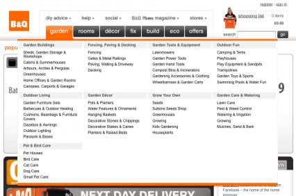
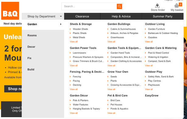
5. B&Q
B&Q now has a mega menu within a mega menu – users must first select ‘Shop by department’, then choose the range they wish to buy from.
The current layout is similar to the old one in terms of having categories grouped into blocks with prominent headings, however it has been simplified by limiting each list to just three subcategories.
It’s notable that the EasyGrow category doesn’t have anything listed, but that is because it links to a content page rather than a range of products.
2011
2014
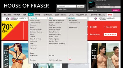
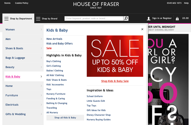
5. House of Fraser
Another retailer that has adopted an element of mobile design on desktop, so its mega menu is now housed within a burger menu.
The main navigation options are largely still the same, but the categories within each option are new.
In 2011 each of the categories was presented in a separate column, but now there is a uniform format within each category – ‘Highlights’, and ‘Inspirations & Ideas’.
Each category also has a hero image that either advertises an offer or displays related photos.
2011
2014
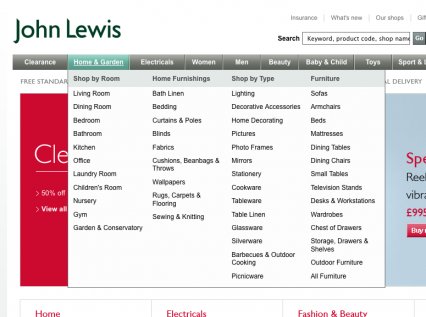
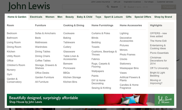
6. John Lewis
John Lewis has a massive mega menu that takes up the entire screen. The background even fades to grey to give the menu added prominence.
The aesthetics have changed a bit since 2011 but it’s essentially the same menu, with long columns for each product category.
There is, however, a new ‘Highlights’ column that promotes offers and seasonal product ranges.
John Lewis has also added a banner ad at the bottom of each menu, while some categories have large hero images dedicated to a specific product or offer (e.g. the ‘Beauty’ menu is dominated by an ad for ‘Marc Jacobs Daisy Dream’).
2011
2014
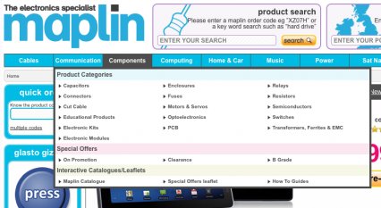
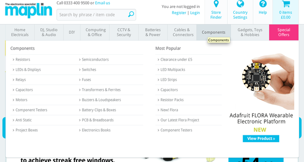
7. Maplin
Maplin has also gone for a plain, stripped down design that is almost identical across each category.
Alongside the subcategories there is a ‘Most popular’ category and an image of a promoted product.
It’s cleaner and, in my opinion, easier to scan than the old version.
2011
2014
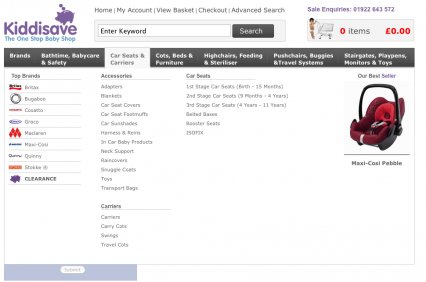
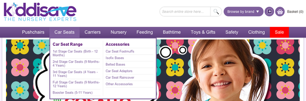
8. Kiddisave
Children’s retailer Kiddisave has reduced the size of its menus, perhaps as a result of switching to responsive design.
In 2011 it stretched across the entire screen and included columns for ‘Top brands’ and ‘Promoted products’. Now it’s limited to a maximum of three columns.
2011
2014
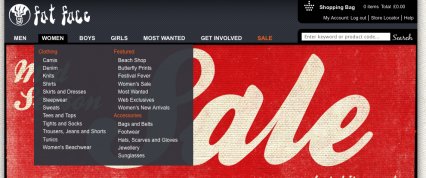
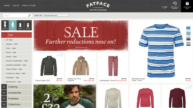
9. Fat Face
Clothing retailer Fat Face has done away with drop-down menus and instead navigates to a new page when you select one of the age/gender categories.
2011
2014
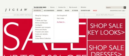
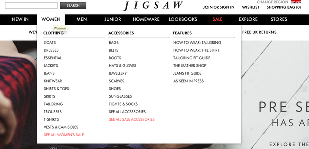
10. Jigsaw
As in 2011, Jigsaw’s navigation includes triple-column mega menus and simple single-column drop downs.
The bigger categories (Women and Men) includes a ‘Features’ column that includes links to content pages, though smaller categories (Homeware) only contain four or five options in total.
Overall though it has a simpler, more user-friendly layout.
2011
2014
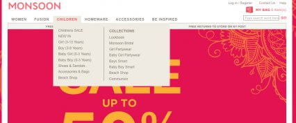
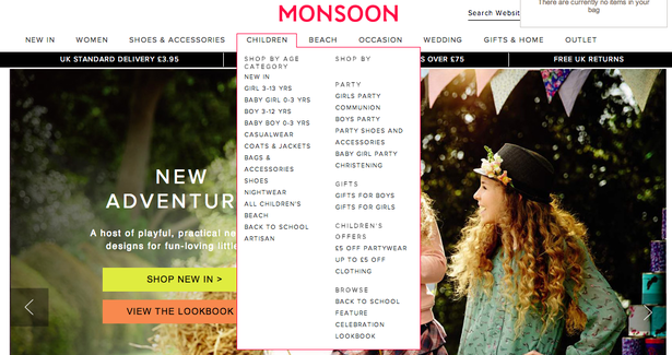
11. Monsoon
Monsoon has expanded its menu since 2011, adding in additional product categories and altering the formatting slightly.
Unfortunately the new layout is more difficult to navigate as the subheadings and the listed items use the same font.
2011
2014
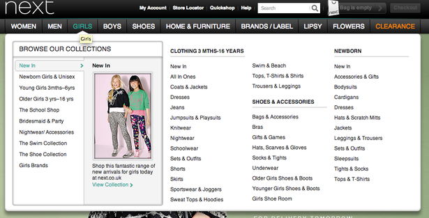
12. Next
All of Next’s menus follow the same consistent format, with a ‘Collections’ tab on the left followed by three columns of product categories.
The bold subheadings and clean layout make it easy for shoppers to find what they’re looking for.
2011

2014
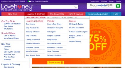
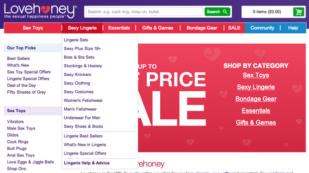
13. Lovehoney
Sex toy retailer Lovehoney has done away with its mega menu and now relies on single-column drop-down menus.
It means there are fewer options within each menu, but also simplifies the site navigation.
For example, in 2011 each menu had a separate column dedicated to content such as guides and size charts, but this has been scaled down to a single ‘Help & Advice’ link at the bottom of each drop-down.
2011
2014
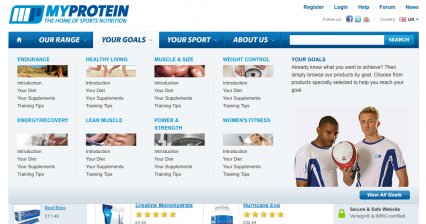
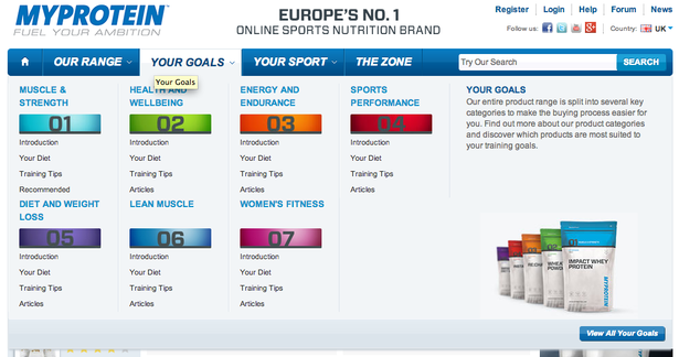
14. MyProtein
MyProtein has maintained the same site design since 2011, though it has slightly modified the layout of its mega menus.
The company’s entire product range is crammed into the ‘Our range’ menu, with six columns that take up the entire width of the screen. Thankfully the layout is quite clear so it’s easy to scan.
The other menus include numerous links to the site’s content giving advice on workout goals, diets and other nutritional information.
In the previous post we mentioned that the use of images makes it stand out versus the other brands on this list and is a good example of how to use mega menus effectively.
However I feel that the design is a bit dated now and the images of numbers within the ‘Your Goals’ menu don’t add much to the usability.
2011
2014
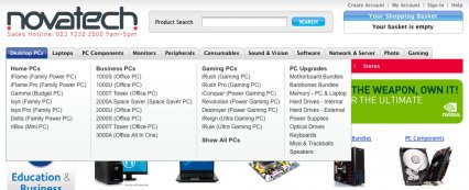
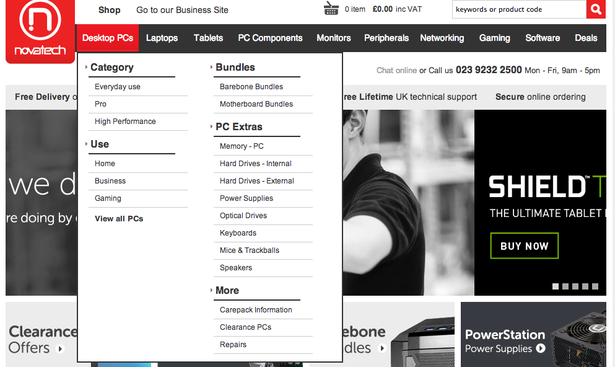
15. Novatech
Another brand that has overhauled its design in the past three years. Novatech’s menus range in size from three columns to a single drop-down menu.
In the example below Novatech has simplified the ‘Desktop PCs’ menu from four to two columns, though it is a bit longer the the previous iteration.
There is now less focus on specific models of computer and the columns for ‘Home’, ‘Business’ and ‘Gaming’ have been simplified to a single link for each.
This frees up a lot of extra space to upsell related products.
2011
2014
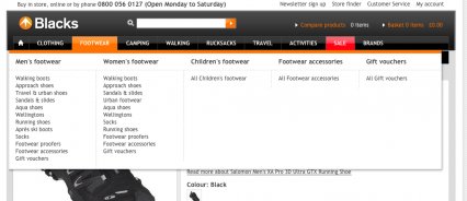
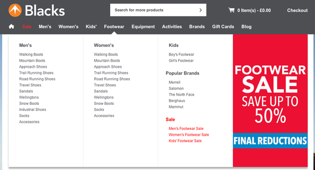
16. Blacks
The size of Blacks’ drop-downs was previously dependant on the number of products in that range, but they’re now uniformly the width of the screen.
It means each menu has four columns of product options, though at the moment the right-hand column is taken up by a big advert for the site’s seasonal sale.
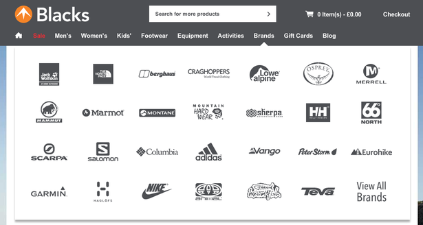
Overall I feel the clean layout is very easy to scan. I’d also like to draw your attention to the ‘Brands’ menu, as the use of logos rather than text links is a neat touch.
2011
2014
2014 brands
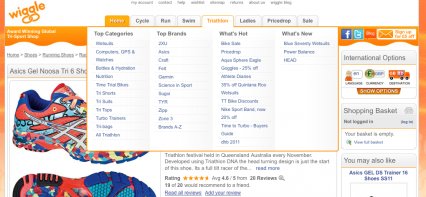
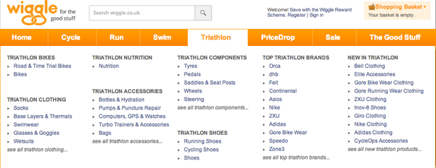
17. Wiggle
Wiggle’s menus now fit the width of the screen and include lists of specific products rather than broad categories.
For instance, the example below previously included ‘Top brands’ and ‘What’s hot’, but now has categories such as ‘Triathlon bikes’ and ‘Triathlon components’.
The use of bold headings and bullet points means it’s very easy to scan.
2011
2014
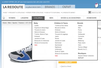
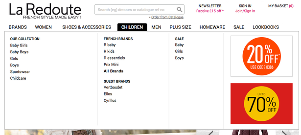
18. La Redoute
Fashion retailer La Redoute has opted to widen its mega menus so they fill the entire screen.
It means that some of them look a bit sparse, but means there is space for graphics to advertise sale items.
2011
2014
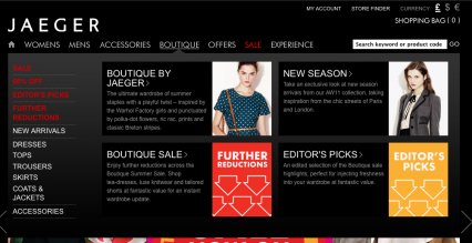
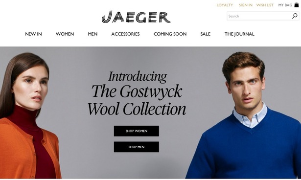
19. Jaeger
Part of Jaeger’s site redesign included getting rid of its drop-down menus.
2011
2014
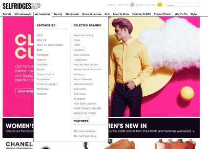
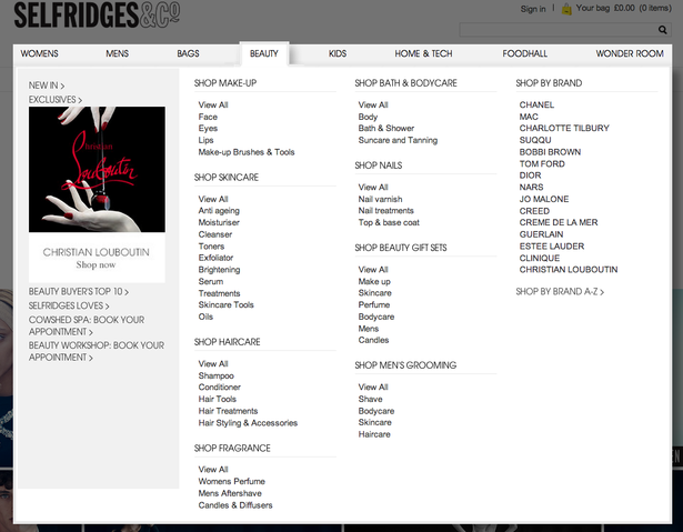
20. Selfridges
Department store Selfridges has huge mega menus, each detailing the various products and brands on offer, alongside a hero image and links to content or product ranges on the left-hand side.
Despite the enormity of the menus they are still fairly easy to use thanks to the clean, simple design.
2011
2014
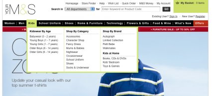
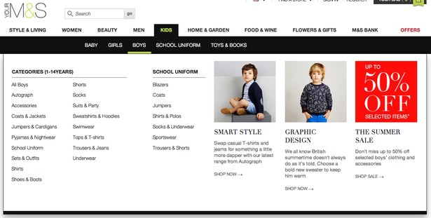
21. M&S
M&S relaunched its site back in February this year – read our review to find out more.
Included in this revamp was the extension of its mega menus so they are now two-fold. Users must navigate two different category lists before they can choose a particular product (e.g. ‘Kids’, then ‘Boys’).
The menus themselves look great and include some attractive imagery and offers, but the added level of complexity could potentially damage the UX, particularly on tablet.
2011
2014
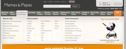
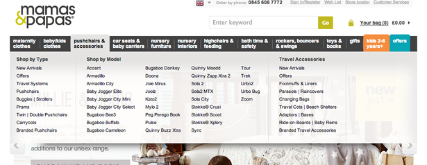
22. Mamas & Papas
Mamas & Papas ha retained the same overall design for its mega menus, using a full-width layout with subcategories laid out in columns.
Some of the menus have product images on the right-hand side that advertise a special offer or best seller.
2011
2014
In conclusion…
There’s a wide variety of approaches to mega menus among these retailers, and few have retained an identical design since 2011.
Full-width menus appear to be en vogue, with 15 out of the 22 brands opting for screen-filling navigation menus.
This gives retailers more space to include a bigger product range and additional images or offers, but it also creates issues for smaller product categories and UX problems on tablet devices.
It’s also worth pointing out that four retailers included in the 2011 list no longer exist, which goes to show the difficulties that multichannel retailers continue to face.


No Comments