


The buzz around responsive websites has been going on for a while now, and a lot of websites are already responsive, or underway. You know what that means?
Today I will teach you how to build a responsive website.
- Tutorial Level: Beginner
- Skills Required: Basic knowledge in HTML5 and CSS
- Completion Time: Approximately 15 minutes
- Warning: This responsive HTML and CSS tutorial is targeted towards beginners, but it can also be for designers and developers who want to have fun!
By the end of these quick tutorials about responsive web design with HTML5, you will already be on your way to web stardom, and by that, I mean, you’ll be ready to convert and make responsive websites!
Additional reading: If after reading this quick tutorial, you want to go more in depth check out this PSD to HTML tutorial: The Only Guide You Need in 2015 (ultimate learning 10k word guide)!
Are you ready? Show me your war faces! Roaaar!
How To Make A Website Responsive (Text Version) – Preparation
If you want to find video version of a little bit more advanced follow-up video tutorial, or you are coming from Youtube for demo and source files, just scroll down.
I promised that it will only take about 15 minutes to build a responsive website, and I will hold true to my word. Only, we shall start slow and small. We will start by creating a simple single-page website. Cool? Okay!
Frameworks you can use:
- Foundation – we will be using Foundation for this tutorial because it’s one of the simplest to use and has a very good documentation.
- 1140 Grid – quite similar to Foundation and other frameworks, definitely worth the look.
- Twitter Bootstrap – one of our contributors, Ranjith Kumar, has written a couple of Twitter Bootstrap Tutorials which you will definitely find helpful.
- Less Framework
- Adapt.js
What is Responsive Web Design?
If you are fairly new to the term, then we have the perfect reading materials for you!
- Introduction to Responsive Web Design
- A Brief Overview of Responsive Design
- Ultimate Guide to Responsive Web Design: 55 Stunning Tools, Tutorials, and Examples
Our Goal

This is our goal.
By the end of this responsive CSS tutorial you will end up with something similar to the page above. It is a very plain design, but it will do the trick for now. It is fairly easy to clone the image as seen above, but the main goal here is to make it responsive. To make the website respond based on the size of your device’s screen size.
Try opening the demo on your smartphone and you will see this:

This is what Foundation can do along with several other frameworks that focus on making websites responsive for mobile devices.
You will find all the files, including the images, in the download link below.
Before moving on, download Foundation and unzip it to a folder where all of your files for this tutorial will be located. It should look like this:
Open index.html and see several elements blasted in one page as a demo. We won’t use everything you will see in it, but you can learn a lot from it. Now, delete it or move it somewhere else so that we can start from scratch.
Our goal is to create a website which has the basic areas of a website: header, body, sidebar, and footer. Of course, everything will be responsive, from images down to text and elements placement.

Step 1: Understanding the Foundation
Okay, it is already given that we will use the structure above, but how will we translate that to HTML? Easy!
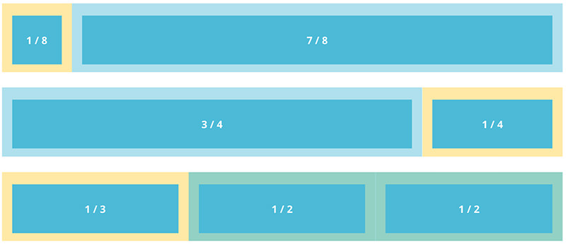
First, you need to understand a few things about Foundation and how layouting works. It uses 12 columns to define the width of each “section”, which is derived from foundation.css’ width of 1000px. So, if we write:
<div class="row">
<div class="twelve columns"></div>
</div>
The above code would mean that in this certain row, you will occupy twelve columns with the width of 1000px. While on the code below:
<div class="row">
<div class="twelve columns">
<div class="six columns"></div>
<div class="six columns"></div>
</div>
</div>
We placed two “six columns” inside of “twelve columns”, this would mean that “six columns” will occupy 50% of the width of “twelve columns”. The same is true for other number of columns:
<div class="row">
<div class="twelve columns">
<div class="row">
<div class="seven columns">
<div class="row">
<div class="twelve columns"></div>
</div>
</div>
<div class="five columns"></div>
</div>
</div>
For “seven columns” we placed another row inside which occupies “twelve columns”. This means that the “twelve columns” will take the maximum width of “seven columns” and divide it into “twelve columns”. It’s a nest of rows and columns, which is important for our goal layout. Now that rows and columns, and nested columns, have been explained, let’s move on to the main show.
Step 2: Laying Out the Foundation

Using your favorite text editor, create a file named index.html then add the following at the very beginning of the file:
<!-- Editor's note: if you're wondering what are these items below, you should follow the link below -->
<!-- paulirish.com/2008/conditional-stylesheets-vs-css-hacks-answer-neither/ -->
<!--[if lt IE 7]> <html class="no-js lt-ie9 lt-ie8 lt-ie7" lang="en"> <![endif]-->
<!--[if IE 7]> <html class="no-js lt-ie9 lt-ie8" lang="en"> <![endif]-->
<!--[if IE 8]> <html class="no-js lt-ie9" lang="en"> <![endif]-->
<!--[if gt IE 8]><!--> <!--<![endif]-->
<!-- Set the viewport width to device width for mobile -->
Welcome to Foundation
<!-- Included CSS Files -->
<!--[if lt IE 9]>
<link rel="stylesheet" href="stylesheets/ie.css">
<![endif]--><script type="text/javascript" src="javascripts/modernizr.foundation.js"></script>
<!-- IE Fix for HTML5 Tags -->
<!--[if lt IE 9]>
<script src="http://html5shiv.googlecode.com/svn/trunk/html5.js"></script>
<![endif]-->
The above code is where we deal with the evil of Internet Explorer. It is also where we call on to different stylesheets which are necessary to make the whole thing responsive and run on mobile devices. It comes with Foundation. Then type the following code:
<div class="row">
<div class="twelve columns">
<h2>Header Twelve Columns</h2>
</div>
</div>
<div class="row">
<div class="twelve columns">
<div class="row">
<div class="seven columns">
<h3>Body Seven Columns</h3>
</div>
<div class="five columns">
<h3>Sidebar Five Columns</h3>
</div>
</div>
</div>
</div>
<div class="row">
<div class="twelve columns">
<h2>Footer Twelve Columns</h2>
</div>
</div>
I have already explained what these “rows” and “twelve columns” are above.
Tip: if it’s not clear to you why we should wrap the sidebar and body with “twelve columns” you can try removing it and see what happens!

By now it should look like this.
We haven’t added stylings yet, but you can already see how it jives with our goal. I’m not much of a designer but I will do my best to make this look amazing.
Wait, wait, wait! What’s that navigation bar, you ask? As I have mentioned earlier, this is one of the beauties of Foundation. It has extensive documentation that will teach you how to properly use forms, navigation, buttons, grids, CSS, and other elements covered by Foundation.
Everything is basically done now, all we need to do is add some images and paragraphs and design the whole thing. If you followed this tutorial, then by now you have already created your first responsive web page!
Step 3: Adding Content To Web Design
This step is needed to actually see how the webpage will look like in its full glory. Copy some Lorem Ipsum and paste it on your “body” div, then insert images using tag and then you’re on your way to becoming a superstar with this!
If you’ll go back and check the demo, you might notice that the background isn’t exactly white, but with a subtle pattern. Choose one on SubtlePatterns and see for yourself which works best.
Step 4: There is no Step 4
Well, actually there is a step 4. The next thing you need to do is study the files you downloaded and start creating your own responsive web page from scratch. There are a lot of other tools you can use aside from Foundation, but the idea is basically the same. Don’t forget to check the documentation!
What do you think about this tutorial? This is my first time writing one, and it may appear messy to experts, but comments and suggestions are always welcome so that we can all improve, right? Start typing now!
Note: If you are looking for quick and easy way to build your own free website, check out Wix website builder. It allows to make quick HTML5 designs which are mobile friendly and beautiful.
A few weeks ago, we released two different introductory articles about HTML5 and CSS3, and I promised you we’d do some cool stuff together in the upcoming months. Well, I have been working hard on this video tutorial and I really hope you enjoy it.
In this responsive css tutorial I will teach you how to create a responsive website using HTML5/CSS3 from scratch. So rather than talking about, let’s get straight to it. I hope you will leave me feedback in as I would like to read some of your opinions very, very much!
In case you are thinking of building a website (for real), here’s a special 20% exclusive discount from Bluehost – applies to all packages! We recommend them!
How To Make Website Responsive: Video Tutorial
Now if you were looking for video version and are ready to build responsive web design with HTML5 and CSS3 – you are in the right place. Just download source files, view demo and click play on the video – let’s make a responsive website!
Build Flat Responsive WordPress Website From Scratch (High Quality Course)
If you are looking to take your web design career to whole new level in 2015 – we created The Ultimate 2015 Web Design Learning Course, where in 9 hours we will teach you how to Build Your Own WordPress Site – 100% Responsive & Flat –
You will learn how to build website from scratch in Photoshop, then convert PSD to HTML and CSS. Finally using Bootstrap magic, we will convert website to fully responsive and functional WordPress website.
Yes, you will learn how to make website responsive, but this time you will be building high quality website design you can be really proud of!
We throw in some business lessons, interviews and many bonuses to amplify your learning and help you get some clients as well! Watch the video to see exactly what’s inside.
What you are waiting for? Take your skills to the next level right now.
P.S. Looking for more responsive web tutorials? See it pays to read until the end!
As a free bonus, learn how to make a responsive email design in one more quick tutorial!
How To Make Email Responsive: Quick Bonus Tutorial
As smart phones and tablets have become popular, more and more people are have been reading their emails regularly on their small screen devices. According to Campaign Monitor, mobile surpassed web and desktop client usage last July 2012. As the mobile email usage grows, web developers and designer must consider optimizing the look of their email newsletters on phones and tablet.
Email clients such as Outlook (Windows), Mail (OSX), etc. use different HTML engines. Many have some rules and regulations. That being said, some CSS might work while some might not.
So, in making an email template, it is highly recommended to use a different approach. Many email clients completely remove the head and strip out styles while some support a limited set of inline and internal styles for formatting. To many, an old-school table layout is the best way to go.
For your reference, read Campaignmonitor and Emailology.
To give you an idea how to create a responsive email template, let’s go ahead and create one, it is actually very similar to the steps you used before to make responsive web design with HTML5.
Resources You Will Need to Complete This Responsive Web Tutorial:
- Pacifico Font (Google Fonts)
- Dummy Images Created in Photoshop
- Social Media Icons
- Time and Patience
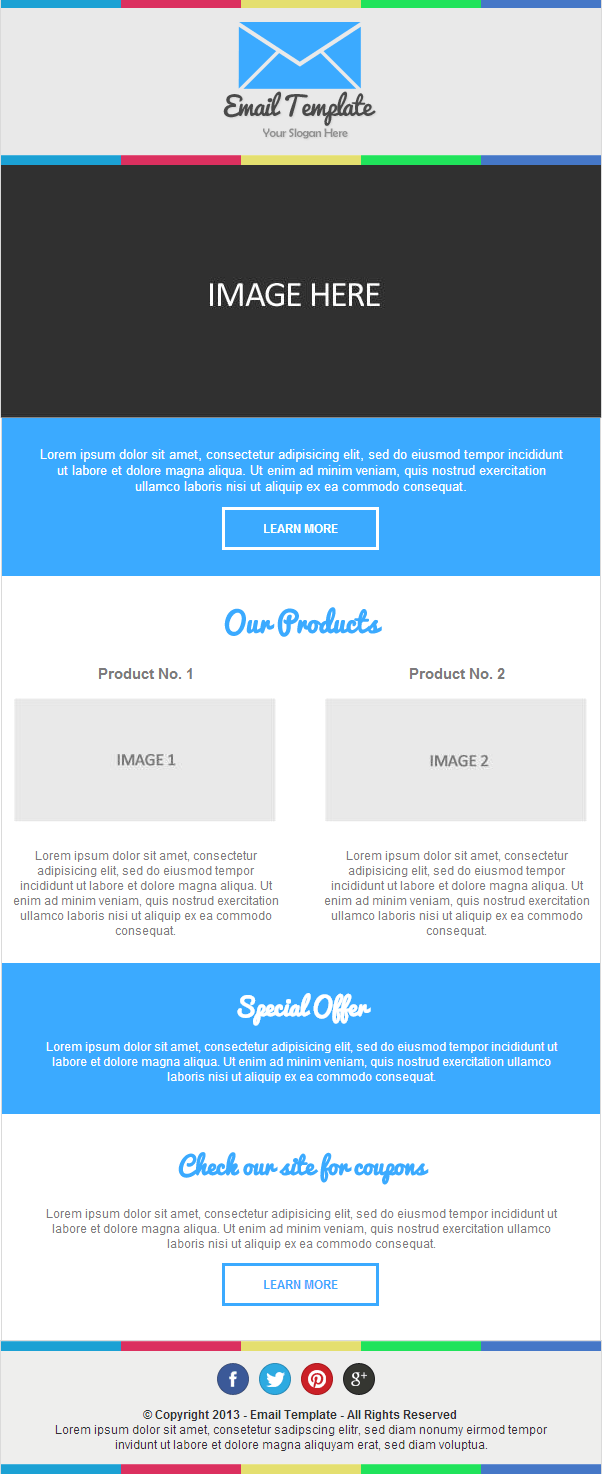
Our Final Product
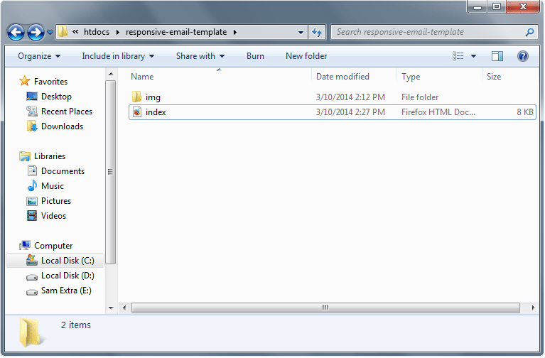
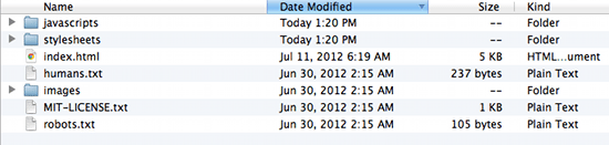
File Structure.
Our file structure will consist of an img folder and an HTML file since we will do an internal CSS this time:
- index.html – this will serve as our main file
- img folder – for our image
The Markup: Building Design in HTML
Our HTML document starts with a DOCTYPE and then followed by HEAD, TITLE and BODY section. Then, we’ll add the link to our Google fonts – “Pacifico”. We will also add the CSS later on our HEAD section. So let’s go ahead and add this to our index.html file.
<!doctype html>
<html xmlns="http://www.w3.org/1999/xhtml">
<head>
<meta http-equiv="Content-Type" content="text/html; charset=UTF-8" />
<title>Email Newsletter Template</title>
<link href='http://fonts.googleapis.com/css?family=Pacifico' rel='stylesheet' type='text/css'>
</head>
For our body tag, we will be set margins off and then we’ll put the attribute selector yahoo=”fix”.
To explain this attribute, let me give you quick information about Yahoo. According to campaignmonitor, Yahoo mail ignores media queries. To solve this, we need to use a tricky solution by using attribute selectors.
By adding a value of “fix” to the Yahoo attribute, it can give me access to the general selectors of the media queries. To learn more about this, you can check this article.
<body leftmargin="0" topmargin="0" marginwidth="0" marginheight="0" yahoo="fix>
For the layout structure, we will wrap the whole thing with a wrapper table and set the width to 100%.
<table width="100%" border="0" cellpadding="0" cellspacing="0" align="center">
Next, the header and the following table elements will be wrapped by a container with 600px table layout. We’ll put a class of border-complete and put styles on the header on our CSS code later. The basic structures of the columns and inline CSS of elements such as the background color and width will also be added.
For our table and image elements, we will also add class device Width for the responsive look. Inside our header section, we will include two divider images and a logo.
<table width="600" border="0" cellpadding="0" cellspacing="0" align="center" class="border-complete deviceWidth" bgcolor="#e9e9e9">
Now that we have our header set, let’s go ahead and add the banner image and the text markup.
For this part, we will be using the file img-banner.jpg on the resource that we provided above. The markup is just the same as the structure of the head except for the border. Instead of adding border-complete class, we will add border-lr class (this will add border on the left and right only) along with the deviceWidth class along with deviceWidth class.
<table width="600" class="border-lr deviceWidth" border="0" cellpadding="0" cellspacing="0" align="center" bgcolor="#eeeeed" >
<tr>
<td>
<a href="#"><img class="deviceWidth" src="img/img-banner.png" alt="" border="0" /></a>
</td>
</tr>
</table>
For the banner text, we will give it a height of 108px and align all texts to the center. The text will have a class of banner-txt.
<table width="600" height="108" border="0" cellpadding="0" cellspacing="0" align="center" class="border-lr deviceWidth" bgcolor="#3baaff" >
 <tr>
 <td align="center">
 <p id="banner-txt">Lorem ipsum dolor sit amet, consectetur adipisicing elit, sed do eiusmod tempor incididunt ut labore et dolore magna aliqua. Ut enim ad minim veniam, quis nostrud exercitation ullamco laboris nisi ut aliquip ex ea commodo consequat.</p>
 <a href="#" class="white-btn" align="center"> LEARN MORE</a>
 </td>
 </tr>
 </table>
For the products section, we need to align two columns. Go ahead and create two tables next to each other and give each column a 48% width. We will also add H2 and H3 tags along with their respective classes and then will later on, add the styling on our CCS codes.
<table width="600" border="0" cellpadding="0" cellspacing="0" align="center" class="border-lr deviceWidth" bgcolor="#fff">
 <tr> <td align="center"><h2 id="our-products">Our Products </h2> </td> </tr>
 <tr>
 <td class="center">
 <table width="48%" border="0" cellpadding="0" cellspacing="0" align="left" class="deviceWidth" >
 <tr>
 <td align="center">
 <h3 class="our-products">Product No. 1 </h3>
 <a href="#"><img width="262" src="img/image1.jpg" alt="" border="0" class="deviceWidth" /></a></p>
 <p class="our-products"> Lorem ipsum dolor sit amet, consectetur adipisicing elit, sed do eiusmod tempor incididunt ut labore et dolore magna aliqua. Ut enim ad minim veniam, quis nostrud exercitation ullamco laboris nisi ut aliquip ex ea commodo consequat.</p>
 </td>
 </tr>
</table>
<table width="48%" border="0" cellpadding="0" cellspacing="0" align="right" class="deviceWidth" >
 <tr>
 <td align="center">
 <h3 class="our-products">Product No. 2 </h3>
 <a href="#"><img width="262" src="img/image2.jpg" alt="" border="0" class="deviceWidth" /></a></p>
 <p class="our-products"> Lorem ipsum dolor sit amet, consectetur adipisicing elit, sed do eiusmod tempor incididunt ut labore et dolore magna aliqua. Ut enim ad minim veniam, quis nostrud exercitation ullamco laboris nisi ut aliquip ex ea commodo consequat.</p>
 </td>
 </tr>
</table>
</td>
 </tr>
 </table>
The coupons section will just have the same layout structure like the special offer section but will have their own styling classes.
<table width="600" border="0" cellpadding="0" cellspacing="0" align="center" class="border-lr deviceWidth" bgcolor="#fff" ><tr>
 <td style="text-align: center;">
 <h2 id="coupons"> Check our site for coupons </h2>
 <p id="coupons">Lorem ipsum dolor sit amet, consectetur adipisicing elit, sed do eiusmod tempor incididunt ut labore et dolore magna aliqua. Ut enim ad minim veniam, quis nostrud exercitation ullamco laboris nisi ut aliquip ex ea commodo consequat. </p>
 <a href="#" class="blue-btn" align="center"> LEARN MORE</a>
 </td>
 </tr>
 </table>
The Footer will also have the same styling like the header part so go ahead and copy the styling of the header. Inside our footer we will create another table for our social icons and give it an id of social-icons followed by another row for our copyright text. At the end of our footer we will put a closing tag to our wrapper table.
<table width="600" border="0" cellpadding="0" cellspacing="0" align="center" class="border-complete deviceWidth" bgcolor="#eeeeed" >
 <tr><td width="100%" ><img src="img/divider.png" class="deviceWidth"/> </td> </tr>
<tr>
 <td align="center" valign="top" id="socials">
 <table id="social-icons" border="0" cellspacing="0" cellpadding="0" >
 <tr>
 <td><a href="#"><img src="img/fb.png" width="32" height="32" style="display:block;"/></a></td>
 <td><a href="#"><img src="img/twitter.png" width="32" height="32" style="display:block;"/></a></td>
 <td><a href="#"><img src="img/pinterest.png" width="32" height="32" style="display:block;"/></a></td>
 <td><a href="#"><img src="img/google.png" width="32" height="32" style="display:block;"/></a></td>
</tr>
 </table></td>
 </tr>
<tr>
 <td style="text-align: center;">
 <p id="footer-txt"> <b>© Copyright 2013 - Email Template - All Rights Reserved</b> <br/>
 Lorem ipsum dolor sit amet, consetetur sadipscing elitr, sed diam nonumy eirmod tempor invidunt ut labore et dolore magna aliquyam erat, sed diam voluptua.
 </p>
 </td>
 </tr>
<tr><td width="100%" ><img src="img/divider.png" class="deviceWidth"/> </td> </tr>
 </table>
</table>
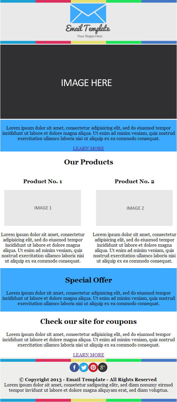
By this time, you must have something like this.
The CSS Tutorial Part
Now that we have our markup structured, we can now start adding different styles on the head section to make it look good and responsive for the desktop and mobile devices view.
Let’s first add stylings for our general elements, such as the body, image, buttons and tables. For our body elements, we will set this to 100% width for the responsive look.
For our table, we will set it to border collapse to set the tables whether the table borders are collapsed into a single border or detached as in standard HTML. Then followed by the logo and buttons, which are fairly self- explanatory.
body {
 width: 100%;
 background-color: #fff;
 margin: 0;
 padding: 0;
 -webkit-font-smoothing: antialiased;
 font-family: Georgia, Times, serif;
 }
table {
 border-collapse: collapse;
 }
td#logo {
 margin: 0 auto;
 padding: 14px 0;
 }
img {
 border: none;
 display: block;
 }
a.blue-btn {
 display: inline-block;
 margin-bottom: 34px;
 border: 3px solid #3baaff;
 padding: 11px 38px;
 font-size: 12px;
 font-family: arial;
 font-weight: 700;
 color: #3baaff;
 text-decoration: none;
 text-align: center;
 }
a.blue-btn:hover {
 background-color: #3baaff;
 color: #fff;
 }
a.white-btn {
 display: inline-block;
 margin-bottom: 30px;
 border: 3px solid #fff;
 background: transparent;
 padding: 11px 38px;
 font-size: 12px;
 font-family: arial;
 font-weight: 700;
 color: #fff;
 text-decoration: none;
 text-align: center;
 }
a.white-btn:hover {
 background-color: #fff;
 color: #3baaff;
 }
For our border, we have two classes. The first one is the border-complete class that will set all the borders (top, bottom, left, right) while the second class border-lr will only set the border for left and right.
.border-complete {
 border-top: 1px solid #dadada;
 border-left: 1px solid #dadada;
 border-right: 1px solid #dadada;
 }
.border-lr {
 border-left: 1px solid #dadada;
 border-right: 1px solid #dadada;
 }
For our elements for H2, H3, and paragraph tags, we’ll just add styling for colors, text-align and a series of padding to make them look good on the screen.
#banner-txt {
 color: #fff;
 padding: 15px 32px 0;
 font-family: arial;
 font-size: 13px;
 text-align: center;
 }
h2#our-products {
 font-family: Pacifico;
 margin: 23px auto 5px;
 font-size: 27px;
 color: #3baaff;
 }
h3.our-products {
 font-family: arial;
 font-size: 15px;
 color: #7c7b7b;
 }
p.our-products {
 text-align: center;
 font-family: arial;
 color: #7c7b7b;
 font-size: 12px;
 padding: 10px 10px 24px;
 }
h2.special {
 margin: 0;
 color: #fff;
 color: #fff;
 font-family: Pacifico;
 padding: 15px 32px 0;
 }
p.special {
 color: #fff;
 font-size: 12px;
 color: #fff;
 text-align: center;
 font-family: arial;
 padding: 0 32px 10px;
 }
h2#coupons {
 color: #3baaff;
 text-align: center;
 font-family: Pacifico;
 margin-top: 30px;
 }
p#coupons {
 color: #7c7b7b;
 text-align: center;
 font-size: 12px;
 text-align: center;
 font-family: arial;
 padding: 0 32px;
 }
For our footer, we will style our social icons and give it a width of 28%. The text will have a padding and an Arial font face.
#socials {
padding-top: 12px;
 }
p#footer-txt {
 text-align: center;
 color: #303032;
 font-family: arial;
 font-size: 12px;
 padding: 0 32px;
 }
#social-icons {
 width: 28%;
 }
By this time, you already have the same perfect look just like the PSD design.
Using Media Queries for the Responsive Look
To make our email template responsive, we will start adding some media queries for smaller devices. This is a technique to make HTML and CSS respond to the device width of the browser. So to do this, add the following code.
@media only screen and max-width 640px {
 body[yahoo] .deviceWidth {
 width: 440px !important;
 padding: 0;
 }
body[yahoo] .center {
 text-align: center !important;
 }
#social-icons {
 width: 40%;
 }
}
@media only screen and max-width 479px {
 body[yahoo] .deviceWidth {
 width: 280px !important;
 padding: 0;
 }
body[yahoo] .center {
 text-align: center !important;
 }
#social-icons {
 width: 60%;
 }
}
On this code, we use the Yahoo attribute that we put on the body tag to let us use media queries on Yahoo mail. On a 640px viewport, we will set the class deviceWidth to 440px and set the social media icons with by 40%. While on the 479px viewport, we’ll set the class deviceWidth to 479px and set the social icons to 60% width.
Final Thoughts
Congratulations! You now have the idea how to optimize emails for mobile devices. Hope you enjoyed all of these responsive website design tutorials and please free to post you comments and suggestions below. Cheers!


No Comments