


 |
| Official Google Web Fonts |
We’re share a hand picked fonts which are used by different professional designers and top most websites & blogs. These fonts are totally awesome and beautiful. These fonts change your blog looks and user points of views.It’s create healthy environments for blog readers.
Sites such as Font Squirrel are helpful, not to mention the free-to-use Google Web Fonts service and Adobe Edge Web Fonts. Powered by Typekit, this supplements the GWF library with several of Adobe’s own open source web fonts and integrates neatly with Edge and Muse. But here is our selection of the best around.
Here is list of most popular google fonts and grab your favourite font for your blog.
Most Popular Google web fonts list
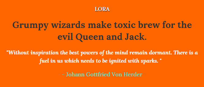
Lora
Lora is a well-balanced contemporary serif with roots in calligraphy. It is a text typeface with moderate contrast well suited for body text.
A paragraph set in Lora will make a memorable appearance because of its brushed curves in contrast with driving serifs. The overall typographic voice of Lora perfectly conveys the mood of a modern-day story, or an art essay.
Technically Lora is optimised for screen appearance, and works equally well in print.
<link href=’http://fonts.googleapis.com/css?family=Lora:400,700,400italic,700italic&subset=latin,latin-ext,cyrillic’ rel=’stylesheet’ type=’text/css’>
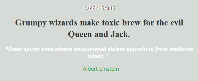
Open Sans
Open Sans is a humanist sans serif typeface designed by Steve Matteson, Type Director of Ascender Corp. This version contains the complete 897 character set, which includes the standard ISO Latin 1, Latin CE, Greek and Cyrillic character sets. Open Sans was designed with an upright stress, open forms and a neutral, yet friendly appearance. It was optimized for print, web, and mobile interfaces, and has excellent legibility characteristics in its letterforms.
<link href=’http://fonts.googleapis.com/css?family=Open+Sans:300italic,400italic,600italic,700italic,800italic,400,300,600,700,800&subset=latin,cyrillic-ext,latin-ext,cyrillic,greek-ext,greek,vietnamese’ rel=’stylesheet’ type=’text/css’>
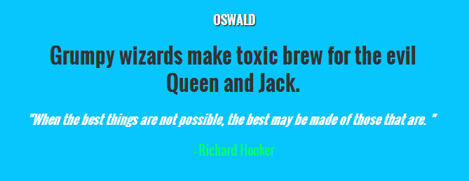
Oswald
Oswald is a reworking of the classic style historically represented by the ‘Alternate Gothic’ sans serif typefaces. The characters of Oswald have been re-drawn and reformed to better fit the pixel grid of standard digital screens. Oswald is designed to be used freely across the internet by web browsers on desktop computers, laptops and mobile devices.
<link href=’http://fonts.googleapis.com/css?family=Oswald:400,300,700&subset=latin,latin-ext’ rel=’stylesheet’ type=’text/css’>
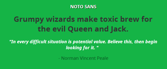
Noto Sans
Noto helps to make the web more beautiful across platforms for all languages. Currently, Noto covers over 30 scripts, and will cover all of Unicode in the future. This is the Sans Latin, Greek and Cyrillic family. It has Regular, Bold, Italic and Bold Italic styles and is hinted. It is derived from Droid, and like Droid it has a serif sister family, Noto Serif.
<link href=’http://fonts.googleapis.com/css?family=Noto+Sans:400,700,400italic,700italic&subset=latin,cyrillic-ext,latin-ext,cyrillic,greek-ext,greek,devanagari,vietnamese’ rel=’stylesheet’ type=’text/css’>
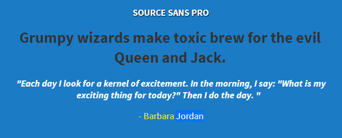
Source Sans Pro
Source® Sans Pro, Adobe’s first open source typeface family, was designed by Paul D. Hunt. It is a sans serif typeface intended to work well in user interfaces.
<link href=’http://fonts.googleapis.com/css?family=Source+Sans+Pro:200,300,400,600,700,900,200italic,300italic,400italic,600italic,700italic,900italic&subset=latin,vietnamese,latin-ext’ rel=’stylesheet’ type=’text/css’>
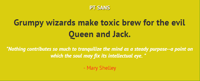
PT Sans
PT Sans is based on Russian sans serif types of the second part of the 20th century, but at the same time has distinctive features of contemporary humanistic designs. The family consists of 8 styles: 4 basic styles, 2 captions styles for small sizes, and 2 narrows styles for economic type setting.
<link href=’http://fonts.googleapis.com/css?family=PT+Sans:400,700,400italic,700italic&subset=latin,cyrillic-ext’ rel=’stylesheet’ type=’text/css’>
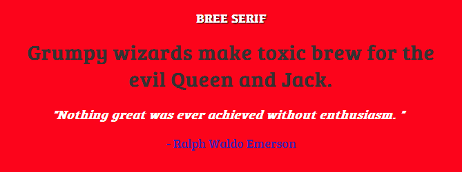
Bree Serif
This friendly upright italic is the serif cousin of TypeTogether’s award winning font Bree. Designed by Veronika Burian and José Scaglione, Bree was originally released in 2008 and it became an immediate success because of its originality, charming appearance and versatility. The new serif style adds some extra flavour to this tasty font.
<link href=’http://fonts.googleapis.com/css?family=Bree+Serif’ rel=’stylesheet’ type=’text/css’>
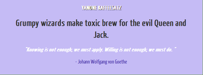
Yanone Kaffeesatz
“Yanone Kaffeesatz” was first published in 2004 and is Yanone’s first ever finished typeface. Its Bold is reminiscent of 1920s coffee house typography, while the rather thin fonts bridge the gap to present times. Lacking self confidence and knowledge about the type scene, Yanone decided to publish the family for free under a Creative Commons License.
<link href=’http://fonts.googleapis.com/css?family=Yanone+Kaffeesatz’ rel=’stylesheet’ type=’text/css’>
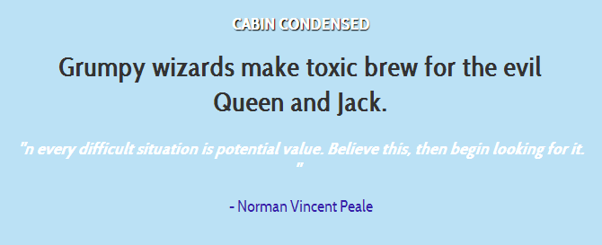
Cabin Condensed
This is the condensed set of styles in the Cabin font family; a humanist sans with 4 weights plus true italics, inspired by Edward Johnston’s and Eric Gill’s typefaces, with a touch of modernism.
Cabin incorporates modern proportions, optical adjustments, and some elements of the geometric sans.
<link href=’http://fonts.googleapis.com/css?family=Cabin+Condensed’ rel=’stylesheet’ type=’text/css’>
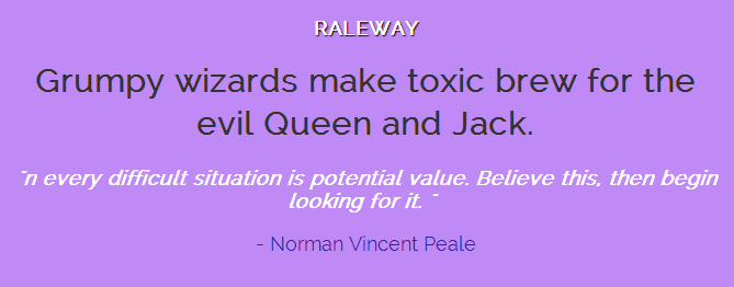
RALEWAY
Raleway is an elegant sans-serif typeface family. Initially designed by Matt McInerney as a single thin weight, it was expanded into a 9 weight family by Pablo Impallari and Rodrigo Fuenzalida in 2012 and iKerned by Igino Marini.
<link href=’http://fonts.googleapis.com/css?family=Raleway’ rel=’stylesheet’ type=’text/css’>
Hopefully you will be enjoy this post and share on social media!


No Comments