Choosing the best colors for websites you design is crucial for your online success. Regardless, whether or not content is king, this is something that is just as important!
The book’s cover counts too…
I know, I know, everyone likes to say don’t judge a book by its cover, but how else are you planning to grab someone’s attention other than with a fancy cover?
Obviously, once you have someone’s attention, you can leave the rest to content. It’s all about web design colours and how you manipulate them.
To find out your real opinion of someone, judge the impression you have when you first see a letter from them.
-Philosopher Arthur Schopenhauer
Table of Content:
- You Make a First Impression Only Once
- Right Website Colors Stimulate Human Senses
- A Guide To Improve Your Website’s Readability Through Colors
- Color Chronicles
You Make a First Impression Only Once, So Choose Best Colors For Websites You Design
There is always a one particular step you would like your website’s visitors to take. It is a step you are always concentrating on the most. It could be your subscribe button, it could be the follow button, or even the buy button.
Whatever that call-to-action button is, always remember that whether people will click on it or not depends on how you make them feel while they are on your website.
Read on, to find out about the five most popular colours used in web design to always leave your website’s visitors warmly welcomed, deeply engaged and even irresistibly intrigued.
1. Pinterest has Pinned Loads of Red
Without a doubt red is considered the hottest colour. If you check out Pinterest’s colour palette, you will notice straight away that red is their primary colour.
Red, often associated with love, is such a strong and dynamic colour that it can make you feel very passionate about anything positioned closely around this colour.
This colour is often seen in clearance and sales promotions, as its intensity creates a feeling of urgency.
Even though this intensive colour can leave your visitors excited and encouraged, always be careful. Too much red can turn them off at once.
Use red in your colour scheme just to accent your web design. Blend it in a colour mix of white, grey, light blue or silver.
This Is How You Should Use Red

I Bet You Did Not Know
The human eye sees red when it looks at light with a wavelength between 630 and 700 nanometers.
Light just past this range is called infrared, or below red, and cannot be seen by human eyes, although it can be sensed as heat.
Great Use of Red Colour Palette by jimjim421

10 Associations With Red
- Blood
- War
- Fire
- Masculinity
- Passion
- Seduction
- Anger
- Force
- Energy
- Courage
Red Coordinates
Hex Triplet: #FF0000
RGB: (255, 0, 0)
2. Amazon Loves the Strength of Orange

Orange is warm and energizing, but not as intense as red. Orange feels more warm than hot.
Full of energy, this vibrant and friendly colour invites people to do something, rather than making them feel pushed or forced to do so with urgency.
Orange is sometimes considered aggressive, in the way it encourages a call to action, like buy, subscribe, sell or follow.
I recommend using orange if after visiting your website you want to leave someone feeling stimulated, cheerful, creative, and full of enthusiasm.
This is how You should use Orange

I Bet You Did Not Know
Web colour orange, defined as FFA500, is the only named colour defined in CSS that is not also defined in HTML 4.01.
Great Use Of Orange Colour Palette by manekineko

10 Associations With Orange
- Optimism
- Determination
- Fire
- Warning
- Autumn
- Religions
- Endurance
- Compassion
- Halloween
- Organism
Orange Coordinates
Hex Triplet: #FF7F00
RGB: (255, 127, 0)
3. Facebook’s Blue Makes Us Feel Safe

You will find many business and corporate websites use blue tones. This colour makes us think about something secure, safe, dependant and full of experience.
Therefore, it doesn’t come as a surprise that every business who cares how they leave their customers feeling in the long term prefers to use blue.
Blue creates completely opposite feelings to red. Blue calms us down and you should not be worried about using too much. You can easily splash blue all over your web design.
This is how You Should use Blue

I Bet You Did Not Know
A survey taken in Germany and published in 2009 found that blue was the favourite colour of 46 percent of male respondents and 44 percent of women.
Great Use Of Blue Colour Palette by entitydesigns

10 Associations With Blue
- Trueness
- Friendliness
- Magic
- Boys
- Ice
- Royalty
- Winter
- Police
- Sky
- Water
Blue Coordinates
Hex Triplet: #0000FF
RGB: (0, 0, 255)
4. Groupon has Some Green Collective Power

Feeling very optimistic right now? Let me guess – You have been looking at something that is green? Maybe it was just a green plant you were looking at, as that would definitely calm you down and make you feel optimistic.
Anyone who is associated with green living or environmental movements will more likely use green at least in some part of their design process.
Have a look at a $100 bill. It is green! Websites like Groupon have a lot of green in their brand, as they are directly dealing with money.
Green is very refreshing and relaxing, leaving people with a feeling balanced and inspired. It represents balance and harmony in a design
This Is How You Should Use Green Color

I Bet You Did Not Know
In some languages, including old Chinese, Thai, old Japanese, and Vietnamese, the same word can mean either blue or green. There is no natural source for green food colorings which has been approved by the US Food and Drug Administration.
Great Use Of Green Colour Palette by Skybluue2u

10 Associations With Green
- Money
- Greed
- Growth
- Envy
- Nature
- Spring
- Health
- Youth
- Grass
- Hope
Green Coordinates
Hex Triplet: #00FF00
RGB: (0, 255, 0)
5. Yahoo! Splashes a Lot of Purple on their Logo

Purple is very often described using words like imagination, creativity, dignity, nobility and abundance. Stronger shades of purple are more related to spring and romance, whereas darker ones are associated with luxury and wealth.
Purple is used in a variety of beauty, fashion and lingerie products, because purple calms and soothes more than any other colour.
It is also considered to be more feminine and romantic than masculine. When looking at anything purple, many people feel that it appears to be artificial, because of the fact that this colour can be found in nature very rarely.
Just like red, people can find purple too strong and overpowering, making them feel forced, or pushed, to take a certain action. So it would be very wise to pair purple with other colours like black or white.
This Is How You Should Use Purple Color

I Bet You Did Not Know
In April 2007 it was suggested that early archaea may have used retinal, a purple pigment, instead of chlorophyll, to extract energy from the sun. If so, large areas of the ocean and shoreline would have been colored purple; this is called the Purple Earth hypothesis.
Great Use Of Purple Colour Palette by Miaka

10 Associations With Purple
- Wealth
- Royalty
- Nobility
- Sophistication
- Romance
- Artificial
- Exotic
- Spirituality
- Luxury
- Feminine
Purple Coordinates
Hex Triplet: #800080
RGB: (128, 0, 128)
I THINK YOU DESERVE A BONUS!
No! I am sure you deserve a bonus – So here is my list’s number 6 for You! 😉
6. 1WD’s Clever use of Monochromatic Colours

Usually monochromatic colours like white, black, dark grey and light grey should be used as a backdrop in designs with already established brighter and stronger accent colours.
Take a look at our website, 1stwebdesigner – 1WD. We use a little bit of orange as it’s a strong and bright accent colour – but only in a good combination with dark grey and light grey. And white, of course (what colour is our website’s background?)
Just like birds will always fly, black will always represent modernity, mysteriousness, elegance and power. Whereas grey is a neutral color, representing something very calm and invisible, like shadows.
If grey can sometimes look dirty, then white will create the opposite effect. White represents cleanliness openness, simplicity and minimalism.
This Is How You Should Use Monochromatic Color

I Bet You Did Not Know
In digital photography, monochrome is the capture of only shades of black by the sensor, or by post-processing a color image to present only the perceived brightness by combining the values of multiple channels.
Great Use Of Monochromatic Colour Palette by munsteri

10 Associations With Monochromatic
- Power
- Elegance
- Space
- Softness
- Heaven
- Peace
- Innocence
- Pessimism
- Depression
- Boredom
Monochromatic Coordinates
Black:
Hex Triplet: #000000
RGB: (0, 0, 0)
Gray:
Hex Triplet: #808080
RGB: (128, 128, 128)
White:
Hex Triplet: #FFFFFF
RGB: (255, 255, 255)
What Is Your Favourite Colour?
How does your favourite colour make you feel? We have look at top 5 colors. Now let’s see what colors do to our human senses and how colors can be mixed in a website color sheme.
Right Website Colors Stimulate Human Senses
Colors can stimulate and excite people, increase their appetite, make them feel warm or make them feel tranquil. More about this in this section. There are also some great examples to inspire you.
Red simply makes you excited according to those who study chromodynamics. Coke’s website is red – it gives you a feel of a lazy, hot summer day – just when you feel the need to drink Coke.
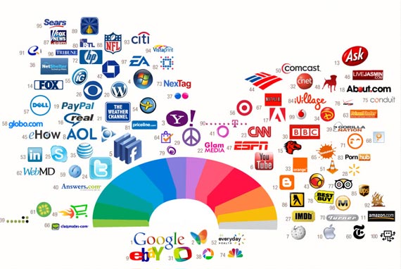
Image Source: StockLogos
There’s more to colors in web design than just the emotional factor. People tend to gamble more under red light conditions than under blue light. This is the main reason behind cities like Las Vegas using a lot of red lights. Colors have impact on performance. Red lights make people act quicker and feel more powerful, which is not always beneficial, while blue makes people think more before acting. There is a reason STOP signs are red – you need to act right away and stop the vehicle you drive, otherwise you are in danger.
Mixing Colors
Mixing colors is beneficial if done the right way. Mixing very complementary colors is also something people do, but it should only be done occasionally. It shouldn’t be overdone because it has a bad effect on people’s eyes. You can think of a black website with pink text. Now that’s an image I would like to get out of my head as soon as possible :).
There is a very good trick behind using complementary colors together. Drawing a thin neutral white, gray or black line around the two colored shapes will make the eyes see both colors separately. Just look at the Pepsi logo below: red and blue are separated by not only a thin layer of white, but by a quite big one. This white shape blends red and blue better then if they would be placed right on top of each other.

Image source: Pepsi
Colors and Cultures
Moreover, colors mean something else in different parts of the world. While red means luck in China, it means a lack of it in Germany. Huge corporations with lots of financial resources will use large amounts of money to study the effects different colors have on different cultures, before entering a new market. Many think it is impossible, but clients can be lost because of using the wrong colors.
And while huge corporations usually hire experts to do this research for them, the results are not always good. Every designer (and every person in general) has a tendency to like colors or combinations of colors and to use them in different situations because it’s what they personally like. I myself love red and black together, pretty obviously because I’ve been supporting Italian outfit A.C. Milan for almost ten years now. This is not such a good asset when working with colors is your way of earning a salary. It is crucially important for designers to tear all their personal favorites apart and only focus on the clients and their needs.
Colors for a Website
Picking a color for a website means much more then picking your favorite color and turning it into a layout. It means picking the right color in order to get the desired response from your audience. If you know your audience well and figured out which color works best for them, you are already halfway there in the creation process. It is also quite unlikely to pick a color that will fit every visitor of your website, therefore it is even more important to be able to determine which color and tone works best for most users you target.

According to different sources, half of the people visiting a website don’t come back because of the color of the design. The first thing people need to recognize when they see your site are the brand colors. If you have multiple colors and they can’t see the most dominant, it means you should consider a redesign.
- If you have a blue color scheme, people will likely give you a better response when in a good mood. If you want a clean, white design, it’s fine too. But if you want to make it exciting, use bright red or orange here and there. White and green work great together, and if you want to be stylish and modern without using intense colors, go for white and gray. Such a combination illustrates something glamorous, sleek, fresh and clean. Just look at the classy example below.
- If you like darker shades, pretty much everything works well with black as long as black is not the dominant color. A website with a black background can be fancy and look good, but is not easy to read. The two simplest combinations you can go for are black and white or black and a bright gray. Although a very powerful contrast, black and orange work really well together, but might require white for balance.
- If you want to combine both black and white with a color, then they work really well with blue; make sure white is dominant, otherwise you need a very bright blue to dominate. Don’t give black a lot of emphasis in this combination. You can see a good example below. The second example is quite poor and shows how this combination can be put into practice. Not only is the design outdated, but the colors make it even more difficult to bear.

- Black and white work very well with red too, but make sure red is not dominant, as then it gets too powerful and creates an unbearable contrast with black. You can see two good examples below.
- A third combination I would recommend is black, white and green, and you can see down below why.

Image source: Website Templates Online
Okay, we have gone trough the suitable colors for websites schemes and how to mix them. Did you ever consider that colors can also contribute to readability of your website? No. Then you are going to love the next section.
A Guide To Improve Your Website’s Readability Through Colors
Colors exist not only to make your site look pretty. Colors have a more important function – to make your site usable. This is why a designer must always think of readability first and beauty second when choosing the colors for a site. We will also talk about tools to use, so stay tuned.
When you think about the number of available colors, it looks easy to pick a bunch of them that go well together and are readable. If you stick with classic background colors, such as white (FFFFFF), or very light gray (F5F5F5, FAFAFA, FCFCFC, etc.) and foreground colors such as black (000000), or very dark gray (080808, 050505, 030303, etc.), or the lightest/darkest pair of the main color (i.e. red, green, blue or whatever color you are using) on your site you might wonder why readability is an issue at all. However, sooner or later you will get fed up with these classic combinations everybody is using and you will want something fancier.
This is where your problems start. These fancier combinations might be pleasing esthetically but in terms of readability they are not necessarily winners. Of course, nobody says it is impossible to find good combinations outside the group of frequently used ones. With the right tools I will mention in this article finding colors with good readability becomes much easier. However, before we go to the tools, let’s review some of the basics of colors and readability.
Color brightness is determined by the following formula:
((Red value X 299) + (Green value X 587) + (Blue value X 114)) / 1000
Note: This algorithm is taken from a formula for converting RGB values to YIQ values. This brightness value gives a perceived brightness for a color.
Color difference is determined by the following formula:
(maximum (Red value 1, Red value 2) – minimum (Red value 1, Red value 2)) + (maximum (Green value 1, Green value 2) – minimum (Green value 1, Green value 2)) + (maximum (Blue value 1, Blue value 2) – minimum (Blue value 1, Blue value 2))
The rage for color brightness difference is 125. The range for color difference is 500.”
These formulas might look pretty cryptic and hard to understand but when you use a tool that calculates the values for you, for instance the Colour Text Legibility tool, or the Colour Contrast tool, you easily get an answer if the colors you have chosen pass the test or not.

However, unless you feel like reinventing the wheel and hunting for color combinations with good brightness and difference, you can stick to the safe choices that have already been developed for you, such as dark text on a light background.
The Golden Classics: Dark Text on a Light Background
All equal, dark text on a light background provides the best readability. Of course, it depends on which colors you choose but the highest readability ratio is achieved when you use black on white:
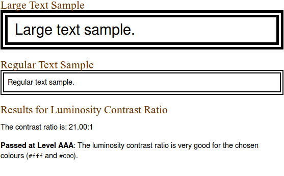
Black on White
As you see from the screenshot above, readability varies depending on the font size (and obviously the font itself) and a good tool will tell you if the combination you have chosen is good for titles only or for both titles and body text. Generally, the larger the font size, the more readable it is. Don’t count on this too much because as you know, for body text 10-14 is the most used size (i.e. is relatively small), which means that for body texts you won’t be able to use a color that is readable for titles.
Black on white isn’t the only great combination. If you want to see more examples of excellent to good contrast when you use white as a background color, check the first table in this article.
White backgrounds are pretty common but sometimes you will want more color. For instance, some very pale shades of red, green, yellow, blue, etc. make great backgrounds when used with black or another very dark foreground color. These combinations are not as readable as when you use black but still the ratio is good. Here are some examples of combinations where the background color is different from white and the foreground color is different from black:
For Differing Background and Foreground
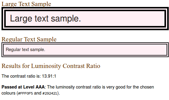
Ivoryblack (#292421) on lavenderblush1 (#FFF0F5)
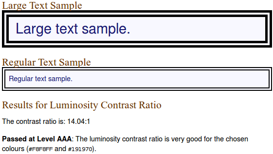
Midnight blue (#191970) on ghostwhite (#F8F8FF)
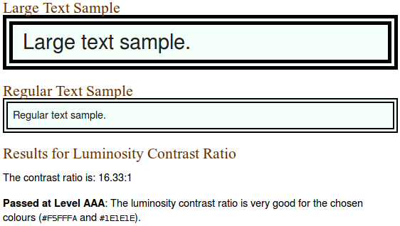
Sgi gray 12 (#1E1E1E) on mintcream (#F5FFFA)
One small trick many designers use to make a page more readable (and more pleasing to the eye, too) is to employ gradients for background. A gradient of white and a very pale shade of any other color works best. Well, you can’t measure its brightness and contrast using the readability formulas but if the two colors that constitute the gradient separately have good readability values, when combined, the result is even better.
The Intricacies of Dark Background
Dark backgrounds can be very depressing – not only because dark colors are traditionally related to bad things in life, at least in the Western cultures but also because they are a lot of pain to choose a readable foreground color to go with.
The problem comes from the fact that even if your contrast values are good, this doesn’t make it easier to read the text. White on black might have the best ratio but it causes eye fatigue pretty soon. As Pabini Gabriel-Petit writes, “On a black background, the high-chroma colors yellow (#FFFF00), green (#00FF00), cyan (#00FFFF), and magenta (#FF00FF) provide the best contrast.”
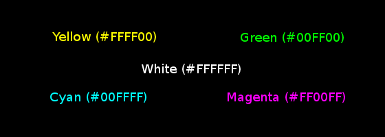
Dark Background Choices
If these color combinations, no matter how readable they are supposed to be, give you the feeling you are back in the 80s or early 90s when monitors were green and the text was orange, you are not alone. I have never used such an antique monitor, so I am not able to tell from experience but always when I land on a site with a dark background and light text I have to read, I get the feeling it is a time machine that takes me back two or three decades ago and my eyes are the first to object.
OK, dark backgrounds might be cute but when I have to read a 2,000+ word article (and the comments under it), this makes me cry – literally! Some sites that care about their users (and their users’ eyes) provide ways to switch colors, so if you don’t like the default dark background, you are not forced to watch it. Additionally, there are many ways to override the default colors a site uses but I’d rather visit sites that use readable color schemes than spend my time fine tuning the colors.
Probably I go to extremes, but I will personally never recommend to use a dark background with light font for sites with lot of text to read – I feel this is a usability sin #1. For other types of sites – i.e. image galleries, or even corporate sites where there aren’t 1,000+ word texts, dark backgrounds aren’t a no-no.
Those Tricky Colors That Fit Nowhere
After I discussed the two most common scenarios – i.e. dark on light and light on dark, the only thing left is to discuss all the other color combinations you can think of. These color combinations include the majority of colors but for one reason or another, you can use them neither for background, nor for text color because no matter how masterfully you combine them, either the contrast is low, or the combinations aren’t esthetically pleasing (or both).
Of course, this doesn’t mean these colors are useless. Not at all – they are great for headings, especially with larger font sizes, and for emphasis, as seen from the next examples:
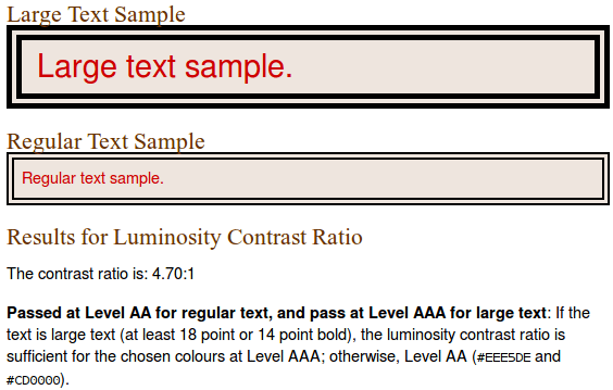
Red 3 (#CD0000) on seashell2 (#EEE5DE)
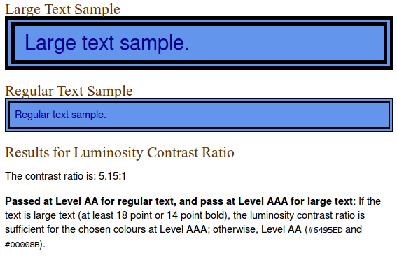
Blue 4 (#00008B) on cornflowerblue (#6495ED)
Colors have a huge effect on readability. This is why you need to choose them wisely so that they not only create esthetically pleasing combinations but also make it easier for users to read the text. Text is an integral part of any site and we shouldn’t punish visitors for coming to our site by using hard to read color combinations. This is where we are going to show you some great examples of websites that uses bold color combinations to catch viewer’s attention.
Be Inspired with These Bold Colored Websites
Big and Bold – one of the growing means nowadays to catch the viewers’ attention. Bold colored websites are fast becoming a trend because of its ability to catch the attention of the readers due to their size and boldness.
How do designers achieve this? In the present trends, if you want to make a blindingly unforgettable statement, you need a few things:
- A saturated color scheme which is bright enough to catch one’s interest without blinding him or her
- An awesome and probably mind-blowing image (a photograph or a graphic illustration)
- A uniquely remarkable tagline.
Those, however, are not easily achieved. To attain a beautiful, bold color design, you need to think it through. You also need some design skills and a great deal of guts.
Because there is no single general rule in choosing colors for your design, I will just lend you some inspiration! This is to help you exercise your creative muscles because colors, as discussed in a lot of design blogs, are important to web design.
So, to cut the chase, I present you the examples of beautifully done bold color scheming designs. I hope that it will somehow shed us some inspiration on how to use these colors effectively.
Abby Putinski
andCulture
Artem and Julia Wedding
BarCamp Omaha
Caramel Budgie
Collision Labs
Connect Mania
Dangers of Fracking
Dear Mum
do a backflip
Dropify
Verde
Every Last Drop
Flow Media
Gloo Sticker Albums
Gum
Hy
jorgeATGU
Kick My Habits
Lets Yep!
Netlife
Nineswiss
Pixilate
Rainbow Nursery
Sailthru 2012 Annual Report
Sánchez Romero Carvajal
Squarespace
Studio MPLS
Tapped
The Basement
The Design Files Open House
Think Big
Tornobambino
TriplAgent
WDG
Will Fernandes

Xylem Digital
YCN Studio
Bold and big, these websites are genuine examples of designs that focus on the subtle and little things: colors, fonts and placement. These little things result into drastic effects in a design. Yes, this is a dangerous move for a designer. It might even result into the viewer being too shocked because of the bold colors, but the designers took the risk and look what they have gotten! You have seen now a lot of color combinations and bold websites. As we want you to get as much as possible out of this color orientated article we are going to focus on some blue color combination in the next section.
Color Chronicles
This section will be about some great colors that can really fire up your website. We are including a brief description of every color included and some of great pallets that you can use.
Brilliant Blue
Blue is one of the three primary colours and as such is also part of the chromatic spectrum. It is a cool color which covers a relatively wide area of the spectrum, ranging from cyan to a more violet tint. It also meant trust and is widely used for government like website designs.
Characteristics
According to its proper theory, blues are considered far colours, meaning that they seem to expand whatever shape they fill; a room, for example, will seem larger if painted blue, rather than yellow or orange.
It is easily perceivable by the human eye, given that blue colours present a wavelength between 440 and 490 nm. All three types of photosensitive cells respond to this range, albeit to varying degrees. On the other hand, the inclusive nature of the name means that some shades are (literally) easier on the eyes than others. Nevertheless, blue is a common sight in top favourites.
Symbolism
Although present in living beings (mushrooms and frogs, for instance), generally it has more inorganic and abstract associations.
One of these is the sky. Light tones give a sense of open space and freedom, an overall calming effect. Using light blue backgrounds in web design can make a site look friendlier, but large backgrounds have the risk of becoming dull. To avoid this, take inspiration from nature: the sky is much more appealing when the Sun creates a sort of gradient, rather than when it’s more or less one solid colour.
Next is the sea (or water in general). As a symbol of life and vitality, it also represents versatility; you can find it nearly everywhere, filling different shapes in different states. Although it is colourless in small quantities, in reality water has a slight blue tint that becomes more obvious in large quantities. While the image of a still body of water can be considered peaceful, remember that it can just as easily turn into a source of turbulence.
Blue is also a powerful corporate colour because of its association with stability and confidence. This is also why many IT companies prefer to use it in their visual identity, trying to combat the (to a certain degree) volatile nature of technology. Of course this all depends on the company’s philosophy, profile and desired image, but reliability seems to be the most wide-spread.
Some of the more negative associations are cold and melancholy. Less saturated shades remind of murky skies on cold days, while brighter shades closer to cyan have a frostier feel to them. Also, save for eye colours, the presence of blue on the human body is an indication of something wrong. This can be both physical and mental, hence the expression “feeling blue”.
Combinations
Bright, electric shades of blue create a fantastic effect when combined with dark, ash brown. Although it dominates and gives the overall composition a cool feel, at the same time it manages to generate energy. It works well with dark metallic colours as well.
Together with teal or mint green it creates a natural, watery scheme that is also very fresh and inviting. Of course, there must be some balance and hierarchy between the two colours; otherwise they will compete with each other if they have the same intensity.
Using blue for less important details in orange or yellow schemes can cool down the design and take away some of the glare. While traditionally, orange is blue’s complementary, combinations with yellow will have roughly the same effect.
Palettes
01. Complementary blue by tudor.girba
02. Swimming Sports by julievonderropp
03. Sunny Shores by twinklebunnytoes
04. Sea Foam by louisan
05. Lilac Bathroom by nightzdragonz
06. Leviathan by matthepworth
07. Bleu Blanc Rouge by kuler
08. blueberry pie by elsabartley
09. Nautical Cruise by thecolorcat
10. Giant Attack Robot by stevereed.m
Make Everyone Jealous with Green Themes
Green is a complementary colour that results from the combination of yellow and blue, taking on many of the latter’s characteristics while still retaining its own features and symbology. Interestingly, in many languages, the name itself has its roots in words describing growth, freshness, youth and grass
Characteristics
Green is a tranquil and peaceful colour with soothing properties. The word which best captures its essence is “balance”; neither too warm, nor too cool, calming but still vibrant, easy yet not too easy to perceive. Although present in minerals (emeralds, for example), it is mostly an organic colour.
Studies suggest that the colour improves the ability to concentrate and aids in reading comprehension. In Denmark, during exams, the desks are covered with green tablecloths to help the students focus and to try to relieve some of the stress.
Although no longer accurate, the term “green room” comes from the fact that the waiting room was literally painted green. It was said to relax the performers’ eyes before they would have to face the lights on stage.
Symbolism
Naturally, it represents everything organic, especially the plant world. Now it has become the number one colour for the environment and causes dedicated to preserving or saving it; it has also extended to eco-friendly products and services (the term “green energy” comes to mind).
Going deeper into the topic, it is a symbol of life and fertility. This can come either from the more obvious source of green (plant life) or from water which can occasionally take on greenish shades. Through extension, it can be a symbol of new beginnings, just as tiny sprouts on dark soil let us know that spring is on its way. Saying that someone is “green” means that they are new or inexperienced.
On the other hand, it can also represent the exact opposite: illness, death and decay. It is probably an analogy to the fact that anything green and visible on the human body is toxic, therefore a sign of sickness. Green mold is also a sign of decay.
There are also some figurative associations, such as luck or envy. A four leaf clover traditionally brings good luck and is presumably the source of the connection. The ancient Greeks believed that envy was caused by excessive bile which would normally give a person a pale green complexion.
Combinations
As mentioned in the previous article, its complementary is red and the theoretically ideal proportion is 50-50. However, the pair should be used in less vibrant shades and as accents rather than main elements in order to avoid a Christmas feeling. Another way would be to use orange instead of red.
For an earthy mood, brown is the obvious choice. Darker and less saturated versions of both give a more somber feeling; keeping the dark brown but coupling it with a vibrant (but not default RBG!) green allows you to place emphasis on elements without adding too much glare.
Blue and a more bluish green make for a nice watery combination, but like with red, a proper hierarchy should be used. Using just the two will make the visuals hard on the eyes and you definitely don’t want that! Both of them work great with dark grays and provide great contrast and emphasis.
Palettes
01. Botany Greens by julievonderropp
02. Freshaliciousness by whoneycutt
03. After Vacation by whoneycutt
04. Peachy Green by books4me22000
05. Lime Light and Shady by whoneycutt
06. Elderberry by julievanderropp
07. Vintage Light by nlarroyo1
08. Green Accent by reinderdevries
09. Lettuce carrots and cucumbers by mohdakram12
10. Turtle by rbb2008
Set Your Website on Fire with Red Color
Red is part of the primary triad, but it is also on the opposite side in a few senses. Unlike blue, its name is much less tolerant and only a few colours have the luxury of being included in the category. The exclusiveness is present at a biological level, as well: only one of the three types of receptor cells is truly sensitive to the wavelengths characterising red. If you really think about it, just slightly tinting something red will most probably warrant a different name.
Characteristics
Being a warm colour, it tends to be more invasive and will make a room appear to be smaller than it actually is, but when used well and in darker forms, it can lend itself to a cozier environment.
As mentioned, red is somewhat more difficult to perceive and this is because it has the highest of wavelengths. As its wavelength increases, it also nears the edge of what is called infrared, which cannot be perceived by the naked eye.
Colour therapy suggests that exposure to red raises the blood pressure, thus having an invigorating effect. Without going too much into the subject, Eastern philosophy associates red with the adrenal glands and, by extension, with the emotions produced by increased adrenaline.
Symbolism
Naturally, the things associated with it vary with every culture, but there are some general symbols with which we can all agree. In no particular order, these include heat, fire, passion, courage, danger, love and energy.
It is a very human colour which is why it has emotions associated to it. Demanding activities, whether mental or physical, and strong emotional responses imply increased blood flow therefore creating a very straightforward connection with red: blood.
Delving deeper into the human aspect, warmth and energy can be derived. Strangely, the general idea of flames being red has long been rooted, even though orange would be more appropriate. Perhaps it’s because it triggers much stronger feelings which are better represented by fire and we also tend to remember and associate extremes. Warmth and heat also suggest life, but from an inner perspective.
Red is a very powerful symbol for danger because of its immediate perception and adrenaline-related qualities. Stop signs and stop lights are examples of its daily uses. In part because of this, large quantities of bright red can be overbearing so it should be used sparingly.
Combinations
Given its overall effect, for a balanced result it’s best to either tone down a predominantly red design or use it in smaller quantities to bring more life. This mostly concerns bright shades; while darker tones can still be imposing, they are still more tolerable. It should be noted that it tends to conflict with strong cool colours and will warm up more passive colours like browns.
Its complementary is green and theoretically it should be used in a 50-50 proportion for a harmonious effect. In order to avoid a Christmas impression, their interaction should be kept at a minimum and a third colour should be introduced to keep them in check by dominating quantity-wise. Another solution is to use less bright variants.
As an attention-grabber, it works well on darker backgrounds such as dark grey, ash brown and even black. The contrast is effective even with darker or vintage tones of red. On the opposite side, it can be successfully used on white backgrounds in more minimal designs, but once again with a bit of caution.
Palettes
01. TOOL Remix by whoneycutt
02. Sea Serpent in Horrible Peril by sethbenson
03. Shark Attack by kristi
04. Fire Dragon and Charthouse by mark
05. Herzin by maya-kido
06. Oil Flame by rickomoreira
07. Vintage Poster by robertkubas
08. Court of the Crimson King by carle
09. Water Cherries by spongebobgirl949
10. War on Water by cgriffith
Bold Brown
To start off, brown is not a colour in itself, rather it is a range of composites. It can be obtained in a variety of ways which can all result in many shades, depending on the quantities used. In essence, it is a mixture of the three primary colours that has a low level of cyan, but it can also be red, orange, yellow or rose with varying quantities of black and white.
Characteristics
Although they stem from warm colours, the lack of brightness makes empirically categorizing browns a bit tricky, as it also depends on what they are associated with. Theoretically, they are warm, but as a rule of thumb, the more saturated they are with their base (red, orange or yellow), the warmer they are. Adding black or white makes it a cooler shade, but it stays warm. Unsaturated shades are considered near neutrals.
They are best used as a supporting elements given their capacity to enhance others. Dark shades of brown are excellent as replacements for black, as they emit the same rock-solid stability, but are not so overwhelming or imposing. This can also reduce the sharpness of the contrast and make reading text much easier and relaxing.
Symbolism
It is a natural colour, organic and inorganic, with ties to earth, wood and even animals (think of fur). In general it brings the feeling of stability and order, as well as security and homeyness.
It could also be said that browns are more human. Skin tones can, more or less, fall into the spectrum and brown eyes and hair are some of the most common physical traits worldwide. There has also been a study that noted a possible connection between brown eyes and facial features which give the perception of dominance.
However, through extension, natural can also signify roughness, and stability can turn into stubbornness. When used excessively, they can make things dull and lifeless, although, ironically, brown can be a symbol of life. Tan or beige without a counterbalance reminds most people of stretches of arid sun-scorched ground.
When representing life, vitality or fertility, inspiration should be taken from nature itself. Earth (soil) alone does not mean life, but it provides the means for it to flourish. Trees protect themselves through dark (or sometimes light), thick bark, hiding their more vital parts. This all means that it should be given, as mentioned previously, a supporting role when aiming for a natural effect.
Combinations
Taking note of the previous points, when combining browns with other colours, they serve as catalysts while still keeping their warmth, but also taking some characteristics from the shade it supports. This leads to surprising and interesting overall effects.
For an earthy and natural effect, green is the best option, although the result can be quite different depending on the shade. With bright green, it will give your design energy and make it more eye-catching, but minty green will result in a cool and vintage look. On the topic of vintage, less saturated browns and pastels are the best options.
Dark brown will definitely make yellow pop, probably not as much as pure black, but the softer and less aggressive contrast makes it much more pleasant to look at.
Light shades (cream, beige, etc.) make pink appear much more feminine, and purple more royal or noble if you will. They are also good substitutes for white in most situations.
Palettes
01. Moss Rose by robertnbrown
02. Boerne by aschroeder
03. Red & Brown by shiz0-media
04. Sunny Day by koralute
05. Herbs and Spice by whoneycutt
06. India Brown by jakob
07. Elegant brown by aakash.bits
08. Touches of color by jennifer
09. Chocolate coffee by njayendra
10. Coconuts and bananas by riopelle





























No Comments