


We’ve previously highlighted 11 great ecommerce checkouts, and now it’s time to see which brands have managed to create top notch, user-friendly mobile checkouts.
Given the disparity between conversion rates on desktop compared to mobile, it’s perhaps understandable that retailers might put more effort into optimising their desktop checkout.
However as mobile conversions are so hard to come by, you really need to make their purchase journey as comfortable as possible.
These are by no means the very finest mobile checkouts in the world, and I’d actually be interested to read your nominations should you wish to add them in the comments section.
But these retailers have proved to be better than most when it comes to mobile checkout design.
Firstly, here the criteria I look for…
- Speed. Mobile users don’t have a lot of patience and, if using 3G, might have a slow internet connection. Therefore speed is of the essence.
- No forced registration. Forcing new users to create an account is proven to cause basket abandonment, and this problem will only be magnified on mobile.
- Security reassurance. Research shows that many people are wary of entering card details on mobile, so retailers should make efforts to reassure their customers.
- Easy form filling. It’s incredibly fiddly to fill in forms on a mobile, so sites should make it as easy as possible. This means big text fields and big buttons.
- Progress indicators. A progress indicator helps reassure shoppers that the checkout process will be over soon.
- Remove distractions. In the event that someone actually wants to buy something on your mobile site it’s a good idea to allow them to focus on the task in-hand, so remove all distractions and superfluous links.
And now, here are the retailers…
AO.com
As a simpleton with fat thumbs, I like mobile checkouts to have large text fields and massive buttons.
Appliances Online doesn’t let me down. The buttons are huge.
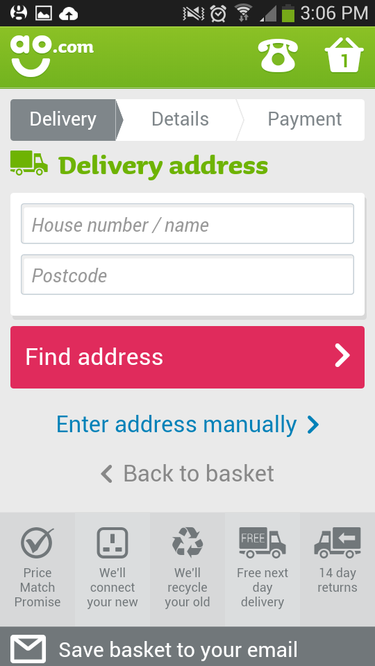
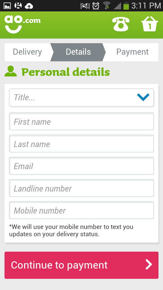
AO.com also scores points for keeping form filling to a minimum, accepting alternative payment methods and allowing users to select their delivery time and date from a dropdown menu.
All-in-all it’s one of the most user-friendly checkouts that I’ve seen.
Crate & Barrel
Big buttons and big text fields, this is what I love about Crate & Barrel’s mobile checkout.
It also uses a numerical keypad for phone numbers.
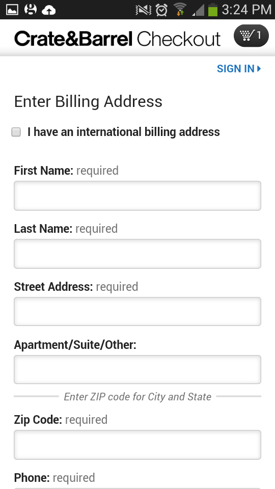
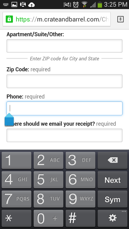
One criticism would be that there isn’t a progress bar so users don’t know how many stages are left in the checkout process.
Topshop
Topshop has a clean and simple checkout with a prominent progress bar so users know exactly where they are in the whole process.
There is also a guest checkout option, postcode lookup tool and numerical keypads when relevant.
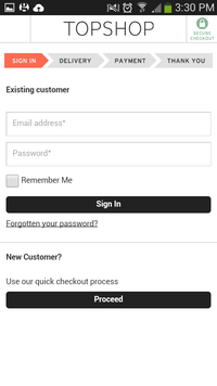
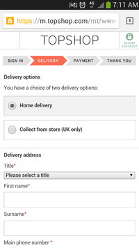
However the design could be improved by making the buttons bigger and by removing an unnecessary form that appears prior to payment screen so users can confirm their billing address.
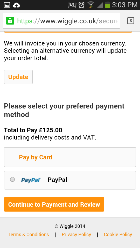
Wiggle
I recently reviewed Wiggle’s checkout design in a post comparing some of the UK’s top cycling brands.
In my opinion there needs to be more variety in the colour scheme, as if everything is orange then nothing stands out.
This is an even bigger problem on mobile, as the size of the screen makes it even more difficult for CTAs to gain any visibility.
Asking for an email address upfront might also put some users off.
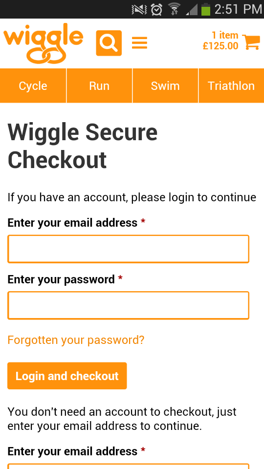
Even so, the checkout process is short and requires a minimum amount of form filling. It also has a postcode lookup tool and uses a numerical keypad when entering phone numbers.
Wiggle also accepts PayPal, which may help to increase conversions among shoppers who are wary of entering card details on mobile.
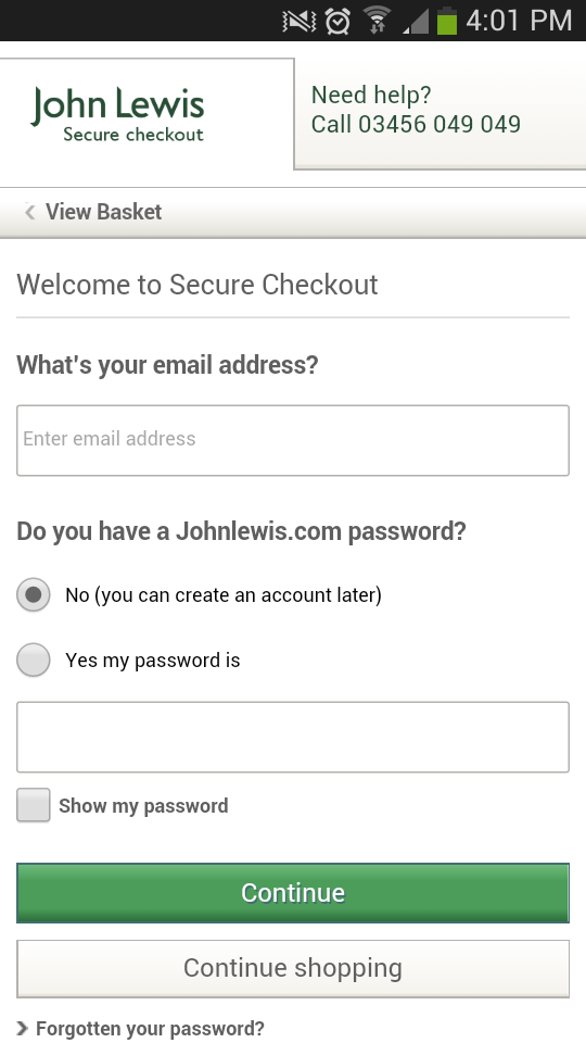
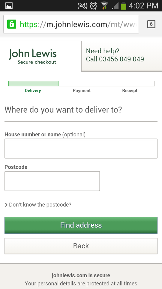
John Lewis
Asking for an email address upfront is a potential flaw, however there’s much to admire about John Lewis’ checkout.
It has a clean, uncluttered layout, plenty of space for fat thumbs, progress bar and big, bright CTAs.
There is also a prominent click-to-call button at the top of the screen so users can bail out and speak to someone if they get stuck.
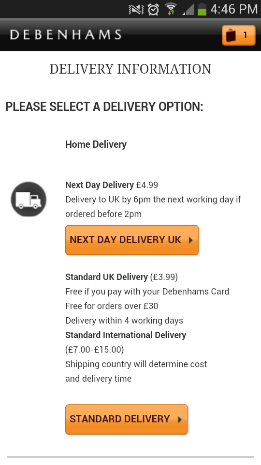
Debenhams
Debenhams offers a guest checkout, a postcode finder, assumes the same address for billing and delivery, and has excellent CTAs. Plus its pages are short and quick to load.
It would benefit from implementing a progress bar, plus the rest of the mobile site needs a bit of care and attention, but then nobody’s perfect.
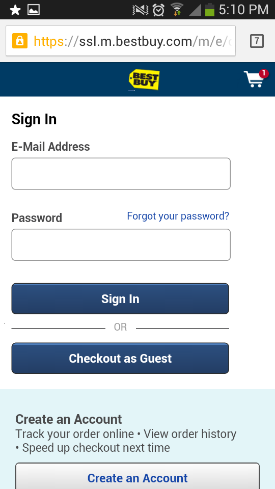
Best Buy
There are only three screens to get through until payment is complete on Best Buy’s checkout, which has a user-friendly layout with plenty of white space.
Some of the buttons would benefit from being made bigger, but in general it’s a quick and easy checkout.
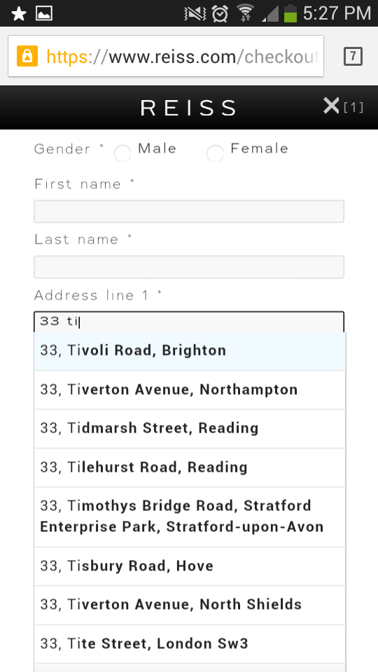
Reiss
There are a lot of problems with Reiss’s rather fiddly mobile site, but I’ve included it here as it has one excellent feature – a real-time address finder.
As you type the first line of an address Reiss’ checkout predicts what it will be using data from Postcode Anywhere. It makes entering your address extremely simple, which is a bonus on mobile.
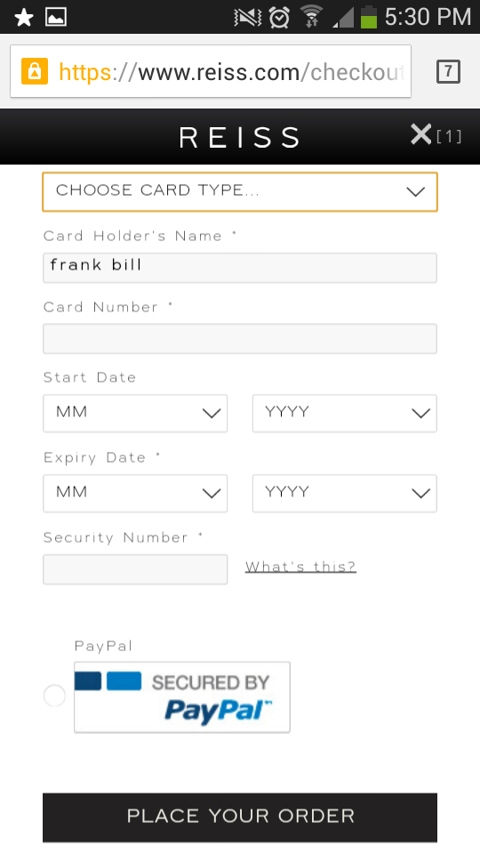
There are one or two other useful features such as a progress bar and PayPal, but really Reiss has a bit of work to do.
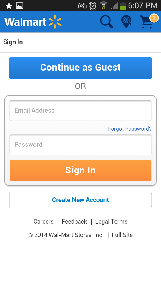
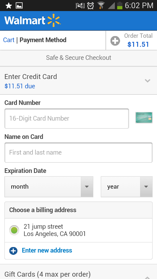
Walmart
Walmart’s checkout offers an excellent user experience with plenty of white space and big, bright CTAs.
The guest checkout option means there are only three or four screens to get through until a purchase is completed.
One minor complaint would be the lack of a progress indicator.
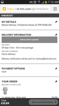
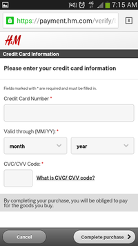
H&M
H&M commits the cardinal sin of forcing new users to register, but there’s also a lot to like about its mobile checkout.
Simple forms, big buttons, a great basket summary, and every step is clearly explained along the way.


No Comments