


For web designers and graphic artists, these color properties are valuable tools for a successful design project.
- Serves as a guide on how to define colors
- Gives a design project a “polished” look
- Enhances visual communication
- Develops color combination agility
- Helps channel correct messages
- Helpful in establishing mood

Appetizer: What is a Color?
A color gives emotion to anything. Almost everything in the entire universe consists a lot of enticing and brilliant colors. From a simple stone, food, beverages, underwear, to gadgets, or even as far to your “brownish black” booger. Am I right? It has a color!
To see color, you have to have light. When light shines on an object some colors bounce off the object and others are absorbed by it. Our eyes only see the colors that are bounced off or reflected.
We understand color just like we understand taste. There are different properties of color to distinguish color as there are different taste attributes that can be found in our taste buds. It is like an analogy. Color:Taste Buds ; Color Property:Taste
Entrée: What are the Different Properties?
Color plays a big role in our visual encounters. But do you know what are behind these colors? When we look, our eyes register these properties. These are the elements of a color that enhances it. And here they are!

Image from Flickr
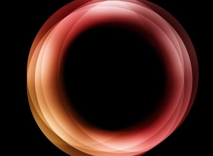
The 1st Entrée: Hue
Hue has several “food versions”, so to speak.
- First: It is the set of “pure” colors within a color space.
- Second: It is the traditional color name of a specific wavelength of light.
- Third: a spectral color. All of the colors of the spectrum are hues. There are only limited hue names: red, orange, yellow, green, blue and violet.
The 2nd Entrée: Tint
Tint is the mixing result of an original color and white. This becomes lighter than the original color. A tint is sometimes called a pastel, any color added with white. For example, a bright blue can result to a sky blue.
The effects of tint give a lighter mood and feeling. This is why tints are more appealing to women. You can mostly see billboards and web templates in soft and pale colors if they are marketing beauty products.
The 3rd Entrée: Shade
Shade is simply any color mixed with black. This makes the color darker than the original.
The same way with making tints, you can mix any pure colors together, then simply add any amount of black, a shade could be created. You can control the amount of shade from an extremely dark to nearly black.
Web designers and graphic artists use little amount of black because it can affect the main color. Shades are dark and mysterious which exhibit masculinity. It can be so empowering so be careful of adding too much black.
The 4th Entrée: Tone
Tone is a result of mixing a pure color with any grayscale color doing away the white and black. This means that a certain amount of white and black must have been added to the original color. Tones give a more appealing effect and sophistication to corporate designs and are pleasing to the eye. Tones suits best in most interior design concepts.
A tone is softer than the original color, which varies depending on the amount of grayscale color you add. By this definition, all tints and shades are also considered to be tones.

Image from Flickr
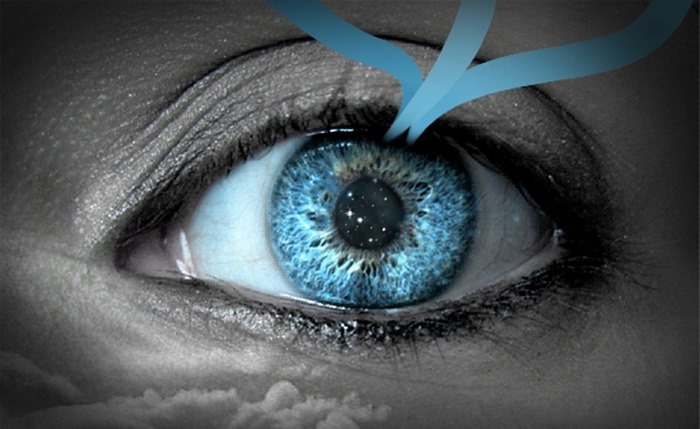
The 5th Entrée: Saturation
Any object changes its appearance during night time and day time. Saturation is concerned with the intensity of the color, how bright or dull the color can be.
Saturation aids to know how a color behaves under lighting conditions. The color may be the same, but the saturation changes. A color that is high in intensity – it is bright.
On the other hand, saturation is also known as chroma.This property of color tells you how pure a hue is. This means the lack of white, black, or gray in a color will appear very vivid and pure.
The 6th Entrée: Lightness
Lightness can be described as too much shaded to or too much tinted. Changing the lightness value could lighten or darken a color. Adding white will increase lightness and adding black will decrease it.
The 7th Entrée: Intensity
Intensity is a synonym for magnitude, degree or strength.This is the brightness or dullness of a color. Less intense colors, like blue, for example, have a soothing effect compared to more intense colors like red. Intense colors are mostly used for highlights and contrast.
The 8th Entrée: Brightness
Brightness is a perception which is affected by a color’s lightness. The brightness of a color is more intense if saturation is increased. A higher level of saturation makes a color look brighter.
In some cases, brightness is called value.
Value is more related to the light and dark properties of color. All colors exhibit these properties. Black, white and gray are values without color.
The 9th Entrée: Grayscale
Grayscale is a series of neutral colors, ranging from black to white, or the other way around. A grayscale image contains only shades of gray and no color.
Imagine an old vintage television set during the 1970’s. The picture is in black and white. Grayscale dumps all colors!

Side Dish: Importance of These Properties
- Presents an image of impressive quality
- Can assist in attracting new customers
- Customers remember presentations and documents better when color is used.
- Color makes them appear more successful.
- Color gives them a competitive edge.
- The use of color makes their business appear larger to clients.
Salad: The Impact of Color Properties to Web Designers and Graphic Artists
You need an eye to combine and use color effectively. Color possesses some kind of magnetic power that touches the visual senses. This would be the basis of a win or loss design project.
Remember this:
- Communicate with your subject.
- Look carefully how nature uses color.
- Learn first by observation.
Color can be a perfect and useful friend for web designers and graphic artists. This brings about a lot of benefits such as:
- Effective Marketing of the brand
- Establishes Brand Identity
- Increases Memory Recall
- Engages and Increases Participation
- Information Dissemination
- Attracts Attention
- Defines the Senses
Designing is like cooking. You need spices to enhance website productivity. Try some of these flavor enhancers.
Dessert: Fun with Colors
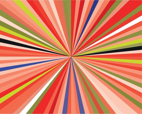
A color wheel is a circular arrangement of hues, close to the order of how colors are represented in the light color spectrum.
Try this for fun! The experience of actually mixing these yourself will help you understand the subtleties of color much more profoundly.
Download the first and third Free Printable Color Wheels to practice on.
- Print out several of the third free template on standard white 8 1/2″ x 11″ paper.
- Get out a set of 12 basic paint colors plus white and black. Or mix your secondary and tertiary colors yourself from scratch. Keep it simple. Use watercolor, poster paints or acrylic.
- Mix your tints, shades and tones and fill in the areas of the wheel. Don’t worry about being perfect.
- Be sure to keep them for reference. Yes, even the ones you think are mistakes.

Image from Flickr
Take Out
After savoring what is on the menu, I hope your taste for colors have changed and would serve as a big help in understanding how to use them. Share your experience.


No Comments