I’ve been coming around to the idea of using Susy (a Sass add-on for grids) lately. I like the idea of grids-on-demand, rather than a strict framework (no matter how simple). We even added support to CodePen. Last week I ran into Eric Suzanne, the creator of Susy, and I told him Zell Liew was working on a guest post for this site. He was “Oh, Zell! Yeah he’s awesome, he’s like the unofficial promoter and trainer for Susy.” And so, here’s Zell introducing us to Susy!
Susy provides you with the tools to build your own grid layouts that match the needs of your website. She gives you the freedom and flexibility to build any design that you can imagine. It doesn’t matter if your design has 5, 14 or 48 columns. Unequal width columns? Susy’s got you covered.
Why would you pick Susy over the million other frameworks out there on the internet? You may never even heard of her before. What if her beauty is only skin deep?
Susy is one of the best things that happened to me in terms of my front-end development workflow over the past few months. She has helped me out so much that I decided to write a book about her to share her merits with the world. It’s an in-depth guide on Susy and how you can use her to easily create any website design you want.
Still not convinced? Well then, all I ask is you give me the opportunity to try and change your mind through this article. We’ll see why Susy is so special, and how she can help you out.
As they say, there’s no substitute for experience, so I’m going to walk you through the Susy experience of creating a layout. And you can compare it with the experience of creating the same layout by hand (which involves calculating pixels…by yourself).
We’ll start off simple, and progress on to more fancy layouts once you’ve gotten to know Susy a bit better.
Before we start, there are some things you must know about our friend, Susy. You MUST use the Sass preprocessor language for it, which means you have to at least know how to convert Sass into CSS. And no, you can’t use LESS. Sorry, LESS folks!
Creating a Very Simple Layout
CSS-Tricks has a pretty straightforward layout, so let’s use that for our first example.
Have a look at the blog and you’ll find that CSS-Tricks is made up of two content areas: the main content and the sidebar area.
We’ll assume CSS-Tricks uses a 12-column layout for the whole site, and it’s content area takes up 8 of 12 columns while the sidebar takes up 4 of 12 columns. Quite standard stuff if you’ve worked with grids before.
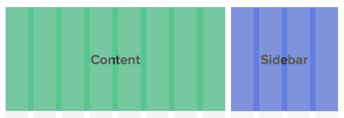
If you have used Bootstrap or Foundation before, the markup for this site layout would be:
<div class="wrap">
  <div class="content col-md-8"></div>
  <div class="content col-md-4"></div>
</div>
Simple, yes. But Bootstrap and Foundation also come with a lot of baggage, that a lot of the time, we just don’t want to deal with. If you don’t need most of the other stuff that comes with Bootstrap and Foundation, Susy would be a much better fit for you.
A stoic developer who hand-codes all his sites from scratch, no frameworks or frills, would probably write his mark-up like so:
<div class="wrap">
  <div class="content">Content</div>
  <div class="sidebar">Sidebar</div>
</div>
To create an 8-column content and 4-column sidebar, you’ll have to measure widths of the content, the gutter and the sidebar. One rule of responsive web development is to output these widths in percentages, so you’ll have to convert them accordingly.
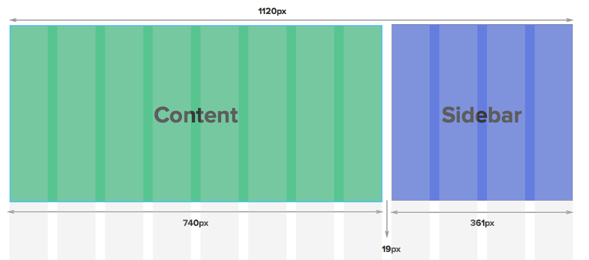
So the corresponding CSS would probably look something like this:
/* I tend to use border-box sizing for all my web layouts. */
*, *:before, *:after {
  -moz-box-sizing: border-box;
  -webkit-box-sizing: border-box;
  box-sizing: border-box;
}

.wrap {
  max-width: 1120px;
}

/* Clearfix for floated children */
.wrap:after {
  content: " ";
  clear: both;
  display: block;
}

.content {
  float: left;
  width: 66.071429%; /* 740px / 1120px */
  margin-right: 1.6964286%; /* 19px/1120px */
}

.sidebar {
  float: right;
  width: 32.2321429%; /* 361px / 1120px */
}
A quick note before we continue further: I love to set the box-sizing property to border-box for all of my web elements, and I highly recommend you do the same as well. Chris has written extensively about box-sizing here.
Anyway, the hand-coding from scratch method can start to get tedious if you have multiple layouts to work with. Imagine calculating all those percentages every single time!
That’s precisely what Susy helps you with. She does the math for you.
Creating the Simple Layout With Susy
When using Susy to create any layout, you’ll first have to let her know what settings you want her to use. There are a whole bunch of default settings that Susy uses to kickstart every project.
I’m assuming this is your first experience with Susy, so we’ll stick with most of the defaults for now. You do need to change two properties though, and you change them by declaring them on the $susy map.
At the same time, let’s also apply the border-box property like we have done above.
@import "susy"

/* Changing Susy default global settings */
$susy: (
  /* Tells Susy to use 12 columns */
  columns: 12,
  /* Tells Susy to use border-box */
  global-box-sizing: border-box
  );

/* Makes border-box properties */
@include border-box-sizing;
This time round, instead of manually calculating the exact pixels and percentages for the layout, we’re going to tell Susy to do it for us. To do this, you’ll just have to tell Susy that content is 8 columns and sidebar is 4 columns.
We do have to let Susy know that sidebar is the last item on the row so it can make the necessary adjustments to minimize the effects of browser subpixel rounding errors.
/* Tells Susy there's 8 columns in the content */
.content {
  @include span(8);
}

/* Tells Susy there's 4 columns in the sidebar, and its the last item on the row. */
.sidebar {
  @include span(4 last);
}
This compiles into:
*, *:before, *:after {
  -moz-box-sizing: border-box;
  -webkit-box-sizing: border-box;
  box-sizing: border-box;
}

.wrap {
  max-width: 1120px;
  margin-left: auto;
  margin-right: auto;
}
.wrap:after {
  content: " ";
  display: block;
  clear: both;
}

.content {
  width: 66.10169%;
  float: left;
  margin-right: 1.69492%;
}

.sidebar {
  width: 32.20339%;
  float: right;
  margin-right: 0;
}
Did you notice that the CSS output is exactly what we needed to create? Susy sure saved us a lot of time.
We’re not done with the CSS-Tricks layout yet though. If you scroll down to the bottom of the site, you’ll find the social media area, and you can also see that there are 10 social media items within this area:

If you use a traditional grid framework in your design, you’re pretty much in trouble. As far as I know, there’s really no simple way to quickly manipulate the number of columns from 12 to 10 using frameworks like Bootstrap or Foundation without affecting the rest of the layout.
Susy doesn’t bind you with such rules. You are free to create your own rules. After all, it’s your grid.
Your Grid, Your Rules
Anything is possible when you’re making your own grids. Before we move on to the CSS, let’s first get the mark-up correct. It should look something like this:
<div class="wrap">
  <div class="content"></div>
  <div class="sidebar"></div>
  <div class="social">
    <ul>
      <li class="social__list-item"></li> <!-- repeat 10x -->
    </ul>
  </div>
</div>
Now we can begin work on the CSS. Using the hand-coding approach, you may have realised you’ll have to calculate the width of each item and gutter again.

.social {
  padding: 1.6964286% /* 19px / 1120px */
}

/* Adds clearfix to social to prevent the float collapse  */
.social:after {
  content: " ";
  clear: both;
  display: block;
}

.social__list-item {
  float: left;
  width: 9.1497227; /* 99px / 1082px */
  margin-right: 1.0166359; /* 11px / 1082px */
}

/* And the last item cannot have any right margins */
/* It is also good to float it right to mitigate subpixel rounding errors */

.social__list-item:last-child {
  float: right;
  margin-right: 0;
}
It feels like quite a tedious job, if you ask me.
It’s so much simpler if we get Susy to do it for us. You’ll just have to tell Susy that there are 10 columns in all (instead of 12), and each social item takes up one column.
.social {
  /* Adds a padding of 19px to each side of the .social container */
  padding: gutter();
  /* Adding a clearfix because all children elements are floated */
  @include cf;

  .social__list-item {
    /* Telling Susy that there are 10 items, and each takes up 1 row */
    @include span(1 of 10);
    /* Another way to tell Susy that this is the last item in the row */
    &:last-child {
      @include last;
    }
  }
}
And Susy produces the same exact CSS properties that we need for the grid!
.social {
  padding: 1.69492%;
}

.social:after {
  content: "";
  display: table;
  clear: both;
}

.social .social__list-item {
  width: 8.16327%;
  float: left;
  margin-right: 2.04082%;
}

.social .social__list-item:last-child {
  float: right;
  margin-right: 0;
}
This is how simple it can be to use Susy. Math skills not required. As long as you know how to make a grid with vanilla CSS, you will know how to use Susy.
One thing about working with percentages is the inevitable fact that your output will contain subpixels, like 10.4px. This has been a major problem with layouts for a very long time because different browsers treat these subpixels differently.
For instance, webkit browsers round these pixels down, and 10.4px will be rounded down to 10px. The larger the number of items in your layout, the larger the occurrence of each rounding error. So our 10-item error is clearly showing up in webkit browsers.

Such errors are unbecoming and we simply cannot have that.
Dealing With Subpixel Rounding Errors
One method is make sure the percentages don’t generate subpixels at all. But
that’s not a good idea because and you’re going to be stuck with either a non-responsive website, or one that snaps to different grid widths.
There’s another method, which I call the Isolate Technique.
This method is slightly more advanced and requires you to know more about laying out elements with the isolate technique that was developed by John Albin Wilkins. This technique has been used in the battle-tested zen grids for a long time. If you’re familiar with Zen grids, you’ll know what I’m talking about here.
If not, let’s examine how to use this technique.
The Isolate Technique
The premise of the isolate technique is to reduce the compounding effects of rounding errors by positioning them right where they should be with specific margins.
The requirements of using this technique are:
- Each element must have a
margin-leftproperty to position itself in the correct position. - Each element must have a
margin-rightproperty of -100% to pull the next item to the extreme left edge of the container.
This technique can be quite confusing if you’re not familiar with how negative margins. Let’s go through a full step-by-step explanation on how it works.
Say you need to create a 3-column layout:

We’ll go through the positioning of each item one-by-one. Item 1 is quite straightforward.
- It has a
margin leftof 0, so it sits on the start line. - Then it pulls the next item (Item 2) back to the start line with a
margin-rightof -100%.

Item 2 has been pulled to the start line by Item 1 before it’s own CSS properties kick in.

Item 2 then positions itself with a margin-left property that is the percentage value of up 2 columns and 2 gutters, positioning it exactly on the third column.

Item 2 also has a margin-right property, which pulls the next item (Item 3) to the start line.

Item 3, gets pulled to the start line by Item 2 before its own CSS properties kick in.

It is then positioned on the 5th column by its margin-left property that is a percentage value of 4 columns and 4 gutters.

And it pulls the next item to the start line and the pattern repeats itself for the number of items in total.
If any item needs to start on a new line, it has to clear the float from its previous item with the clear: left property.

And to align it to with the first column (positioned on the start line), it has to change its margin-left property back to 0 to place itself there.

That’s how the Isolate Technique work. Now that you understand it, we can use it to deal with the subpixel rounding issue.
Solving Subpixel Rounding Errors
We have to position each item manually with the isolate technique, and Susy can help us with that.
Susy has a convenience function that helps you skip ALL the manual stuff. It’s called the gallery mixin.
.social__list-item {
  @include gallery(2 of 10);
}
And the CSS it outputs uses the isolate technique mentioned above.
.social__list-item:nth-child(10n + 1) {
  margin-left: 0;
  margin-right: -100%;
  clear: both;
  margin-left: 0;
}
.social__list-item:nth-child(10n + 2) {
  margin-left: 10.20408%;
  margin-right: -100%;
  clear: none;
}
.social__list-item:nth-child(10n + 3) {
  margin-left: 20.40816%;
  margin-right: -100%;
  clear: none;
}
.social__list-item:nth-child(10n + 4) {
  margin-left: 30.61224%;
  margin-right: -100%;
  clear: none;
}
.social__list-item:nth-child(10n + 5) {
  margin-left: 40.81633%;
  margin-right: -100%;
  clear: none;
}
.social__list-item:nth-child(10n + 6) {
  margin-left: 51.02041%;
  margin-right: -100%;
  clear: none;
}
.social__list-item:nth-child(10n + 7) {
  margin-left: 61.22449%;
  margin-right: -100%;
  clear: none;
}
.social__list-item:nth-child(10n + 8) {
  margin-left: 71.42857%;
  margin-right: -100%;
  clear: none;
}
.social__list-item:nth-child(10n + 9) {
  margin-left: 81.63265%;
  margin-right: -100%;
  clear: none;
}
.social__list-item:nth-child(10n + 10) {
  margin-left: 91.83673%;
  margin-right: -100%;
  clear: none;
}
And the social media area is back to normal!

Now that we’ve built up some momentum, let’s take it up a notch and make the layout responsive.
Making the Layout Responsive
Responsive websites have became increasingly important and I’ll be selling you short if I didn’t talk about how to make responsive layouts with Susy.
The very first step to creating responsive layouts is to make sure that you’re familiar with how media queries work. Pay special attention to the Mobile-First media queries in that article as we’re going to be using them.
For simplicity’s sake, let’s only create a layout with two breakpoints – one for the mobile view that begins at 0px and ends at 700px; and another for the desktop view that begins at 700px.
In the mobile view, both the .content and .sidebar sections take up a full 100% of the viewport. After 700px, .content and .sidebar will be split into 8 columns and 4 columns respectively.
If you hand code it, this is what it might look like (using Sass):
.content {
  /* Styles for mobile view go here */

  /* Styles for desktop view go here */
  @media (min-width: 700px) {
    width: 66.10169%;
    float: left;
    margin-right: 1.69492%;
  }
}

.sidebar {
  /* Styles for mobile view go here */

  /* Styles for desktop view go here */
  @media (min-width: 700px) {
    width: 32.20339%;
    float: right;
    margin-right: 0;
  }
}
You don’t need to create any styles for the mobile view because <div> blocks takes up 100% width by default. What you need, however, is to make sure the desktop layout kicks in once the viewport hits 700px.
Coding a responsive layout by hand is the same as coding a responsive layout with Susy, only Susy makes things faster. You use the exact the same technique and media queries.
.content {
  /* Styles for mobile view go here */

  /* Styles for desktop view go here */
  @media (min-width: 700px) {
    @include span(8);
  }
}

.sidebar {
  /* Styles for mobile view go here */

  /* Styles for desktop view go here */
  @media (min-width: 700px) {
    @include span(4 last);
  }
}
So that’s it for .content and .sidebar.
The next bit is the social media section. This is how it looks like in the mobile view.

Instead of having each item take up 1 of 10 columns, each item now takes up 2 of 10 columns on the mobile view, and you can do this by using span(2 of 10).
Note: You might be wondering why not use 1 of 5 columns instead. There are slight nuances between span(1 of 5) and span(2 of 10), and a picture best explains it:
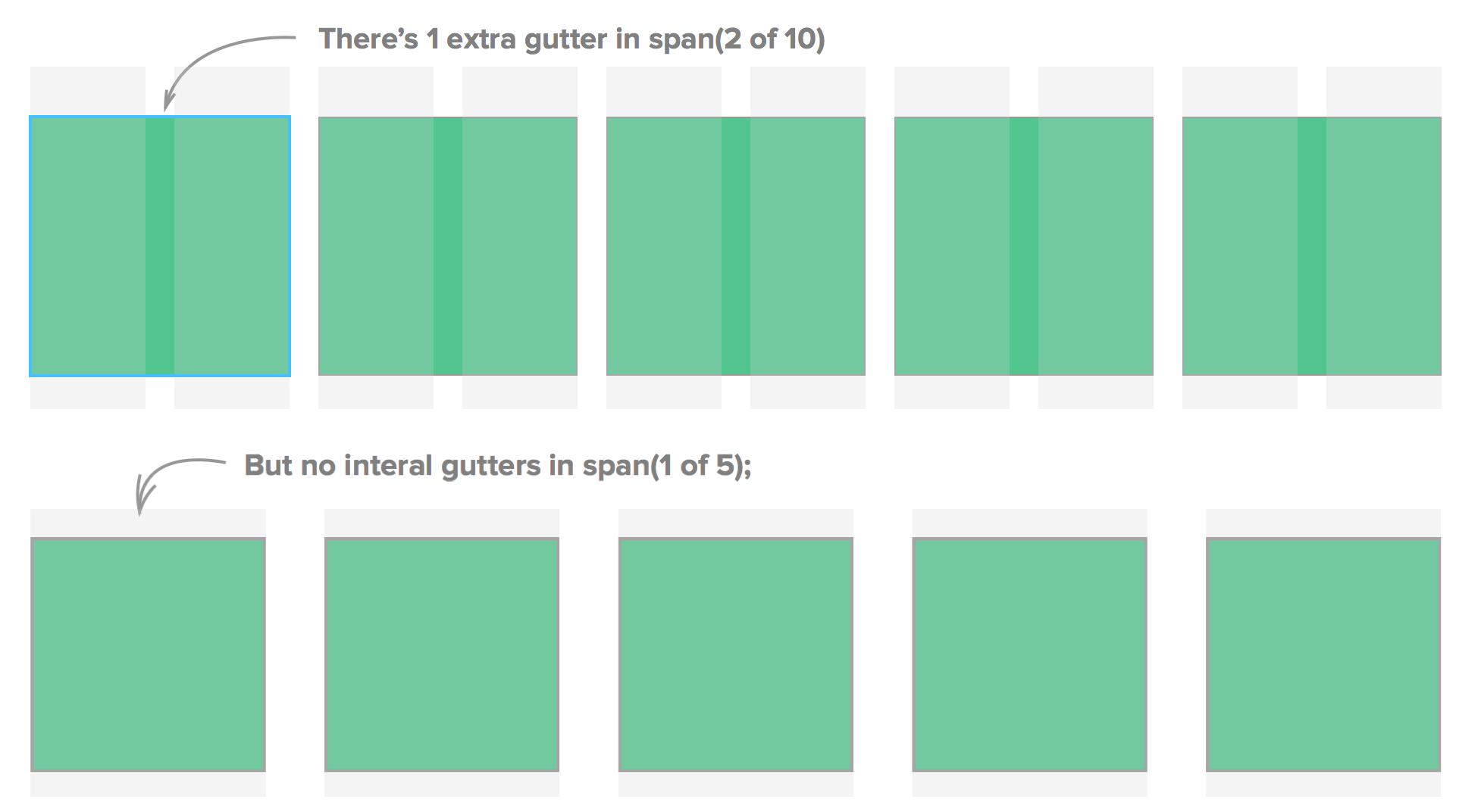
These are fundamentally different layouts because of the number of gutters involved. You can always use the 1 of 5 option but I’ll stick with 10 because the size of the gutters are then much closer to 12.
We’ll call the gallery mixin again, and add one gutter below each item to provide some separation between the rows.
.social {
  /* ... Same styles as above */

  .social__list-item {
    @include gallery(2 of 10);
    margin-bottom: gutter(10);
  }

  @media (min-width: 700px) {
    @include gallery(1 of 10);
    margin-bottom: 0;
  }
}
Here’s an example of what we have done so far:
See the Pen eidcj by Zell Liew (@zellwk) on CodePen.
Working with Susy is just like working with vanilla CSS. The key difference is that Susy is a math-whiz.
Susy is so good at math that she can allow you to create wacky asymmetric grids that have columns of different sizes.
Let’s try creating the layout for CSS-Tricks using an asymmetric grid.
Making The Layout With Asymmetric Grids
Declaring columns is a tiny bit different when working with asymmetric grids. You tell Susy the number of columns and the ratio of their sizes with a Sass list. Since CSS-Tricks has content that is twice the width of the sidebar, the columns can be represented by a 2 1 list. This means that there are two columns, one of them is twice the width of the other.
You’ll also have to set the output mode to isolate on Susy’s global settings:
$susy : (
  columns: 2 1,
  output: isolate,
)
Instead of saying content has 8 columns now, we say that content has 1 column. Susy is smart enough to know the size of the column if you tell her its location. In this case, content is the first item.
.content {
  @include span(1 first);
}
Likewise, you’ll have to let Susy know how many columns sidebar takes up and where it is located. In this case, sidebar takes up the second column, which coincidentally is also the last item on the row.
.sidebar {
  @include span(1 last);
}
This is how it will look:

There is a lot more to asymmetric grids and it would take a whole new article to show you how to build them with Susy. I’ve have created a simple design that explains the concepts of asymmetric grids on my blog that uses the following as an example.
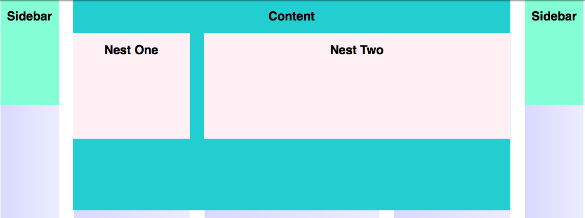
In addition, I wrote about creating an asymmetric layout comprehensively in Learning Susy with a more realistic example that was based on Nathan Ford’s design. You may want to grab the book if you want to find out more about it.
Conclusion
Well, we’ve reached the end of this introduction to Susy, as well as some peripheral (but important) matters like subpixel rounding errors. I hope you are at least a little bit convinced to give Susy a try.
In fact, there is so much more to Susy than what I could cover here. So I’m going to refer you to 5 sample chapters of my book on Learning Susy. Have a read through and you’ll learn how you can use Susy to do so much more. Also, if you have any questions about Susy, or just front-end development in general, feel free to contact me.
Build Web Layouts Easily with Susy is a post from CSS-Tricks


No Comments