


Ugg is launching a multimedia campaign, promoting its footwear as part of an idealised lifestyle.
Check out the video embedded below to get an idea of the brand position (the ad feels like a sort of gooey Guinness advert crossed with a Lands End catalogue).
With this new campaign afoot (no pun intended), I thought I’d take a look around the brand’s web presence and see how it stacks up.
The conclusion is that there’s a lot to improve upon in Ugg’s digital strategy. Part of maintaining a premium lifestyle brand is doing digital well. Having said that, no doubt the new campaign, with its well produced videos, will revitalise the brand if given enough media exposure.
For more on content in ecommerce, attend our Festival of Marketing, November 12-13th in London.
Social
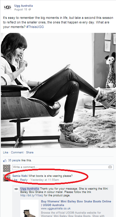
The campaign has been pushed on Twitter using the nice black and white imagery but it doesn’t seem particularly engaging. Whilst I like the idea of ‘small moments’, the #ThisisUgg hashtag seems slightly at a tangent. It would seem more appropriate if the tweet had some encouragement to share – win a pair, win a trip etc.
Despite having nearly 40k followers, this tweet sent on Monday (two days ago) has no replies.
It’s easy to remember the big moments, but take a second to reflect on the smaller ones. What are yours? #ThisisUGG pic.twitter.com/4d5h540fBX
— UGG Australia (@UGGUK) August 18, 2014
In fact, tweeting seems to happen three times a week, which isn’t often enough for a brand with a billion dollar revenue.
The naivety continues when the brand tweets to various contributors to its blog. I only know these are blog contributors because I happened on it beforehand.
The images are fine, but the tweets don’t really mean anything. They talk about winning, but what exactly? The shoes in the pic? Again engagement is low.
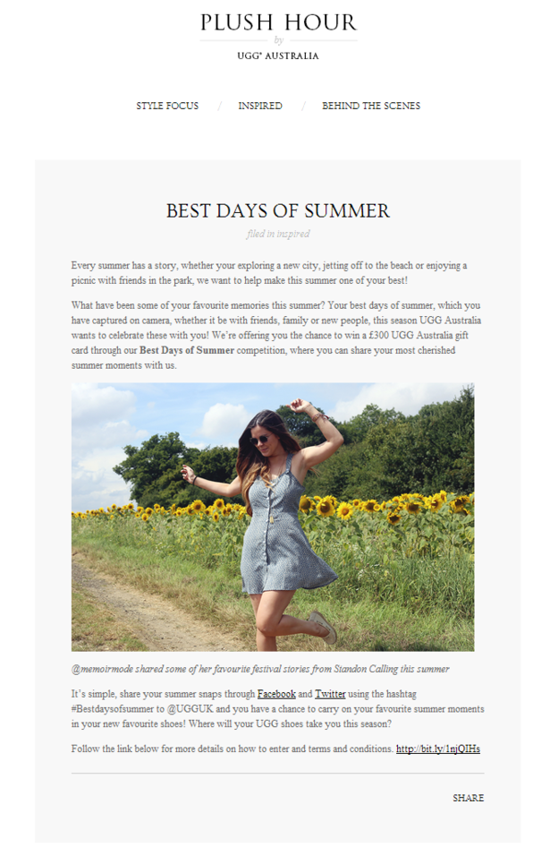
A Summer spent in Paris with @_luciagrace How will you spend yours? Share your #bestdaysofsummer with us to win! pic.twitter.com/RekIpUSiJK
— UGG Australia (@UGGUK) August 12, 2014
On Facebook, again content and commerce don’t collide enough. Here’s a perfect example of Ugg learning on the job.
The posts are precisely the same as Twitter content, despite Facebook being a better platform to expand on one’s message.
Elsewhere, the brand’s YouTube account still has a video about the Spring collection pinned to the front page, rather than the new campaign.
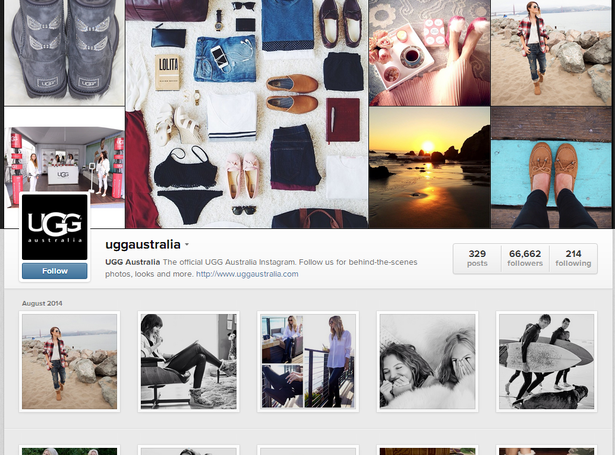
Instagram seems to be a happier hunting ground, perhaps because this platform is more brand led, about imagery and less about commerce and engagement.
Website
Product listings
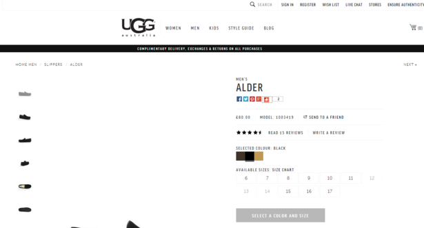
These aren’t bad. My main problem is that the product image and product description are completely below the fold when I load some pages. See below for an example.
The product description could be more prominent, lengthier (currently only two sentences) and punchier. There are no images of a person wearing the shoes in question, even though this is something Ugg does right across its new campaign.
Blog
There’s room for improvement here.
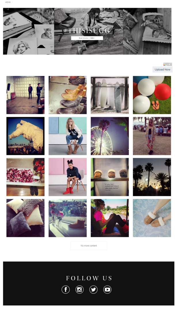
When I click the blog link from the home page I’m taken to a page with a limited display of Instagram style photographs (managed by Pixlee) which look nice but don’t really have any associated content – I’m invited to share them via my own networks and at the bottom of the page there are links to Ugg’s various profiles.
It appears there’s nowhere else I can go from here, until one realises that the header image with the ‘This is Ugg’ hashtag (the new campaign) has a call to action to ‘read articles’. Clicking this takes you to the blog on a microsite, but it’s not at all obvious (it’s very small) and arguably one should be led straight to this microsite from the original homepage link.
The blog on the microsite itself could also do with some work.
The posts aren’t dated, as far as I can see, which is a turn-off, and the text is small and poorly contrasted.
Compare the content below with the richness provided by other brands such as ASOS and Ugg doesn’t come off favourably.
Style features
The style guide is altogether much better and it’s debatable whether the blog section is needed at all – perhaps a social hub would be more appropriate and closer to what Ugg is trying to achieve.
Here on the style guide, there are six features to explore and each is a visually appealing experience. The photography is nicely done and the copywriting is sharp.
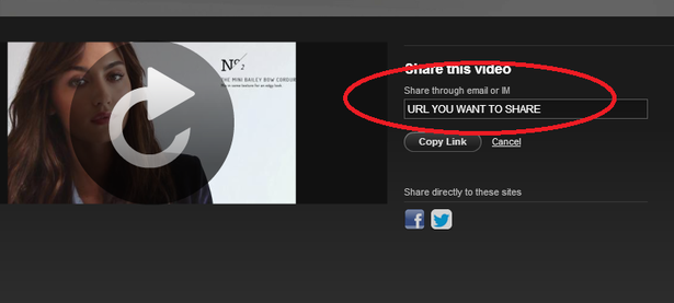
Taking a look at ‘the classic boots’ feature there’s still the odd niggle that hints at a website not yet optimised.
For example, there’s a good video, nothing groundbreaking though it’s embedded nicely and shows off a number of products fairly well. However, there’s a glitch at the end – I’m encouraged to share but it looks like the URL hasn’t been included, the software’s default is shown ‘URL YOU WANT TO SHARE’. The embed code looks legit, but the average shopper isn’t going to be able to email or tweet about this show reel even if they want to.
In addition, these style guides are included on the homepage, too, below the fold and underneath the new campaign video. This duplication might serve to highlight a lack of content on the site as a whole.
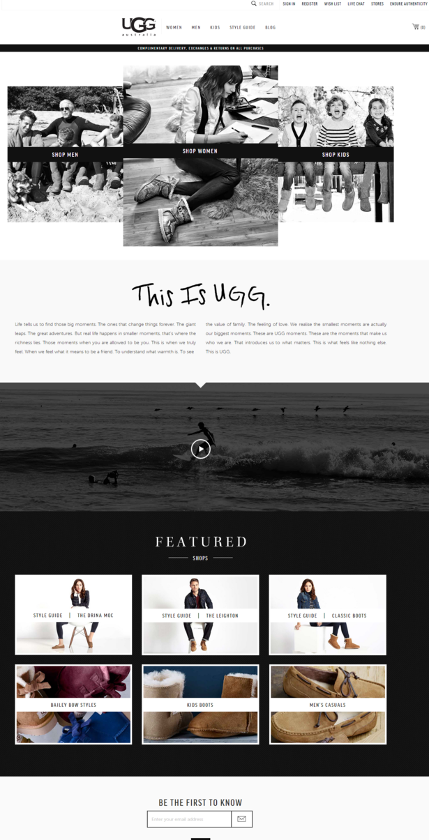
Above the fold the homepage looks classy – nice black and white imagery illustrating Men’s, Women’s and Kids’ collections and the campaign video embedded below some copy detailing the campaign’s ‘This is Ugg’ rhetoric.
Navigation
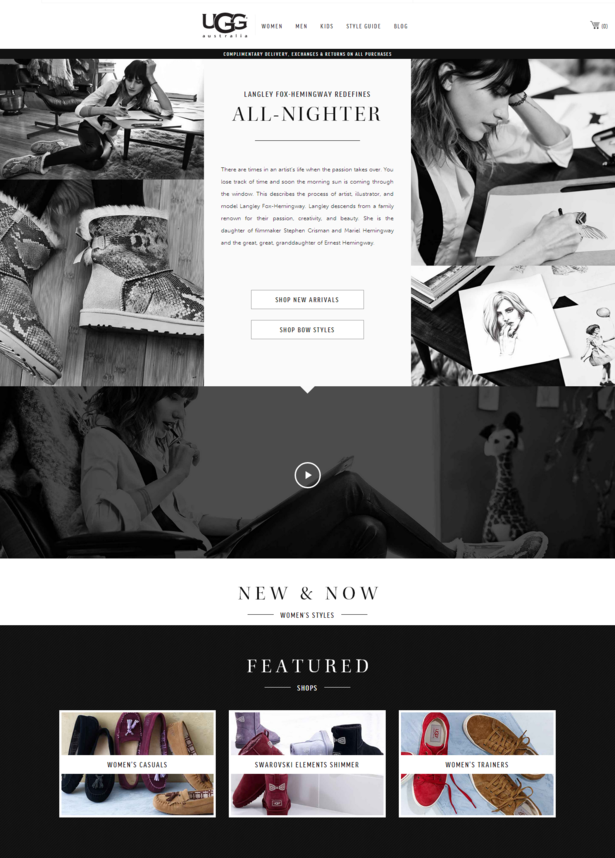
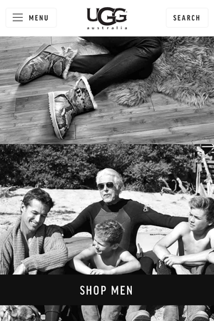
The content and the new campaign continue on the Women, Men and Kids pages. It looks great again and I feel it does align Ugg with its desired market.
I found the video particularly cringe (a 15 second cut of the embed below), though I don’t necessarily think that’s a bad thing – these boots aren’t for me.
This page is pretty much all branding, before one clicks through to new arrivals or some of the featured styles. Personally, I find it slightly confusing that from this top page I can’t get to various product listings unless they are featured. For example, if I want to select ‘casual shoes’ I have to go back into the header menu and select from the dropdown.
Once into the product listings, everything works well but I’m again beholden to the header menu to go to other categories of shoe (outside of casual, which I selected). It’s arguable, but some users might be confused by this.
Having all categories visible, not just on rollover, is perhaps desirable.
(Click to enlarge)

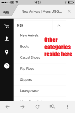
This is more confusing on mobile, where although the site looks good, again I’m presented with few products when I navigate to Men’s.
I have to use the small menu in the top left to look at other categories, rather than the filter that seems obvious. To me, this doesn’t feel natural, as a filter with all products in does.
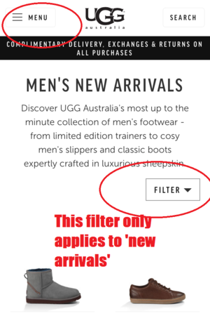
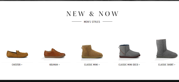
The Men’s page is slightly better at first, as the New and Now section is populated, with some styles to select.
These lead to product pages rather than categories. There seems to be a slight glitch on the Women’s equivalent page as there’s nothing in this section despite the presence of the header text.
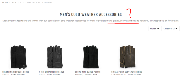
But there are problems again with the navigation – just look at the men’s category of ‘cold weather accessories’.
No mention of gloves, scarves and hats until you hit the page in question, where they are all mentioned but only gloves are shown.
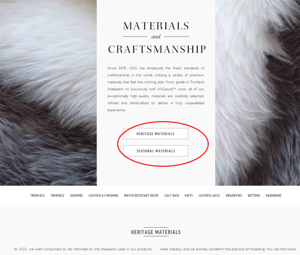
One of the better scrolling content pages is about materials and craftsmanship, a key part of a higher end shoe.
However, this link is only available in the footer of the website.
Again, despite the content being appealing on this page, there are mistakes. Look at the snapshot below. The two linked boxes that say ‘heritage materials’ and ‘seasonal materials’ both link to the ‘new arrivals’ page, which doesn’t really make sense.
Livechat
Customer service details are all adequately provided but a note here that live chat didn’t work in Chrome, my URL was appended with #livechat but nothing launched.
Conclusion
Clearly Ugg is a massive brand and brings in enormous global revenue. A large majority of this revenue is from the high street, from thousands of stockists.
The new campaign from Saatchi is set to revitalise the brand, I’m sure. The content is aspirational and well produced for TV and online video.
However, there’s so much to improve upon in Ugg’s digital strategy. Part of maintaining a premium lifestyle brand is doing digital well. We only have to look at Burberry for the regenerative power that digital excellence can bring, not to mention PR (QED). Ugg could make many quick changes but ultimately feels like it needs to employ more people in its digital team, from social media to ecommerce.
Let me know what you think below.
p.s. I’ve subscribed to Ugg’s email list and will report back if I find anything of interest.


No Comments