


Depending on your individual opinion, Helvetica is either a classic, truly neutral English typeface with universal appeal and functionality – or it’s an overused, bland set of letters with its own cultural and historical baggage that needs to hurry up and die already. Lettering artist Jessica Hische claims that the iconic font “only really looks good when paired with itself.”
But I’m not here to talk only about Helvetica (personally I have no real qualms with it), but to talk about the idea of fonts that some designers consider to be “overused.” Who gets to decide when a font has “jumped the shark,” so to speak? Does using a so-called overused font diminish others’ perceptions of your creative abilities? Or does it signal that you know what current clients need and are actively looking for?
Recommended Reading: 100 Must-Have Free Fonts For Commercial And Personal Use
What If It’s Your Signature Font?
Were you using Helvetica before it was trendy? (Probably not, unless you were designing before 1960). Is there a particular type style that’s all the rage now, making your work look like it’s just one of the crowd? What do you do when people suddenly decide that the font you’ve been using for years is suddenly cool?
In my opinion, there are two main paths to take here. The first is to simply keep doing what you’ve been doing, and let the imitators move on to something else once the fad has faded. You know this typeface inside and out; it’s part of your work and your unique identity as a designer. As long as you are a master of your craft, you probably don’t have to worry about anyone lumping you in with those who came after you.
The other option – and I’m not picking sides here – is to update your font library a bit. Being a creative professional means changing and adapting to the current landscape and the expectations of your newest clients. If you feel like your style could use a face lift, then by all means start shopping around for some other fonts that would suit your purposes just as well, but be distinct from what you were using before. This is a good way to subtly evolve your style without going all out and possibly turning off previous fans of your work.
Details Matter
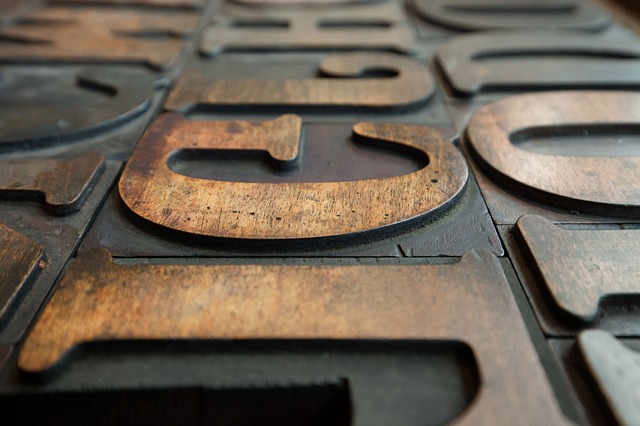
Type is all about details. It’s what makes different type applications different from each other. There are only 26 letters in the English alphabet, after all. How else are we going to get all the variety possible out of type and letterforms except through tiny details that go unnoticed by the majority of viewers, but that make a world of difference to the design?
Here’s the key takeaway: don’t worry about the font – worry about the details. Is the ascender of that d too high for the logo you’re designing? Does the bowl of the lowercase a curve just right, or is there something you would change? And what’s the deal with that ampersand?
Perhaps you should find another font that suits your needs better. There are hundreds of thousands of fonts out there, all incrementally different from one another in sometimes very subtle ways. There’s absolutely no reason to stick with something just because it’s popular or expected.
Design Is Like A Symphony And Type Is But One Instrument
Designers are like composers. Type, color, and composition all matter separately, and they can’t be discarded without a good reason. The audience sees the final product, but only the professional can see and appreciate the separate elements that went into the whole. In this way, design is like a symphony orchestra. All you, the layperson, hear is the harmony and beauty of the music, but the conductor and musicians are hearing something very different.
Read Also: Design Vs Art – The Difference And Why It Matters
Or, to use one of my favorite analogies, design is like a harmonious plate of food served up at a restaurant by a master chef. You may not know all of the individual ingredients that went into creating it, but believe me, if the chef had left any one of them out, you’d be able to tell that something was wrong.
Your expectations of a high quality meal are the same regardless of how much training you have, and the same is true for users, clients, and anyone else who is looking at your design work. They can’t necessarily tell when your design is working, but they’ll certainly know when it’s not.
Pick The Best Font For The Job
Let’s face it – the most popular typefaces look good and work well in a lot of the most popular types of projects commissioned by clients today. Even if you feel it’s an “overused” font, or that too many people have jumped on the band wagon. If it works, use it. You’ll find that if you make the right choice, your design will hold up in the future while all those bandwagon hoppers fall by the wayside. After all…
Read Also: How To Keep Your Design Skills Fresh
There’s Usually A Reason They Are Used So Much
Certain typefaces have an elegance and internal structure that is hard to deny. That’s why people use them so much – because they’re well-designed. Their popularity may wax and wane, but the talent and thoughtfulness that went into their creation is forever. Nobody uses a poorly designed typeface over and over again in professional design work (so Comic Sans doesn’t count).
What Do You Think?
What typefaces do you think have earned the label of “overused” lately? Do you think the accusation is justified? Are any of your favorite or go-to fonts in danger of being slapped with this label?
Related posts:
![]()


No Comments