


Still remember the old days where in you are just starting out with Photoshop? You designed an image-based text and then just uploaded it on your website?
Instead of doing this with Photoshop, the good news is, it is now possible to create textured text using CSS3. Webkit now supports the background-clip CSS3 property that does exactly what Photoshop does.
Aside from that, you can also use the mask-image CSS property to do almost the same effect; however, this property clips the visible portion of an element according to the transparency of the mask images.
In today’s tutorial, you will learn how to apply these effects and create a cool textured text using CSS3 and HTML5.
Resources You Need to Complete This Tutorial
- Any background image
- Any textured images (PNG file)
- Lato (Google Font)
- Pacifico (Google Font)
- Oswald (Google Font)
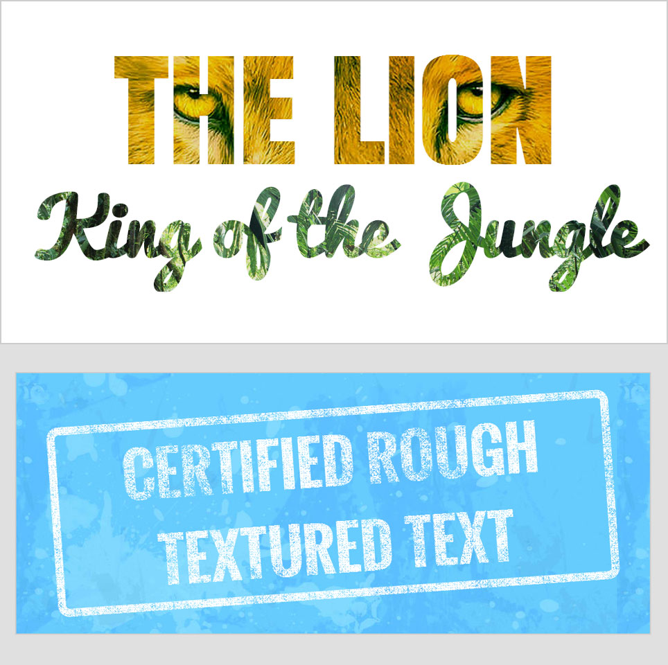
What we’re going to build
Using Webkit Background-Clip To Text
For this part of the tutorial, you are going to use the webkit background-clip property to apply a cool lion and jungle text effect with the H1 tag.
The HTML
For the markup, wrap our first H1 tag with clipped-title1 and clipped-title2 with our second H1 tag.
<div id="clipped-title1">
   <h1>THE LION</h1>
</div>

<div id="clipped-title2">
   <h1>King of the Jungle</h1>
</div>
The CSS
Now for our CSS, you will use the background-clip property to clip the image to the text. By default, the background extends to the outside edge of the border.
On the CSS below, different background images are used. The first one is a lion background image while the second one is a jungle background image. Notice the webkit-text-fill-color was set to transparent to make sure that the image color will be the one to display on the text.
#clipped-title1 {
	background: url(../images/lion.jpg) no-repeat center center;
	background-size: cover;
	color: #fff;
	-webkit-text-fill-color: transparent;
	-webkit-background-clip: text;
}

#clipped-title2 {
	background: url(../images/jungle.jpg)no-repeat top center;
	background-size: cover;
	color: #fff;
	-webkit-text-fill-color: transparent;
	-webkit-background-clip: text;
	cursor: pointer;
}

#clipped-title1 h1 {
	font-size: 200px;
	font-family: Anton, sans-serif;
	text-align: center;
	-webkit-transition: text-shadow 1s ease;
	text-shadow: 0 0 1px rgba(0,0,0,.1);
	margin: 0;
	padding: 0;
}

#clipped-title2 h1 {
	font-size: 110px;
	font-family: Pacifico, sans-serif;
	text-align: center;
	-webkit-transition: text-shadow 1s ease;
	text-shadow: 0 0 1px rgba(0,0,0,.1);
	margin-top: -75px;
	padding: 0;
}
Using Webkit Mask-Image To Text
By using the -webkit-mask-image CSS property, you can set the image in a text. This is almost the same like the background-clip except that the mask image clips the visible portion of an element according to image mask transparency.
The HTML
For the markup, you will simple wrap an H1 tag to an ID masked-image.
<div id="masked-image">
     <h1>CERTIFIED ROUGH<br/>TEXTURED TEXT</h1>
</div>
The CSS
For the CSS, simply put the basic styles for the color and font type and so on. Also, you will use the –webkit-mask-image property to clip a rough image background to the text. Rotate the text -4 degrees using the transform property.
#masked-image {
    font-family: Oswald, sans-serif;
    font-size: 100px;
    color: #fff;
    text-transform: uppercase;
    border: 14px solid #fff;
    border-radius: .2em;
    text-align: center;
    margin: 0;
    display: block;
    -webkit-mask-image: url(../images/rough-texture.png);
    -webkit-transform: rotate(-4deg);
    -moz-mask-image: url(../images/rough-texture.png);
    -moz-transform: rotate(-4deg);
    -o-mask-image: url(../images/rough-texture.png);
    -o-transform: rotate(-4deg);
    mask-image: url(../images/rough-texture.png);
    transform: rotate(-4deg);
}
Wrapping Up
There you have it! That’s how easy it is to create a textured image using the background-clip and mask-image CSS property. Although this maybe a good replacement for the Photoshop workflow, still at this time of this writing, it has not yet been supported on the old browsers like the Internet Explorer 8 and its Jurassic versions.
I hope you find this tutorial helpful. Please feel free to comment below if you have any other idea to do the same effect like the demo.


No Comments