


Logos, as you all know, play are a major part in branding. A good logo can help the masses associate and identify your product or service. This is precisely why logos go through vigorous designing and redesigning stages to communicate the brand they’re representing well.
Of course, there are those that don’t do so well as the meaning behind them somehow gets lost. For the ones that do their job successfully, you can’t help but marvel at how ingenious the design is and how they convey meaning with the use of space and symbols. That is, if you know what they mean or what to look out for. To help you with that, we’ve compiled 25 logos that we found have hidden meanings in their designs.
Recommended Reading: Logo Evolution of 25 Famous Brands
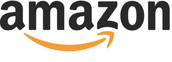
1. Amazon
The giant online store aptly takes on the name Amazon to convey its wide store directory. This is further hinted by the arrow linking the ‘A’ to ‘Z’ to say that they have everything from ‘A’ to ‘Z’. Which should be able to satisfy you, hence the dual meaning of the arrow being a smile.
(Image source: Business Insider)
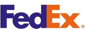
2. FedEx
The shipping company’s logo seem like a simple one with only its name. However if you take a second look at the space between the ‘E’ and the ‘X’, you would notice an arrow. With it so perfectly placed there, it is no wonder that the arrow represents speed and percision.
(Image source: The Branding Journal)
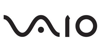
3. Sony VAIO
VAIO is Sony’s brand line for its laptops. The logo is not just a sylized brand name but refers to turning analog waves into a digital form too. The analog waves are represented in the ‘V’ and ‘A’. ‘I’ and ‘O’ on the other hand can also refer to 1 and 0, which are the two digits used in binary code, the digital.
(Image source: The Branding Journal)
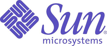
4. Sun Microsystems
This logo was designed by computer science professor Vaughan Pratt. While not having designer chops, Pratt managed to come up with a ingenious design by making Sun’s logo into an ambigram, which is a typographic design that spells a word out in various directions.
Here, he constructed the design that no matter what direction you twist and turn it, you can still read the word “Sun”.
(Image source: Diply)
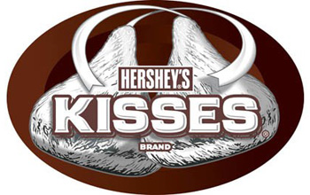
5. Hershey’s
Hershey’s Kisses are so fun to give out as you can offer them to people with the quip: “Do you want a kiss?”
Bad jokes aside, turn the logo on its side and you just might spot a (chocolate) Kiss between the ‘K’ and ‘I’.
(Image source: Webneel)
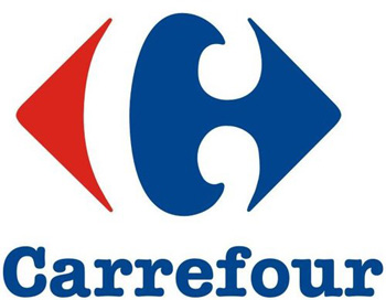
6. Carrefour
The popular French hypermarket’s name Carrefour translates to mean crossroads. Hence the red and blue arrows pointing at different directions. If you squint hard enough, you’ll be able to make out the letter ‘C’ which was cleverly incorporated through the use of negative space.
(Image source: The Branding Journal)
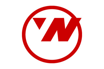
7. Northwest Airlines
This used to be Northwest Airlines’ logo before it was retired in 2003. Simply put, the logo is well-designed by making use of negative space to both convey ‘N’ and ‘W’ at the same time. The triangle placed in the ring also suggest the image of a compass, with the triangle pointing in the northwest direction.
(Image source: Pixel Push)
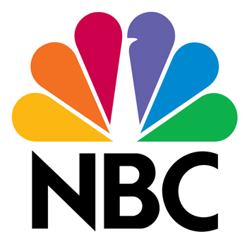
8. NBC
NBC was once known as the Peacock Network when the bird was first used as its logo in 1956. The peacock has now evolved to this with its 6 colored tail representing the departments; News, Sports, Entertainment, Stations, Networks, and Productions.
Additionally, the peacock is depicted facing right to show that the television network is looking towards the future.
(Image source: The Branding Journal)
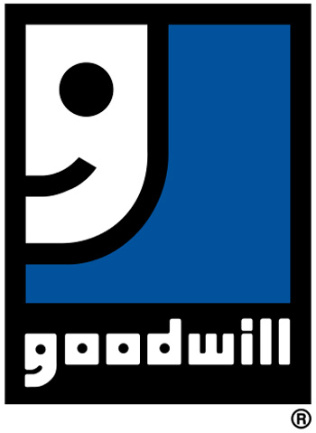
9. Goodwill
As a non-profit organization that helps disadvantaged people, it’s easy to see that Goodwill’s logo featuring a smile means that the organization helps them to become better.
If you look closer at the ‘G’ in the wording, you would see the same half smiley face. Now is the logo a ‘G’ or a smiley face?
(Image source: Wikipedia)
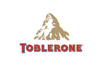
10. Toblerone
Chocolate again! Toblerone’s logo is lot more complex than Hershey’s. Look closely at the mountain and you’ll be able to spot a bear. The reason for this is because the Swiss chocolate company originated from the city of Bern, Switzerland which is also known as the City of Bears.
(Image source: Web Designer Depot)
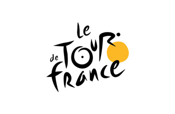
11. Le Tour de France
The name of the of the annual and vigorous biking competition isn’t the only feature in this logo. Look closer at the letter ‘R’ and the yellow circle next to it. You’ll be able to see a cyclist in racing postion. The yellow circle can also represent the sun to signify that the race takes place during day time.
(Image source: Web Designer Depot)
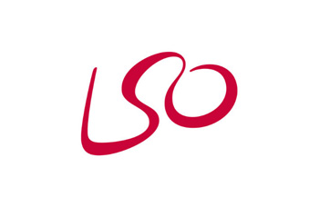
12. London Symphony Orchestra
At first glance, this might seem to be a simple logo consisting of only the initial letters that make up the London Symphony Orchestra.
But if you take the trouble to visualize, the wavy line also conjures up an abstract image of a conductor waving his baton.
(Image source: Web Designer Depot)
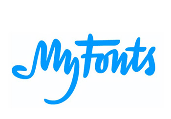
13. MyFonts
MyFonts is a font resource for all your font needs. Being a font resource site, they’ve got to walk the talk by having a customized font as their logo. And what better way to do that than by having the ‘My’ stylized to also look like a hand? You know, to suggest that you can get your hands on the fonts you need.
(Image source: Web Designer Depot)
14. Facebook Places
Anyone remembered the defunct Facebook Places? Considered to be a direct competitor of Foursquare, all you have to do is take a closer look at the design. Especially the rectangle meant to represent a map. Now is it just me or does the lines form a number 4?
(Image source: Business Insider)
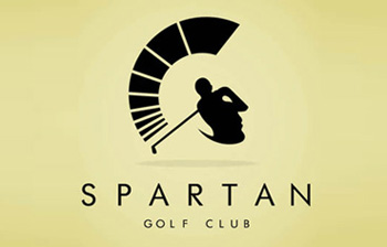
15. Spartan Golf Club
Like most logos on this list, this one tries to represent its name. And it does it well by representing 2 things. It first features a golfer swinging his club. With the use of negative space, it secondly features a side profile of a Spartan warrior.
(Image source: Somebody Marketing)
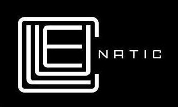
16. Cluenatic
If you couldn’t guess from the name, Cluenatic is a puzzle game. And a puzzle game needs a puzzle as its logo. Here, the letters making up the word ‘Clue’ is arranged to look like a maze. Additionally when you view the logo as a whole, it looks like a key.
(Image source: Stumblepod)
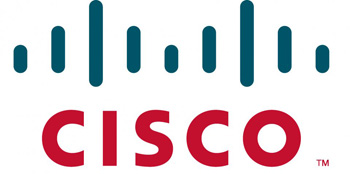
17. Cisco
Cisco is well-known for designing, manufacturing, and selling networking equipment. It is therefore not surprising that they decide to incorporate an illustrated digital signal into their logo.
But there’s another meaning to that digital signal. In fact it looks like an abstract of the famous Gold Gate bridge in San Francisco. By choosing this design, Cisco managed to both convey what they do and where they are located at.
(Image source: Business Insider)
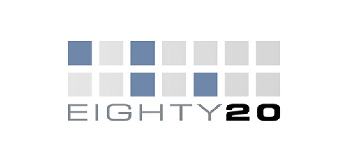
18. Eighty 20
At first glance, you might think that this data company’s logo is just made up of random squares arranged into 2 rows. In fact, the squares are really binary codes with the top being 1010000 and the bottom being 0010100.
The binary codes form the numbers 80 and 20 respectively. When put together they form the company’s name. You get extra geek points if you managed to figure that out without the help of this explanation.
(Image source: Stock Logos)
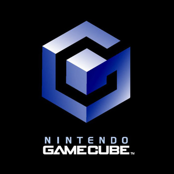
19. Nintendo Gamecube
I’m sure anyone will agree that this is a good logo with its clever cube-ception game going on. But it’s about to get even more clever. If you look at it this way, the blue lines also form the letter ‘G’ and the black space in between forms the letter ‘C’. And what do they represent? That’s right, Gamecube.
Well played, Nintendo. Well played.
(Image source: Business Insider)
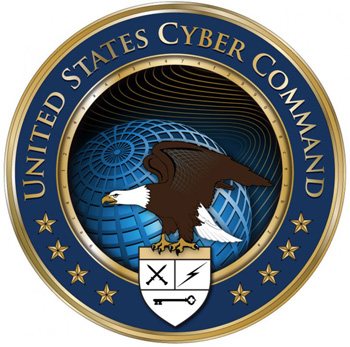
20. US Cyber Command
Why is this logo here? It looks like any ordinary blah government logo. That’s what the United States Cyber Command wants you to think. Look closer at the inner golden ring and you’ll find 32 characters.
The meaning of the characters is a little bit hard to decipher. Many speculated it’s Cyber Commmand’s mission statement encrypted in the 32 character code. For the logo’s meaning, check out this link.
(Image source: Business Insider)
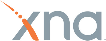
21. Microsoft XNA
XNA is a set of tools Microsoft came up with for games development. The orange dashed line that makes up one of the ‘X’ strokes is actually Morse Code spelling out XNA. _.._ is X, _. is N, and ._ is A.
(Image source: Wikipedia)
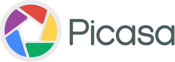
22. Picasa
Google’s image editing and sharing site does not only represent a camera shutter. Oh no. Its name Picasa is a word play on the concept that the site is a home for your photos. Casa in Spanish translates to house. Now do you see a house in the middle of the colorful shutters or do you see a house?
(Image source: Wikimedia)
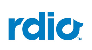
23. Rdio
Rdio, although lacking an ‘A’, offers radio streaming services as its name implies. Its logo cutely uses the space in the ‘D’ and ‘O’ to contain musical notes; a semibreve and a crochet respectively.
(Image source: Business Insider)
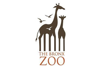
24. The Bronx Zoo
The Bronx Zoo can be found in New York City. Naturally being a zoo, they would use animals (in this case giraffes and birds) in their logo design. But wait, take a second look at the giraffes’ legs and you’ll see New York’s cityline artfully included through the space between the legs.
(Image source: Pixel Push)
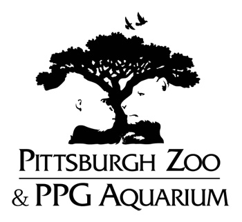
25. Pittsburgh Zoo
American zoos sure love using negative spaces in their designs. And they do it beautifully, as demonstrated by the Pittsburgh Zoo in Pennsylvania.
In case you don’t see it, there’s a gorilla and a lion staring at each other from the sides of the tree.
(Image source: Wikipedia)
Related posts:
- 40 Classy Uses Of Monogram Logos
- 30 Cool Cat Logos For Your Inspiration
- 4 Creative Photoshop Artists Who Cleverly Manipulate Landscapes [PHOTOS]
- When Does Brand Design Actually Matter?
![]()


No Comments