


Writing on this blog affords me a rare opportunity to talk positively and constructively about things that I care about. Which makes a change from the usual negative bile I spew on other websites and at home.
We have a responsibility to offer guidance, tips and best practice to help improve everyone’s digital experiences and we love highlighting examples that we think will offer inspiration.
I don’t think we’ve ever said “Brand X sucks”, at least not without offering constructive criticism or highlighting where things could be improved.
But when we’re researching certain topics, as I was doing last week when investigating whether top UK retailers use guest checkouts it’s difficult not to be frustrated with poor user experiences and thoughtless design.
This article is designed to show how a few of the poorer checkouts I’ve experienced could be improved, with just a few simple tweaks. This isn’t for naming and shaming; it’s for prodding in the right direction for the benefit of their customers.
Graham Charlton wrote a cracking post on 11 of the world’s best ecommerce checkouts which I encourage you to read as it contains essential advice for best practice.
Sidenote: I just had to check whether there’s a company called Brand X in existence. Apparently Brand X are a jazz fusion band from the late 70s featuring Phil Collins. So yes, Brand X do in fact suck.
Boots
This is my current basket at Boots. The first thing you certainly won’t fail to notice is the sheer volume of information, text, options, navigation and input fields all vying for your attention
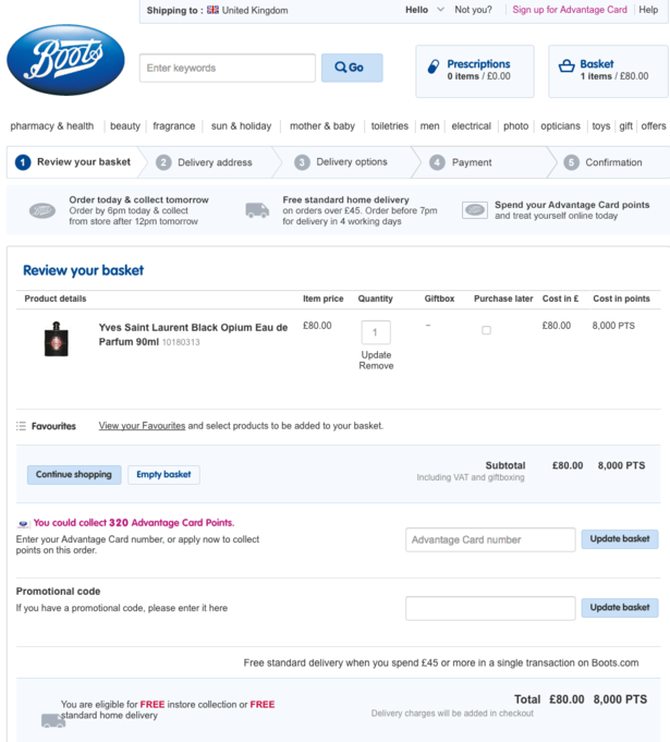
It’s exhausting and doesn’t bode well for the journey ahead. In fact, speaking of the journey ahead, the actual checkout button is hidden well beneath the fold.
Streamlining and simplifying the checkout process in order to make it quicker and hassle free is a key way to improve conversion and reduce basket abandonment.
You should ask yourself how much of this page is really necessary at this stage of the journey, when they’re already committed to buy.
Does the customer still need every link to the site across the top navigation? A single ‘continue shopping’ button would do.
The options to enter a loyalty card number or promotional code would be better saved for the payment page.
The ‘Purchase later’ option doesn’t need to be there, this just needs to be on the product page itself where the item can be added to a ‘favourites list’. Boots allows customers to operate a ‘favourites list’ and a ‘wish list’ which I’m not entirely clear on the difference between and just confuses matters. Again, the ‘favourites’ menu doesn’t need to be there at this stage.
I can count three examples where the offer of ‘free delivery’ is mentioned on the page. However the ‘free delivery’ offer isn’t highlighted on the homepage, which would be much better positioning.
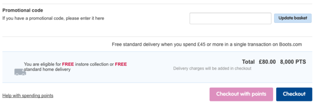
To Boots’ credit, free delivery is highlighted in red on the product page, however this makes it even more unnecessary on the basket page. Delivery costs must be highlighted at the earliest opportunity to avoid nasty surprises. It should also be included in the total price at this stage, with different delivery options available in a drop down menu, which then alters the total.
Finally that checkout button needs to be much higher, it’s ridiculous that I had to spend more than a few scomds looking for it.
There are loads more tips here on how Boots can improve its conversion.
Halfords
Again it’s the clutter that puts me off the most here…
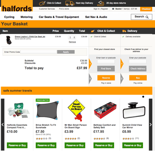
It’s fantastic that Halfords offers click & collect as well as delivery, and it’s right that both these options are communicated here as it will determine the remainder of the checkout journey, but there’s a problem with the clarity of the buttons.
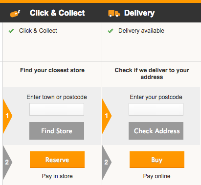
Using both grey and orange for four different options is confusing, especially when the numbered arrows next to them are the opposite colour. Grey also has a tendency to make buttons look defunct or unclickable.
There’s also a bigger problem in that the call-to-action buttons are practically the same colour as the logo and various other large parts of the page. I don’t know what’s clickable and what isn’t.
There’s also a misalignment with the headings. Price, Quantity and Total are slightly out of line which looks unprofessional, but worse than that the Click & Collect and Delivery headers don’t necessarily look like they’re related to the options below.
The recommended products at the bottom also dwarf the actual basket on the page. If a customer has reached this point, there’s a good chance they’ve finished shopping. Let’s make their journey to the payment page as swift and distraction-free as possible.
River Island
At a glance River Island’s ‘shopping bag’ is good, with lovely bright call-to-actions, minimal amount of distraction and plenty of white space to keep things focused.
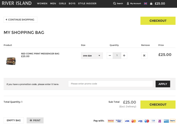
Here’s where I start to feel really picky… Is there too much space? Is everything far too spread out? I’m very gingerly asking this as I feel that by criticizing it I’m coming across as bit of a hypocrite. I’d much rather this than the clutter of the previous two experiences, however I feel it’s gone too far the other way.
It’s when you get to the checkout itself that things become… gigantic.
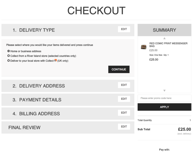
This is brilliant in terms of accessibility, but I personally have to take a step back from the monitor.
What’s clear is that this is a checkout built perfectly for a mobile user, it’s entirely responsive and is genuinely a pleasure to use on a smaller screen. Perhaps an adaptive design would have been better contextual experience.
Newegg
The US electronics store goes completely in the opposite direction to the above. Tiny illegible text everywhere, shades of grey fogging navigation and CTAs and completely mobile unfriendly.
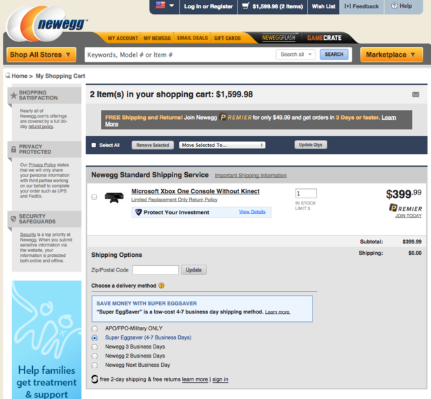
Options for PayPal and other quick alternatives are presented at the bottom of the page although they’re not presented later on the payment screen, so if you miss them here, you won’t have the option again.
As for the checkout itself, there’s far too many options on the… take a deep breath… sign-in/guest-checkout/new-customer-sign-up screen.
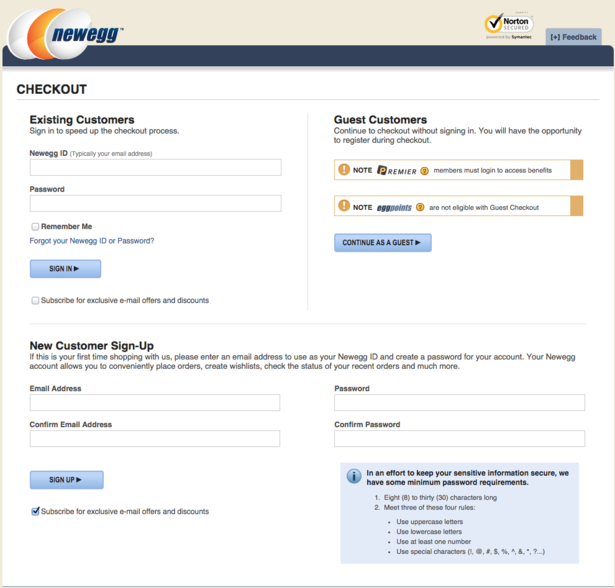
Other ecommerce sites handle this amount of options, but in a far more succinct way. For instance, offer existing customer sign-in and a single email entry field, which serves as a guest checkout with the option to create an account later.
The two warnings about what you’re not eligible for as a guest aren’t very friendly. Perhaps they could be worded in way that highlights what the benefits of being a member are, rather than telling you what you’re missing.
H&M
H&M has a very tasteful looking checkout, but unfortunately it’s not the most user friendly.
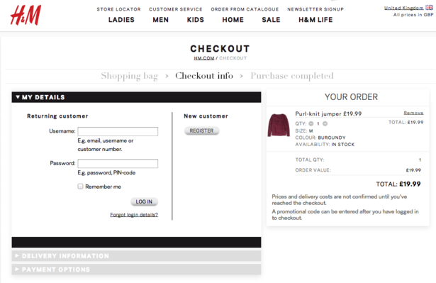
The text is far too small, and the mixture of sizes and typefaces makes it more difficult to read. H&M could also do with offering a guest checkout here rather than forcing users to register straight away.
On the next page there are more text issues…
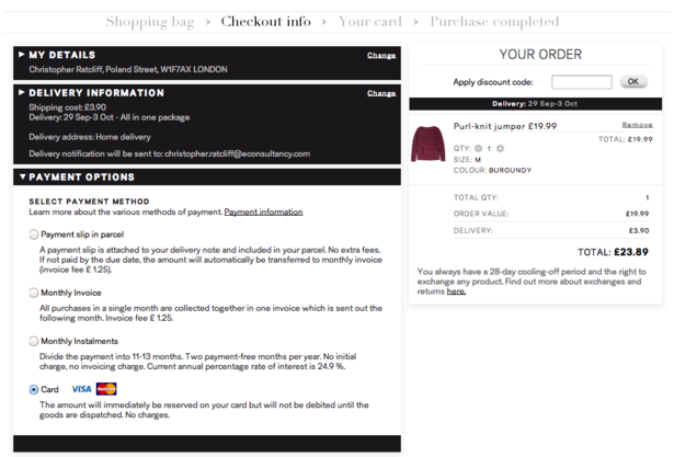
White on black text, especially when the text is so small, makes for a difficult read. The huge amount of small print under each payment option seems unnecessary. Perhaps this can be hidden away in drop-down or hover menus.
Payment options are also limited to Visa and Mastercard. It would be great to see PayPal or click & collect as possible options too.
For more advice on guest checkouts, read my best practice guide.
To learn more about ecommerce and all things digital come to our Festival of Marketing event in November. A two day celebration of the modern marketing industry, featuring speakers from brands including LEGO, Tesco, Barclays, FT.com and more.


No Comments