I’ve been trawling through some mobile sites to find features I like.
Previously I published probably my favourite 15 mobile features but here’s 30 more I like to see on the smaller screen.
As ever, check out the Econsultancy Mobile Web Design and Development Best Practice Guide for more guidance and come to the Festival of Marketing in London, November 12-13th, to learn more.
Right, let’s get stuck in with the screenshots!
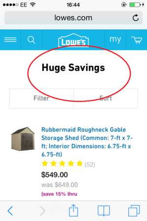
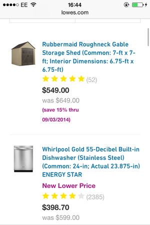
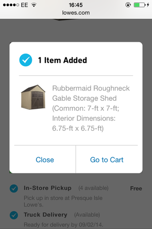
Lowes
Big bold copy…

Different coloured text for ease of reading and comparison.
Lightbox confirmation of add to cart.
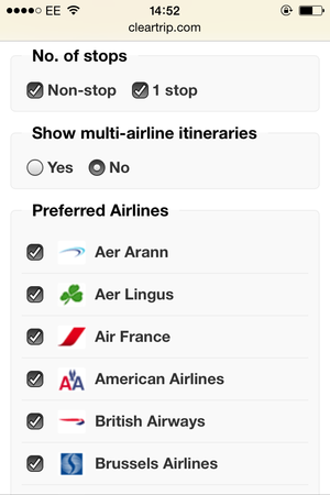
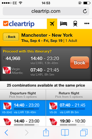
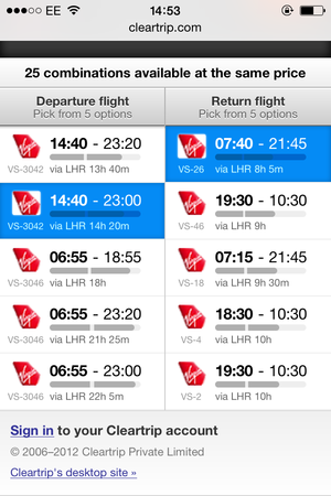
Cleartrip
Easy sorts and granular filters make mobile browsing easier.
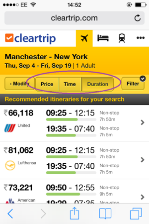

Colours used smartly to highlight trip summary (the most important part to check is in the brightest colour), booking call to action (a warning red) and selected departure and return flights (blue to highlight selection).
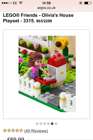
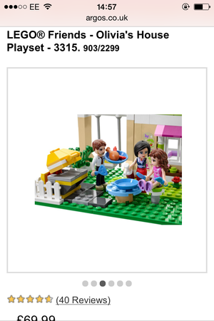
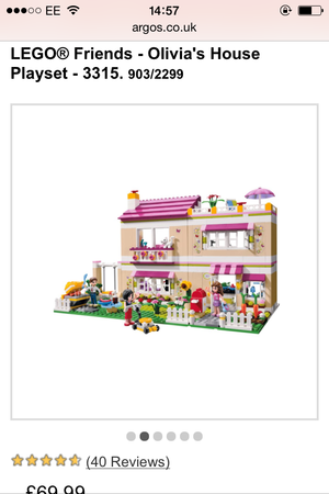
Argos
Category select with chunky illustrated buttons.
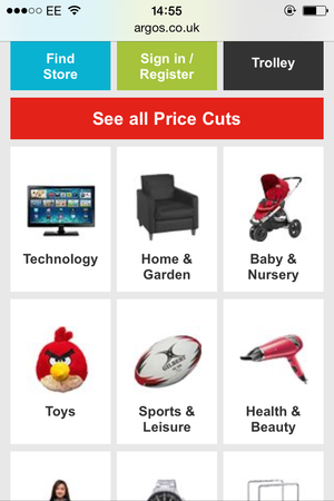
Compelling, crisp product-photo slideshows (x6 photos here).
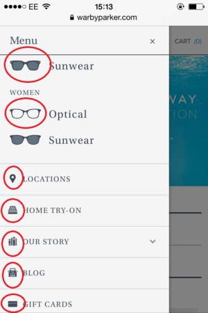
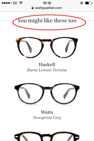
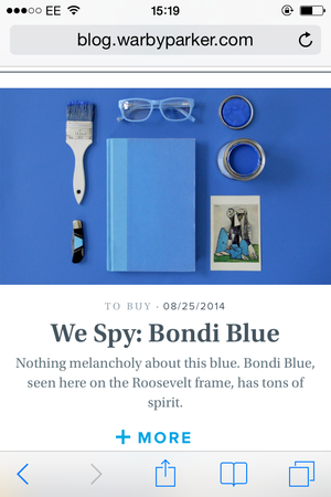
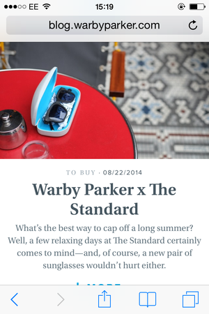
Warby Parker
Menu icons (even tailored for sex in the product categories).
Beautifully displayed ‘you might like these too’ suggestions on product page.
Gif! (take my word for it with these screenshots).
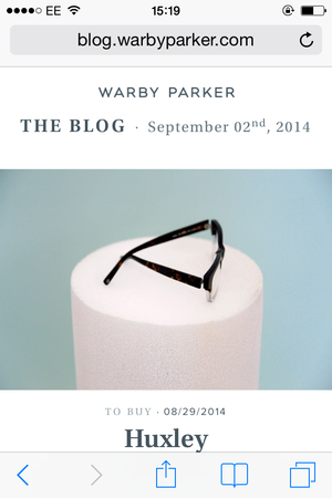
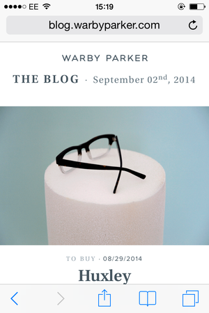
Beautiful palette, beautiful type.
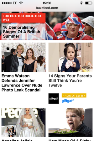
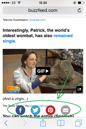
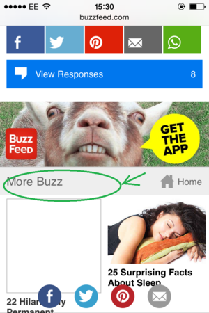
BuzzFeed
Bold headlines stand out.
More neat and simple app download messaging (no App Store screenshots here).
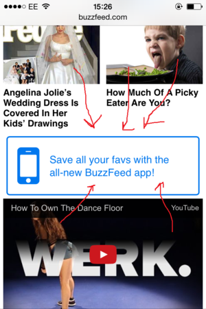
Share buttons pinned to the bottom of page, for when you’ve finished reading the article.
No dead ends at the end of articles, lots more articles to scroll through (More Buzz).
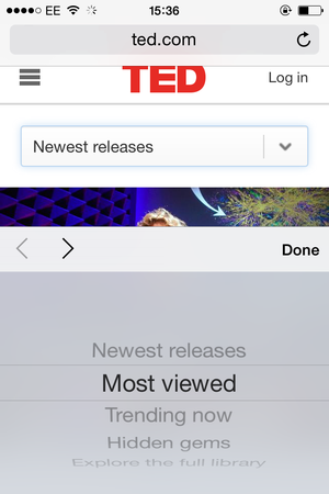
TED
OS field input.
Large text ‘About’ section at bottom of homepage.

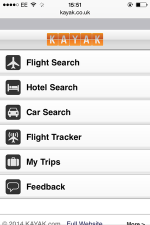
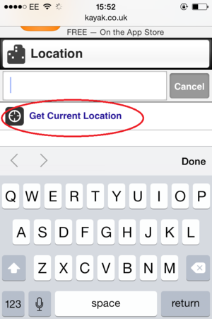
Kayak
Simple homepage design. Not too many options.
Auto-fill fields (today’s date, one night stay, one person, one room) and helpful logos.
GPS for current location.
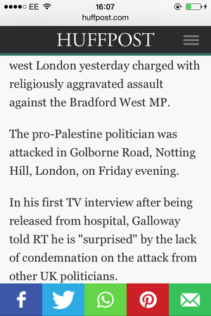
HuffPo
Simplicity of page design – nice big text, no annoying native format ads.
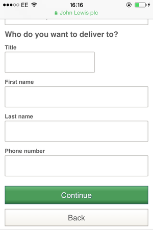
John Lewis
Chunky fields for fat fingers.
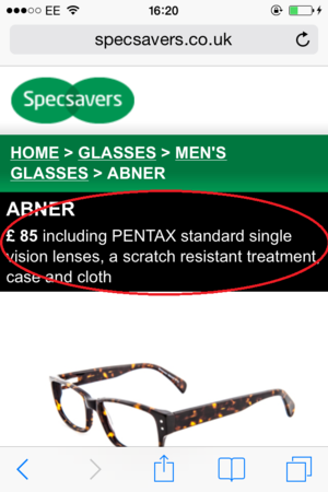
Specsavers
Simplicity of homepage.
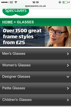
Chunky product select, this from the Men’s category. This saves mistaken clicks.
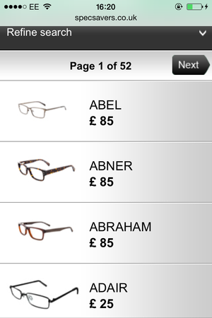
Top line, easy to read product features.
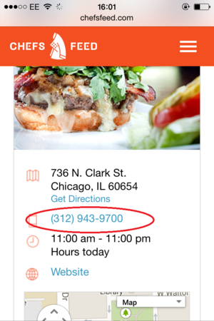
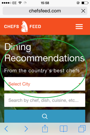
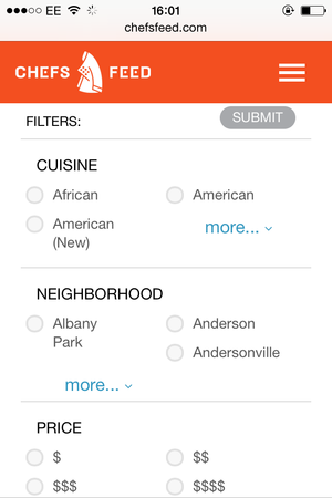
Chefs Feed
Value proposition on homepage.
Header pinned to top of page.
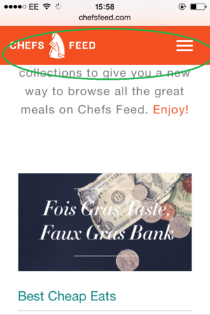
Filter menu to allow users to narrow their searches.
Click to call. Saves time for users.